Unlock a world of possibilities! Login now and discover the exclusive benefits awaiting you.
- Qlik Community
- :
- All Forums
- :
- QlikView App Dev
- :
- Distribution chart
- Subscribe to RSS Feed
- Mark Topic as New
- Mark Topic as Read
- Float this Topic for Current User
- Bookmark
- Subscribe
- Mute
- Printer Friendly Page
- Mark as New
- Bookmark
- Subscribe
- Mute
- Subscribe to RSS Feed
- Permalink
- Report Inappropriate Content
Distribution chart
Hello,
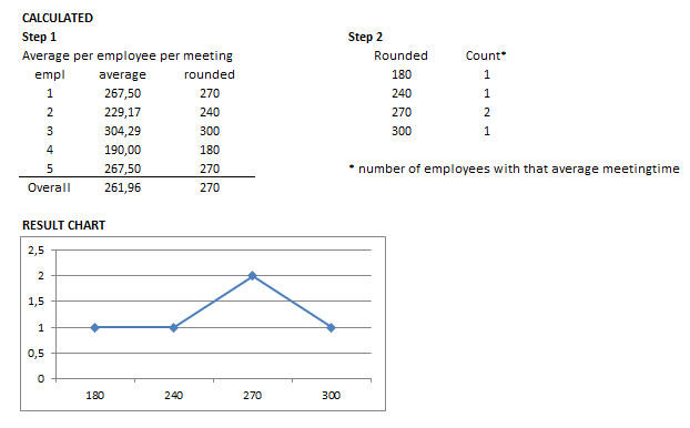
I like to add a chart with a distribution (scatter or histogram): X rounded meeting time (read categories) Y count of employees with that average meeting length. What I already have in a chart: the rounded average meeting length with employee as dimension. See underneath.
Formula for the average meeting length (the "if" statement has to do with time registrered not related to any meeting, which would pollute the average meeting time).
=ROUND((SUM(IF(Meeting.Meetings>0,Meeting.Time))+SUM(IF(Meeting.Meetings>0,Meeting.BreakTime))+SUM(IF(Meeting.Meetings>0,Meeting.Other)))/SUM(Meeting.Meetings),30)
(1 records has the number of meetings incl. time, breaktime and other time per employee per interval > 1 employee can relate to many records)
What I would like is to present: the numbers as a distribution like the underneath one.
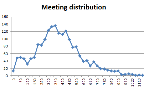
(don't like to say this, but the chart above was made in Excel in a couple of seconds > individual averages exported to Excel > pivot table on the length > chart with X distinct lengths, Y count)
What I have trouble with: getting the distinct rounded meeting lengths on the X-axes and also the count of the rounded averages (trouble there is that first the average has to be calculated per employee, after which a count has to be made of those averages).
Has anyone a suggestion how I could realise this (frontside only if possible)? Many thanks for any thoughts.
- Mark as New
- Bookmark
- Subscribe
- Mute
- Subscribe to RSS Feed
- Permalink
- Report Inappropriate Content
Hi,
maybe you could use the formula for the average as calculated dimension and then an expression having the count.
- Mark as New
- Bookmark
- Subscribe
- Mute
- Subscribe to RSS Feed
- Permalink
- Report Inappropriate Content
Perhaps a calculated dimension class(rangesum(Meeting.Meetings,Meeting.BreakTime,Meeting.Other),30) and count(Meeting.Meetings) as expression. Post sample data if you need more help.
talk is cheap, supply exceeds demand
- Mark as New
- Bookmark
- Subscribe
- Mute
- Subscribe to RSS Feed
- Permalink
- Report Inappropriate Content
Hi, the class function did help, thanks for the suggestion.
Next step is getting the per employee dimension integrated which can than be counted. Class now results in a single class (with the overall average, since the employees are not taken into account). Basically 1 bar in the graph. I'll have a look if I can create some sample data (actual data is >100K records with ~200K meetings).
A few sample records (not actual records, but same problem)
| INPUT records | ||||
| Empl | MeetingTime | MeetingBreak | MeetingOther | MeetingMeetings |
| 1 | 200 | 50 | 30 | 2 |
| 1 | 250 | 40 | 40 | 1 |
| 1 | 400 | 30 | 30 | 1 |
| 2 | 600 | 75 | 60 | 3 |
| 2 | 200 | 50 | 30 | 2 |
| 2 | 300 | 30 | 30 | 1 |
| 3 | 800 | 50 | 30 | 1 |
| 3 | 400 | 60 | 40 | 2 |
| 3 | 100 | 50 | 30 | 1 |
| 3 | 450 | 90 | 30 | 3 |
| 4 | 300 | 50 | 30 | 2 |
| 5 | 200 | 50 | 30 | 2 |
| 5 | 250 | 40 | 40 | 1 |
| 5 | 400 | 30 | 30 | 1 |
The chart underneath is the result I'm aiming for.