Unlock a world of possibilities! Login now and discover the exclusive benefits awaiting you.
- Qlik Community
- :
- All Forums
- :
- QlikView App Dev
- :
- Re: Issue with Pie Chat colouring - doesn't align ...
- Subscribe to RSS Feed
- Mark Topic as New
- Mark Topic as Read
- Float this Topic for Current User
- Bookmark
- Subscribe
- Mute
- Printer Friendly Page
- Mark as New
- Bookmark
- Subscribe
- Mute
- Subscribe to RSS Feed
- Permalink
- Report Inappropriate Content
Issue with Pie Chat colouring - doesn't align with the legends colour convention
Hi folks,
Really need some clarification, if you guys could shed some light would be much appreciated.
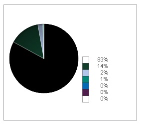
Based on the image above, as you guys can see all the colours in the legend and the pie chart aligns well except for the majority (83%) part. Its white in the legend, but black in the pie chart. :S
Is it safe to assume, due to the fact that the background of the dashboard sheet is white - QV somehow converts it to black so that it could be visible? Am just making a huge guess here.
Could anyone advise me on how I could maybe do some changes to the colour scheme, so that the legend and the pie charts' colours could align well?
My user is up to my neck on this matter. Please advise. Thanks in advance!
Best Regards,
Ram
- « Previous Replies
-
- 1
- 2
- Next Replies »
- Mark as New
- Bookmark
- Subscribe
- Mute
- Subscribe to RSS Feed
- Permalink
- Report Inappropriate Content
Its hard to say without looking at the application. I dont think its a generic problem but there might be a combination of your data and the way the object is set up. Have you seen similar issues with other objects or documents?
- Mark as New
- Bookmark
- Subscribe
- Mute
- Subscribe to RSS Feed
- Permalink
- Report Inappropriate Content
Not really, but its worth a shot looking into and referring it to QlikTech.
- Mark as New
- Bookmark
- Subscribe
- Mute
- Subscribe to RSS Feed
- Permalink
- Report Inappropriate Content
Hi Ram,
I too had this problem and the reason I have given below. You can also have a check on this and correct if it is the same.
Go to chart properties--> Expression Tab
then expand your expression by clicking on + sign beside it.
This will open some options--> click on Background color--> Go to its definition and check whether there is any expression written there.
Color will be black if there is any problem with expression.
I have attached screen shot of the same.

- Mark as New
- Bookmark
- Subscribe
- Mute
- Subscribe to RSS Feed
- Permalink
- Report Inappropriate Content
Hi Kavita,
WOW! That just did the job - now its all right the way I want it.
Thanks HEAPS! Legend.
- « Previous Replies
-
- 1
- 2
- Next Replies »