Unlock a world of possibilities! Login now and discover the exclusive benefits awaiting you.
- Qlik Community
- :
- All Forums
- :
- QlikView App Dev
- :
- Re: Combo_chart to display a numeric_null_value?
- Subscribe to RSS Feed
- Mark Topic as New
- Mark Topic as Read
- Float this Topic for Current User
- Bookmark
- Subscribe
- Mute
- Printer Friendly Page
- Mark as New
- Bookmark
- Subscribe
- Mute
- Subscribe to RSS Feed
- Permalink
- Report Inappropriate Content
Combo_chart to display a numeric_null_value?
I have the following problem:
- Next to the primary chart on the current sheet of my app, I have a "historical_values chart"
=> That does not have a proper dimension, just two data_points:
- "prior_week"
- "prior_month"
=> For reasons of screen_space, that second chart is necessarily much smaller than the primary one
- The issue I have is, the values to display in this chart are, so far, always 0 - which is very good, but hard to display...
- In my primary chart, the expression is displayed as a line and because there are six days which get connected, the line is visible.
<=> In the historical_chart, there is only one data_point (the two are disconnected, two completely separate values), so there is no
line, but only a dot...
<=> When I choose the display_type bar, it doesn't get any better - the bar is hardly visible.
=> Just modifying the axis to start at a value of -1 doesn't help matters for the bar only starts at 0...
Can anyone suggest a possible solution here?
Thanks a lot!
Best regards,
DataNibbler
Accepted Solutions
- Mark as New
- Bookmark
- Subscribe
- Mute
- Subscribe to RSS Feed
- Permalink
- Report Inappropriate Content
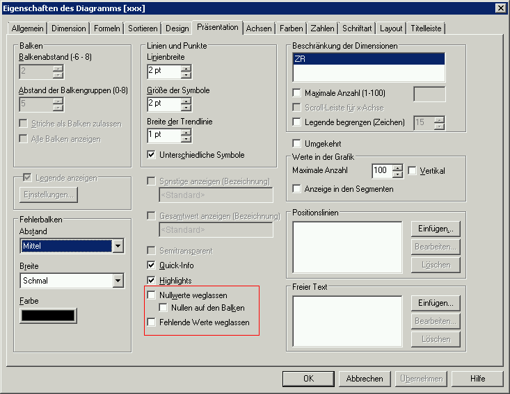
It worked if you displayed all values - see tab Präsentation. In cases if I couldn't use these settings because I needed this for other expressions - I add a tiny value like 0.000000001 to the expression. It's not quite correct but not visible in the chart.
- Marcus

- Mark as New
- Bookmark
- Subscribe
- Mute
- Subscribe to RSS Feed
- Permalink
- Report Inappropriate Content
It worked if you displayed all values - see tab Präsentation. In cases if I couldn't use these settings because I needed this for other expressions - I add a tiny value like 0.000000001 to the expression. It's not quite correct but not visible in the chart.
- Marcus
- Mark as New
- Bookmark
- Subscribe
- Mute
- Subscribe to RSS Feed
- Permalink
- Report Inappropriate Content
Hi Marcus,
that works great! I can format that to 0 decimals using the num() fct and still the value is displayed above the column, so it's easy to see the value was 0 - before, that figure didn't show although I had the corresp. checkbox ticked.
Thanks a lot!
Best regards,
DataNibbler
- Mark as New
- Bookmark
- Subscribe
- Mute
- Subscribe to RSS Feed
- Permalink
- Report Inappropriate Content
Hi Marcus,
unfortunately the problem has come back to me - in the primary chart I have to display the same values - currently, they are always 0.
- I have already set the axis to start at -1
- I have also built that IF_condition like you told me, putting num(0.001, '#.##0') and ticking the "values in segments"
checkbox
- I have also unticked that "remove NULL values" on the presentation_tab like I did before.
<=> Up to now, it doesn't work.
Can you think of anything here? Might it have to do with my dimension?
- Mark as New
- Bookmark
- Subscribe
- Mute
- Subscribe to RSS Feed
- Permalink
- Report Inappropriate Content
This could be - dimensions have also settings to hide null or show all values. But I think it's rather the num() function - they is don't needed.
- Marcus
- Mark as New
- Bookmark
- Subscribe
- Mute
- Subscribe to RSS Feed
- Permalink
- Report Inappropriate Content
Hi,
I have found it out - my dimension comes from a central qvs file because all my charts have the same dimensions, "day" and "month". The dimension "day" includes Sat, but those values are not tracked on Sat - so there is a blank and QlikView cannot calculate an average 😉
I cannot write to the original file, so I will just implement another dimension that has only five days ...
Thanks a lot!
Best regards,
DataNibbler