Unlock a world of possibilities! Login now and discover the exclusive benefits awaiting you.
- Qlik Community
- :
- All Forums
- :
- QlikView App Dev
- :
- Re: Set analysis provide average based on one spec...
- Subscribe to RSS Feed
- Mark Topic as New
- Mark Topic as Read
- Float this Topic for Current User
- Bookmark
- Subscribe
- Mute
- Printer Friendly Page
- Mark as New
- Bookmark
- Subscribe
- Mute
- Subscribe to RSS Feed
- Permalink
- Report Inappropriate Content
Set analysis provide average based on one specific field selection
Hi,
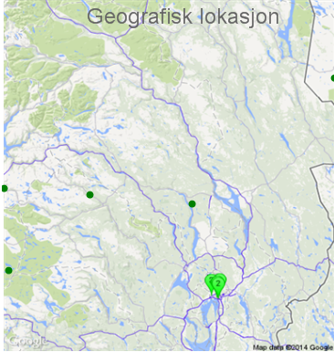
I have a field called 'IllnessGroup'. One illness group may contain many patients all of whom may have had many events. I have a map with each of the patients plotted. What I am wanting to achieve is to have all the patients with an average waiting time (accross all the events they have) of less than the population average to be green else be red. To start with I used the following expression within the 'Background colour' of the chat expression on the map:
IF(AVG(TimeBetweenEvents)>[AVG(TimeBetweenEvents)],red(),green())
In the script I have calculated the field [AVG(TimeBetweenEvents)]. This roughly works as it does indeed colour the dots red or green depending on the average value of 'TimeBetweenEvents' for each patient. The problem is that some illness groups have much longer 'TimeBetweenEvents' values meaning that if you select that 'IllnessGroup' you will always see a red dot.
Instead what I really want is for the colour coding to be relative to the users selection on 'IllnessGroup'. For example if the user has the 'IllnessGroup' selection of Heart attack and stroke and the user has select just three specific PatientIDs I would like the map to display the colours for those three users as green or red based on if they are above or below the collective average 'TimeBetweenEvent' for the all Patients within the 'IllnessGroup' of Heart attck and Stroke.
Any pointers would be greatly apprecaited.
Thanks
Dan
- « Previous Replies
-
- 1
- 2
- Next Replies »
Accepted Solutions
- Mark as New
- Bookmark
- Subscribe
- Mute
- Subscribe to RSS Feed
- Permalink
- Report Inappropriate Content
It struck me that you might wish to keep the colors relative to the IllnessGroup, even when selections in the IllnessGroup listbox is changed. In that case, a new solution is attached. I added IllnessGroup as a new dimension and added it as Total <IllnessGroup> after the total in the denominator to get subtotals per IllnessGroup. Now, a given point does not change color depending selections in the IllnessGroup listbox. In the previous upload, they are relative to groups selected if that is what you wish.
Best regards,
Christian
- Mark as New
- Bookmark
- Subscribe
- Mute
- Subscribe to RSS Feed
- Permalink
- Report Inappropriate Content
So population average is supposed to only be filtered on IllnessGroup and nothing else?
IF(AVG(TimeBetweenEvents)>AVG({1<IllnessGroup=P(IllnessGroup)>}TimeBetweenEvents),red(),green())
- Mark as New
- Bookmark
- Subscribe
- Mute
- Subscribe to RSS Feed
- Permalink
- Report Inappropriate Content
That doesn't seem to quite work. All the points are colored green with that formula. My only selection has been made on illnessgroup. Therefore you would expect to see some red and some green on this map.
Thanks for your help I really appreciate it.
- Mark as New
- Bookmark
- Subscribe
- Mute
- Subscribe to RSS Feed
- Permalink
- Report Inappropriate Content
Hi,
Try This
IF(AVG(TimeBetweenEvents)>AVG(Total <DimensionInMap>TimeBetweenEvents),red(),green()).
Replace DimensionInMap with your dimension used in map.
- Mark as New
- Bookmark
- Subscribe
- Mute
- Subscribe to RSS Feed
- Permalink
- Report Inappropriate Content
I have tried it but I still have the same issue when I use:
=IF(AVG(TimeBetweenEvents)>AVG(Total<PatientID>TimeBetweenEvents),red(),green())
I wasn't too sure if I should be removing either of the greater/less than signs from your formula around the ChartDimension or not.
Thanks
Dan
- Mark as New
- Bookmark
- Subscribe
- Mute
- Subscribe to RSS Feed
- Permalink
- Report Inappropriate Content
IF(AVG(TimeBetweenEvents)>[AVG(TimeBetweenEvents)],red(),green())
How do you calculate [AVG(TimeBetweenEvents)]?
- Mark as New
- Bookmark
- Subscribe
- Mute
- Subscribe to RSS Feed
- Permalink
- Report Inappropriate Content
This was being calculated in the script. I realise this is the wrong way to go given I want it to be a dynamic value based on the users illnessgroup selection, but I'm not sure how I would achieve that.
- Mark as New
- Bookmark
- Subscribe
- Mute
- Subscribe to RSS Feed
- Permalink
- Report Inappropriate Content
Ok, so I just want to understand your need:
you want to see if a certain patient/s on average, wait longer than the average wait time for a specific illness group?
- Mark as New
- Bookmark
- Subscribe
- Mute
- Subscribe to RSS Feed
- Permalink
- Report Inappropriate Content
Almost but slightly more...
As a user you select one or more illnessgroups. Based on that selection of illnessgroup (and disregarding the impact of any other field selection), I want the color to be red if the patients average waiting time was greater than the average waiting time for all the currently selected illness group.
For example if the user has selected illnessgroup of 'Heart Attack' and also selected [AGE] of 55+ I would want the chart to show all those patients that are over 55 colored red if they waited longer than the average waiting time else green. It would consider the entire population of Heart Attack when calculating the average to benchmark the patient against.
Similarlly if both Heart Attack and Cancer is selected I want to take the average waiting time of all patients for those two groups. This will if given a normal distribution (and no other selections have been made on other fields) there will be roughly half green and half red dots on the chart.
If for example you have selected Cancer and 55+ and that people that are over 55+ are usually fast tracked with below average waiting times you would expect to see the majority of the dots being green as we would still be using the whole population of cancer as the benchmark.
I hope those examples make it a bit clearer, apologies it isn't more elegantly put.
Thanks
Dan
- Mark as New
- Bookmark
- Subscribe
- Mute
- Subscribe to RSS Feed
- Permalink
- Report Inappropriate Content
Okay, last question.
what data sources are you using?
do you have 1 large table for all patients or you use different type of schema?
- « Previous Replies
-
- 1
- 2
- Next Replies »