Unlock a world of possibilities! Login now and discover the exclusive benefits awaiting you.
- Qlik Community
- :
- All Forums
- :
- QlikView App Dev
- :
- Re: Re: Set analysis provide average based on one ...
- Subscribe to RSS Feed
- Mark Topic as New
- Mark Topic as Read
- Float this Topic for Current User
- Bookmark
- Subscribe
- Mute
- Printer Friendly Page
- Mark as New
- Bookmark
- Subscribe
- Mute
- Subscribe to RSS Feed
- Permalink
- Report Inappropriate Content
Set analysis provide average based on one specific field selection
Hi,
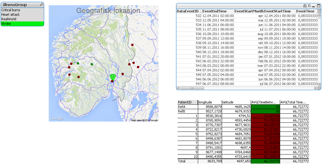
I have a field called 'IllnessGroup'. One illness group may contain many patients all of whom may have had many events. I have a map with each of the patients plotted. What I am wanting to achieve is to have all the patients with an average waiting time (accross all the events they have) of less than the population average to be green else be red. To start with I used the following expression within the 'Background colour' of the chat expression on the map:
IF(AVG(TimeBetweenEvents)>[AVG(TimeBetweenEvents)],red(),green())
In the script I have calculated the field [AVG(TimeBetweenEvents)]. This roughly works as it does indeed colour the dots red or green depending on the average value of 'TimeBetweenEvents' for each patient. The problem is that some illness groups have much longer 'TimeBetweenEvents' values meaning that if you select that 'IllnessGroup' you will always see a red dot.
Instead what I really want is for the colour coding to be relative to the users selection on 'IllnessGroup'. For example if the user has the 'IllnessGroup' selection of Heart attack and stroke and the user has select just three specific PatientIDs I would like the map to display the colours for those three users as green or red based on if they are above or below the collective average 'TimeBetweenEvent' for the all Patients within the 'IllnessGroup' of Heart attck and Stroke.
Any pointers would be greatly apprecaited.
Thanks
Dan
- « Previous Replies
-
- 1
- 2
- Next Replies »
- Mark as New
- Bookmark
- Subscribe
- Mute
- Subscribe to RSS Feed
- Permalink
- Report Inappropriate Content
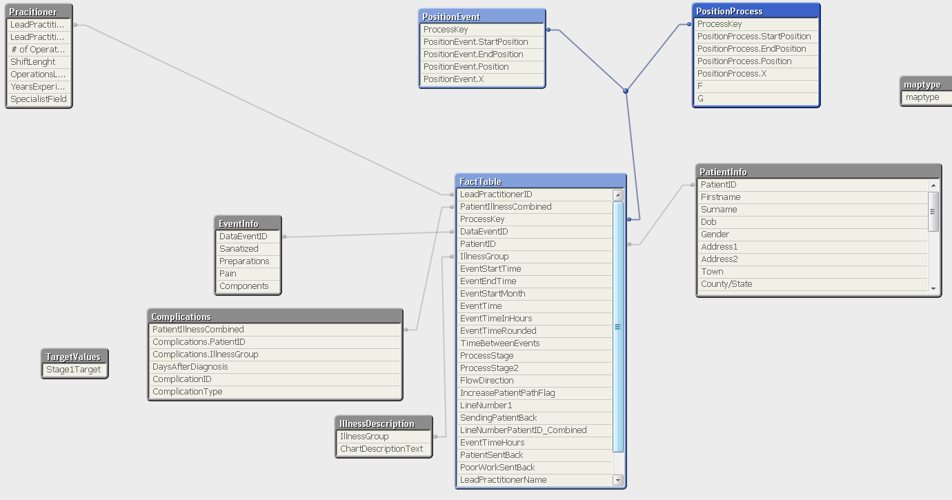
I have one large fact table containing all of the event data. The fact table contains the waiting times and the patient ID. See screenshot below:
- Mark as New
- Bookmark
- Subscribe
- Mute
- Subscribe to RSS Feed
- Permalink
- Report Inappropriate Content
I would propose to create a table that would include all dimensions you want the user to select upon when you
refer to the total average of time between events, the metric would be the timebetweenevents.
you can group this table by the illness group and then write the expression you want in the set analysis when on the left you write the average time between events of the fact table and on the right you out the average time between events of the created table.
it would make the selections of the subscriber dynamic and a certain patient/s selection won't effect the total average of the illness group.
- Mark as New
- Bookmark
- Subscribe
- Mute
- Subscribe to RSS Feed
- Permalink
- Report Inappropriate Content
Hi Daniel,
Can you post a sample .qvw? This calculation should be easy enough to write, it's just hard to do without having the .qvw in front of me.
- Mark as New
- Bookmark
- Subscribe
- Mute
- Subscribe to RSS Feed
- Permalink
- Report Inappropriate Content
Please see attached the QVW file. Please note all data contained is test data there is no real data contained.
- Mark as New
- Bookmark
- Subscribe
- Mute
- Subscribe to RSS Feed
- Permalink
- Report Inappropriate Content
Thanks for your suggestion Brois, I don't fully understand exactly what you are suggesting. If possible could you try to put a bit of an example into the QVW that I have now provided?
Thanks for your time and help.
- Mark as New
- Bookmark
- Subscribe
- Mute
- Subscribe to RSS Feed
- Permalink
- Report Inappropriate Content
Daniel,
Attached is what I think you are looking for. It selects colours based on the average in the IllnessGroup.
Christian
- Mark as New
- Bookmark
- Subscribe
- Mute
- Subscribe to RSS Feed
- Permalink
- Report Inappropriate Content
It struck me that you might wish to keep the colors relative to the IllnessGroup, even when selections in the IllnessGroup listbox is changed. In that case, a new solution is attached. I added IllnessGroup as a new dimension and added it as Total <IllnessGroup> after the total in the denominator to get subtotals per IllnessGroup. Now, a given point does not change color depending selections in the IllnessGroup listbox. In the previous upload, they are relative to groups selected if that is what you wish.
Best regards,
Christian
- Mark as New
- Bookmark
- Subscribe
- Mute
- Subscribe to RSS Feed
- Permalink
- Report Inappropriate Content
Thank you Christian, spot on.
- « Previous Replies
-
- 1
- 2
- Next Replies »