Unlock a world of possibilities! Login now and discover the exclusive benefits awaiting you.
- Qlik Community
- :
- All Forums
- :
- QlikView App Dev
- :
- Re: separate data into different charts
- Subscribe to RSS Feed
- Mark Topic as New
- Mark Topic as Read
- Float this Topic for Current User
- Bookmark
- Subscribe
- Mute
- Printer Friendly Page
- Mark as New
- Bookmark
- Subscribe
- Mute
- Subscribe to RSS Feed
- Permalink
- Report Inappropriate Content
separate data into different charts
Hi, QV
I have a question for you guys.
Lets say I have a data on sports players.
I have basketball players and soccer players.
In my data I have no table that separate different kind of sports for the players.
It is all in one group.
How can add that separation without adding data.
I can get that separation with expression but I want to divide the two sports into two different charts in red circle below (See picture)
Can anybody help me?
I 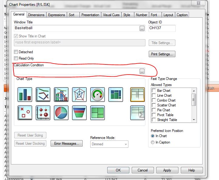
- Mark as New
- Bookmark
- Subscribe
- Mute
- Subscribe to RSS Feed
- Permalink
- Report Inappropriate Content
Hi Darri,
if you want to have two charts, use them with a calculated dimension, similar to this
dim first chart:
if (players='basketball players', players)
dim second chart:
if (players='soccer players', players)
HtH
Roland
- Mark as New
- Bookmark
- Subscribe
- Mute
- Subscribe to RSS Feed
- Permalink
- Report Inappropriate Content
Would you mind upload a sample?
Thx,
Michael
- Mark as New
- Bookmark
- Subscribe
- Mute
- Subscribe to RSS Feed
- Permalink
- Report Inappropriate Content
Hey Darri,
Calculation Condition is used when the data needs to be displayed only when few conditions are met. Like at least one customer or region needs to be selected.
In your case what do you mean by its all in one group. How would you differentiate who is a soccer and who is a basketball player? If there is a flag for indicating that then you could use set analysis to manipulate data.
If you could attach a sample file it would greatly help.
Thanks
AJ