Unlock a world of possibilities! Login now and discover the exclusive benefits awaiting you.
- Qlik Community
- :
- All Forums
- :
- QlikView App Dev
- :
- Re: Reposition Pie Chart data point values?
- Subscribe to RSS Feed
- Mark Topic as New
- Mark Topic as Read
- Float this Topic for Current User
- Bookmark
- Subscribe
- Mute
- Printer Friendly Page
- Mark as New
- Bookmark
- Subscribe
- Mute
- Subscribe to RSS Feed
- Permalink
- Report Inappropriate Content
Reposition Pie Chart data point values?
Hi community,
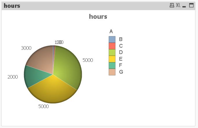
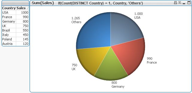
How do we reposition a Pie Chart data point value so that they are more readable?
In the example below, it is hard to read the data values on the blue and red slices. I want to reposition the numbers and not just decrease the font.
Thanks!
- « Previous Replies
-
- 1
- 2
- Next Replies »
- Mark as New
- Bookmark
- Subscribe
- Mute
- Subscribe to RSS Feed
- Permalink
- Report Inappropriate Content
We can't.
You have space on the right - can use "show numbers in legend".
- Mark as New
- Bookmark
- Subscribe
- Mute
- Subscribe to RSS Feed
- Permalink
- Report Inappropriate Content
You can try pressing CTRL + SHIFT and re positioning the chart
or maybe show the numbers in the legend
Go to presentation tab in the Chart Properties and tick Show Numbers in Legend.
It is a better alternative
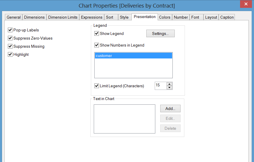
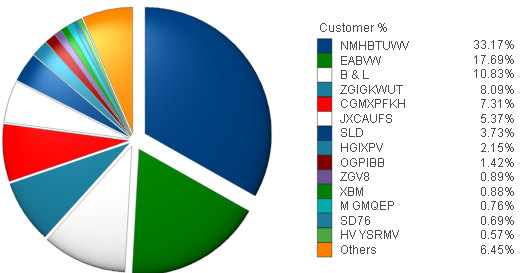
result will be like below
However, I would only advise you use a Pie Chart when you are comparing 2 or 3 Values
- Mark as New
- Bookmark
- Subscribe
- Mute
- Subscribe to RSS Feed
- Permalink
- Report Inappropriate Content
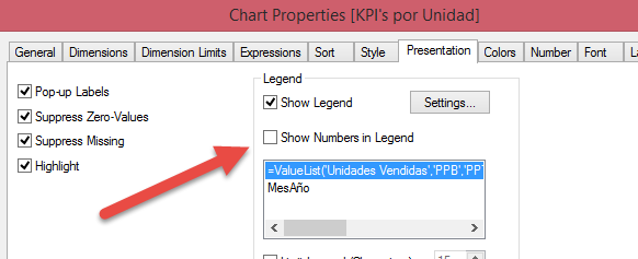
The only alternative is to check " Show numbers in Legend " in the Presentation tab (Object Properties.) and show numbers in legend not in the near the slices.
For "Values on Data Points", and as far as I know, there is no QlikView option to reposition this values in the chart.
- Mark as New
- Bookmark
- Subscribe
- Mute
- Subscribe to RSS Feed
- Permalink
- Report Inappropriate Content
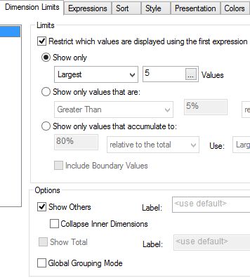
Hi Irene,
try this: limit your dimension to 5 and add a second expression for the labels to place below the values. Uncheck 'Show legend' in the 'Presentation' tab. See the picture below:
- Mark as New
- Bookmark
- Subscribe
- Mute
- Subscribe to RSS Feed
- Permalink
- Report Inappropriate Content
Hi Burkhard,
How do I add a second expression for the labels to place below the values?
Thank you.
- Mark as New
- Bookmark
- Subscribe
- Mute
- Subscribe to RSS Feed
- Permalink
- Report Inappropriate Content
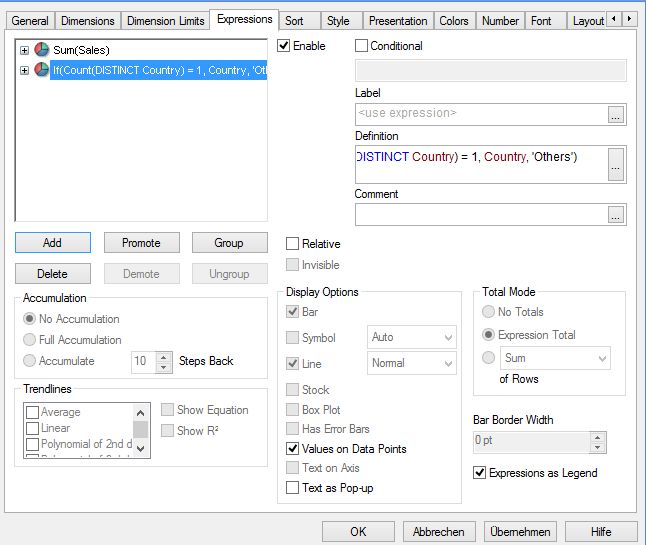
Hi Irene,
go to the 'Expression' tab, click on add and key it in:
- Mark as New
- Bookmark
- Subscribe
- Mute
- Subscribe to RSS Feed
- Permalink
- Report Inappropriate Content
Hi,
if you have a web connection you can use web-services like Google Chart Tools (Image Charts).
- Mark as New
- Bookmark
- Subscribe
- Mute
- Subscribe to RSS Feed
- Permalink
- Report Inappropriate Content
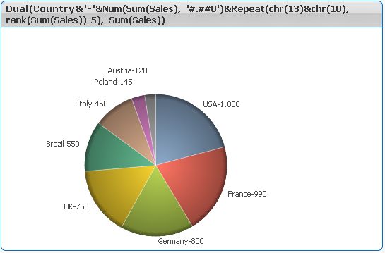
...there is also a solution with one expression only. The label and values start to add more and more distance to the pie so standard overlapping values are clearly visible then. See below the picture!
Two remarks:
i) the parameter of the rank function in my example '5' gives you the starting point for distant placement of the lables and values. You can adjust it to your application.
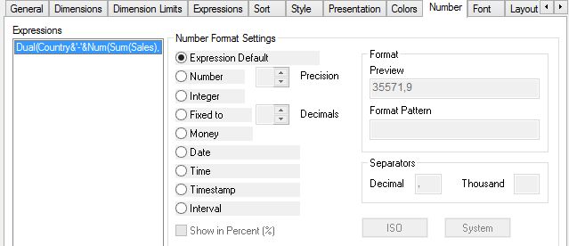
ii) Please make always sure with the dual function to mark the 'Expression default' check box of the 'Number' tab. Otherwise it will not work.
Enjoy.
- Mark as New
- Bookmark
- Subscribe
- Mute
- Subscribe to RSS Feed
- Permalink
- Report Inappropriate Content
I have used google charts for pie and venn diagrams too just because of this issue. they work great!
- « Previous Replies
-
- 1
- 2
- Next Replies »