Unlock a world of possibilities! Login now and discover the exclusive benefits awaiting you.
- Qlik Community
- :
- All Forums
- :
- QlikView App Dev
- :
- Re: "Compound" or "Complex" Chart
- Subscribe to RSS Feed
- Mark Topic as New
- Mark Topic as Read
- Float this Topic for Current User
- Bookmark
- Subscribe
- Mute
- Printer Friendly Page
- Mark as New
- Bookmark
- Subscribe
- Mute
- Subscribe to RSS Feed
- Permalink
- Report Inappropriate Content
"Compound" or "Complex" Chart
Hi -
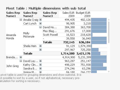
How would I go about creating a QV chart such as the attached? I want to have a dimension column and tabular data on each row, and then a bar chart to the right.
Thank you.
Accepted Solutions
- Mark as New
- Bookmark
- Subscribe
- Mute
- Subscribe to RSS Feed
- Permalink
- Report Inappropriate Content
This is a straight/pivot table chart...
Where expression result is represented as Linear Guage
Check enclosed document...go to Sparklines tab and Regional Scorecard table..
- Mark as New
- Bookmark
- Subscribe
- Mute
- Subscribe to RSS Feed
- Permalink
- Report Inappropriate Content
a pivot
for the bar you need a linear gauge as display options
something similar to (you find it in your example folder, doc name is Data Visualization.qvw)
- Mark as New
- Bookmark
- Subscribe
- Mute
- Subscribe to RSS Feed
- Permalink
- Report Inappropriate Content
This is a straight/pivot table chart...
Where expression result is represented as Linear Guage
Check enclosed document...go to Sparklines tab and Regional Scorecard table..
- Mark as New
- Bookmark
- Subscribe
- Mute
- Subscribe to RSS Feed
- Permalink
- Report Inappropriate Content
This is a straight/pivot table chart...
Where expression result is represented as Linear Guage
Check enclosed document...go to Sparklines tab and Regional Scorecard table..
C:\Program Files\QlikView\Examples\Documents\Data Visualization.qvw