Unlock a world of possibilities! Login now and discover the exclusive benefits awaiting you.
- Qlik Community
- :
- All Forums
- :
- QlikView App Dev
- :
- Re: Re: Is it possible to divide a solitary datapo...
- Subscribe to RSS Feed
- Mark Topic as New
- Mark Topic as Read
- Float this Topic for Current User
- Bookmark
- Subscribe
- Mute
- Printer Friendly Page
- Mark as New
- Bookmark
- Subscribe
- Mute
- Subscribe to RSS Feed
- Permalink
- Report Inappropriate Content
Is it possible to divide a solitary datapoint to graph it over a dimension?
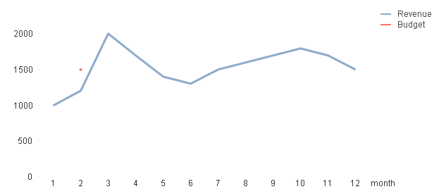
I have a dataset with revenue data spread over the year. In this dataset there is also budget data but that data is not accrued over the year. See the example below. I would like to create a line chart with revenue and budget charted over the months where budget is graphed with sum(budget)/12 every month. Is it possible to do this within the chart expression somehow? Or do I need to work with the data in the script?
LOAD * INLINE [
month, revenue, budget
1, 1000, 0
2, 1200, 18000
3, 2000, 0
4, 1700, 0
5, 1400, 0
6, 1300, 0
7, 1500, 0
8, 1600, 0
9, 1700, 0
10, 1800, 0
11, 1700, 0
12, 1500, 0
];
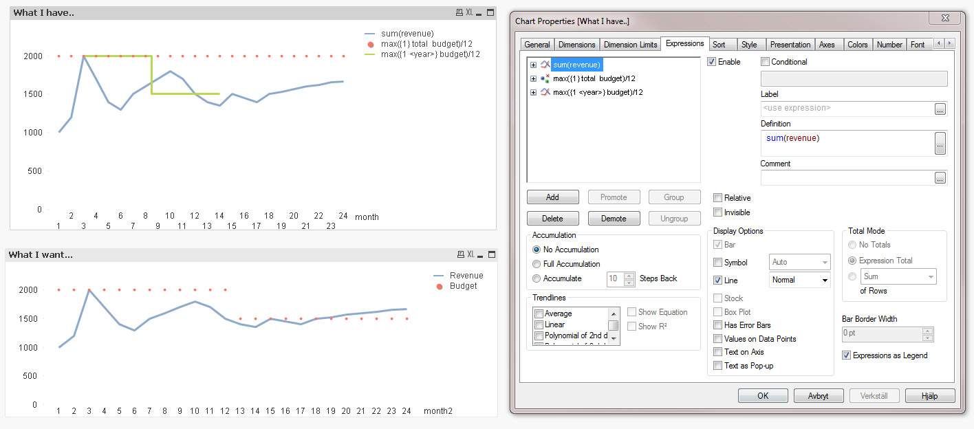
This is what I have...
This is what I want...

TIA
//Ola
Accepted Solutions
- Mark as New
- Bookmark
- Subscribe
- Mute
- Subscribe to RSS Feed
- Permalink
- Report Inappropriate Content
there is another way, in line with what Michael suggested.
Use this as an expression:
max({1} total budget)/12
- Mark as New
- Bookmark
- Subscribe
- Mute
- Subscribe to RSS Feed
- Permalink
- Report Inappropriate Content
One possible way is to do it as a reference line rather than chart expression. For example, create a variable vBudget, define it as a max value of the budget field, probably
=max({1} budget)
and use it in a reference line in expression
=$(vBudget)
Certainly there are many ways to implement this.
Regards,
Michael
- Mark as New
- Bookmark
- Subscribe
- Mute
- Subscribe to RSS Feed
- Permalink
- Report Inappropriate Content
there is another way, in line with what Michael suggested.
Use this as an expression:
max({1} total budget)/12
- Mark as New
- Bookmark
- Subscribe
- Mute
- Subscribe to RSS Feed
- Permalink
- Report Inappropriate Content
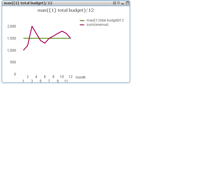
Great, that's what i wanted! Thank you!
Trying to understand how this works I wonder if it is possible to extend this to a larger and varied data set?
Let's say i have the following data and would like the chart below, any ideas on how to make that happen in a chart expression? I tried the basic aggregation functions from the help file but cannot seem to get the desired result. What I seek is to group the sum(budget)/12 by year so the red line shows budget changes in different years. I tried placing the field year behind total (total <year> budget) but it doesn't produce the result I want but I probably am doing it wrong.
dataset01:
LOAD * INLINE [
year, month, revenue, budget
2012, 1, 1000, 0
2012, 2, 1200, 0
2012, 3, 2000, 24000
2012, 4, 1700, 0
2012, 5, 1400, 0
2012, 6, 1300, 0
2012, 7, 1500, 0
2012, 8, 1600, 0
2012, 9, 1700, 0
2012, 10, 1800, 0
2012, 11, 1700, 0
2012, 12, 1500, 0
2013, 13, 1400, 0
2013, 14, 1350, 18000
2013, 15, 1500, 0
2013, 16, 1450, 0
2013, 17, 1400, 0
2013, 18, 1500, 0
2013, 19, 1530, 0
2013, 20, 1570, 0
2013, 21, 1600, 0
2013, 22, 1620, 0
2013, 23, 1660, 0
2013, 24, 1670, 0
];

TIA
//Ola
- Mark as New
- Bookmark
- Subscribe
- Mute
- Subscribe to RSS Feed
- Permalink
- Report Inappropriate Content
It would be so much easier if you add this one line to your script:
LEFT JOIN (dataset01) LOAD max(budget)/12 as MonthlyBudget, year RESIDENT dataset01 GROUP BY year;
So, your budget expression would be simple sum(MonthlyBudget) , no matter how many years you have in the data.
Regards,
Michael
- Mark as New
- Bookmark
- Subscribe
- Mute
- Subscribe to RSS Feed
- Permalink
- Report Inappropriate Content
sorry, did not see your reply...but here you go! this way you can extend it to a larger data set with multiple years.
- Mark as New
- Bookmark
- Subscribe
- Mute
- Subscribe to RSS Feed
- Permalink
- Report Inappropriate Content
Yes, you are probably right Michael, it seems that is the way to go.
Thanks for taking the time to answer!
//Ola
- Mark as New
- Bookmark
- Subscribe
- Mute
- Subscribe to RSS Feed
- Permalink
- Report Inappropriate Content
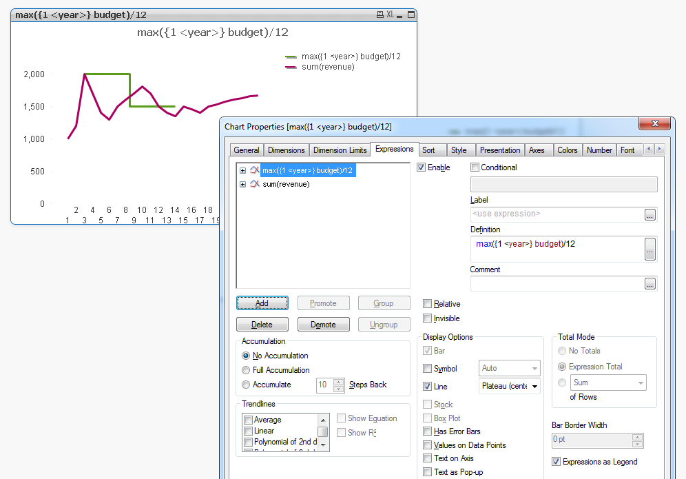
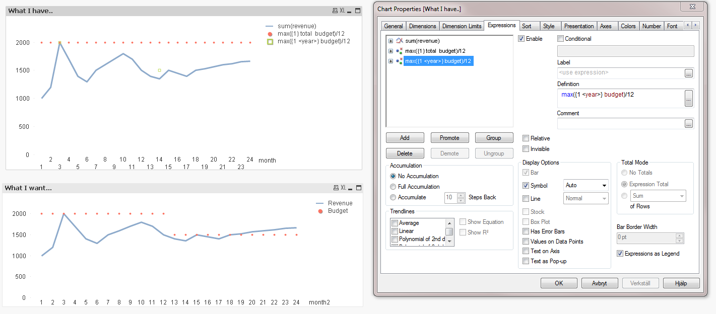
I can't seem to get this to work. This only generates two datapoints in the months that I have budget data. If you choose symbol instead of line you'll see that it only plots 2 data points whereas your earlier answer gave datapoints for every month. I must admit that I still don't really understand how the total qualifier works.
I understand that I can fix this in script as Michael Solomovich suggests but I am trying to learn these aggregation functions and happened upon a live case  .
.
TIA
//Ola
- Mark as New
- Bookmark
- Subscribe
- Mute
- Subscribe to RSS Feed
- Permalink
- Report Inappropriate Content
select line in "display options" and plateau as line type. you have symbol selected with Auto as symbol type. take a look at my screenshot for reference.
total qualifier is adding up all the values to give you a "total".
when you add <year> in the set analysis in the expression max({1<year>}budget)/12, it still gives you the max budget for entire data set (signified by "1" as set modifier) but aggregated by years. so for each year you have one maximum value for the entire data set (what i mean by entire data set is that user selections are ignored)
- Mark as New
- Bookmark
- Subscribe
- Mute
- Subscribe to RSS Feed
- Permalink
- Report Inappropriate Content
I see, I just wanted to visualize that this only generates two datapoints whereas your first answer generated datapoints for the whole dimension. As you see, this time only two datapoints exist and the line stops in month 14, the last month with budget data. What I'm shooting for is something as in the lower chart, with datapoints for every month, based on a 12th of that years budget. Is that possible?
TIA
//Ola