Unlock a world of possibilities! Login now and discover the exclusive benefits awaiting you.
- Qlik Community
- :
- All Forums
- :
- QlikView App Dev
- :
- Re: Hide Dimension value in chart
- Subscribe to RSS Feed
- Mark Topic as New
- Mark Topic as Read
- Float this Topic for Current User
- Bookmark
- Subscribe
- Mute
- Printer Friendly Page
- Mark as New
- Bookmark
- Subscribe
- Mute
- Subscribe to RSS Feed
- Permalink
- Report Inappropriate Content
Hide Dimension value in chart
Hello,
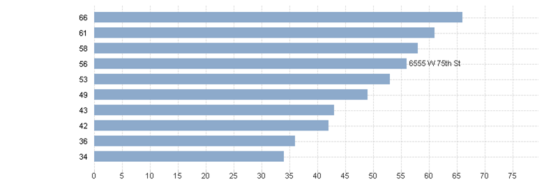
I'm trying to hide 'non-selected' dimension values in a bar chart. The idea is to only show the name of the dimension value that is selected but continue to show the expression for all values.... Here is my chart:
The dimension is 'base address'. I have a set expression which counts based on the 'base address'. This keeps the chart static regardless of base address selection (this is desired). What I am trying to do is blind all other dimension values when I select a particular base address from the list box, say '5211 w 103rd St'. for example:
This allows the viewer to see where a particular dimension value stands in a blinded comparison to others. Any ideas?
Accepted Solutions
- Mark as New
- Bookmark
- Subscribe
- Mute
- Subscribe to RSS Feed
- Permalink
- Report Inappropriate Content
And hopefully the last follow-up here...
1. Removing dimension label pushes the text on axis out the are too. Keep the label, make it white (Font tab, Color)
2. If use a separate expression for Label, it could be even simpler than that. The expression itself just
[base address]
And, add color attribute to it, the same I had earlier for dimension:
=if(match(concat(distinct [base address],','), [base address]), black(), white())
- Mark as New
- Bookmark
- Subscribe
- Mute
- Subscribe to RSS Feed
- Permalink
- Report Inappropriate Content
Brad,
Here is a idea.
1. To keep all bars when address is selected, and set, that is if your expression is
sum(Amount)
change it to
sum({<[base address]=>} Amount)
2. To hide non-selected values, use text color attribute expression for the base address dimension:
=if(match(concat(distinct [base address],','), [base address]), black(), white())
So, the non-selected will be white on white, hence invisible.
Regards,
Michael
- Mark as New
- Bookmark
- Subscribe
- Mute
- Subscribe to RSS Feed
- Permalink
- Report Inappropriate Content
Hi Michael, I thought the text colour expression for dimensions only worked in straight tables or pivot tables, no?
- Mark as New
- Bookmark
- Subscribe
- Mute
- Subscribe to RSS Feed
- Permalink
- Report Inappropriate Content
You're right.
I tried in a table and didn't bother to check in bar chart. So #2 part of my idea should be replaced with something else...
- Mark as New
- Bookmark
- Subscribe
- Mute
- Subscribe to RSS Feed
- Permalink
- Report Inappropriate Content
i thought the same too...in a bar chart, i couldn't get that to work.
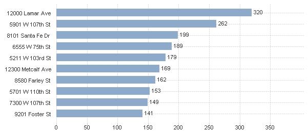
a possible workaround for the OP's requirement, is making the label and bar stand out more for the selected base address while still showing all the values.kind of like the example attached.
- Mark as New
- Bookmark
- Subscribe
- Mute
- Subscribe to RSS Feed
- Permalink
- Report Inappropriate Content
Yes, this is reliable, although not exactly the OP's request.
- Mark as New
- Bookmark
- Subscribe
- Mute
- Subscribe to RSS Feed
- Permalink
- Report Inappropriate Content
I think I found a way, if you disable the "Show Legend" selection for the dimension and then change the expression to
=Dual(if(match(concat(distinct [base address],','), [base address]), [base address],''), sum(value))
Then on the expression tab make sure Values on Data Points is selected.
- Mark as New
- Bookmark
- Subscribe
- Mute
- Subscribe to RSS Feed
- Permalink
- Report Inappropriate Content
Grace, almost there... The problem here that the values on the data point will be the same as on axis, which is not good.
So, the should be two expression. The first one is Label:
if(match(concat(distinct [base address],','), [base address]), [base address],'')
Display options - none, i.e. "bar" is unchecked. Check "Text on Axis". Number property - expression default.
Second expressions is sum(value) - bars, value on data point, number is number.
There could be nuances to address, but in general should work.
- Mark as New
- Bookmark
- Subscribe
- Mute
- Subscribe to RSS Feed
- Permalink
- Report Inappropriate Content
And hopefully the last follow-up here...
1. Removing dimension label pushes the text on axis out the are too. Keep the label, make it white (Font tab, Color)
2. If use a separate expression for Label, it could be even simpler than that. The expression itself just
[base address]
And, add color attribute to it, the same I had earlier for dimension:
=if(match(concat(distinct [base address],','), [base address]), black(), white())
- Mark as New
- Bookmark
- Subscribe
- Mute
- Subscribe to RSS Feed
- Permalink
- Report Inappropriate Content
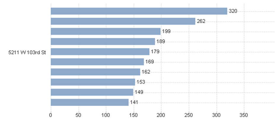
Awesome work everyone! You nailed it Michael. I flipped the 'text on axis' and 'value on data points' for the expressions because the base address offsets when on the axis and ends up somewhere between two bars making it a bit confusing visually. Here is the result. The chart displays all base address values but only displays the name of the base address that is selected. So, I have a blinded comparison and a visual ranking.