Unlock a world of possibilities! Login now and discover the exclusive benefits awaiting you.
- Qlik Community
- :
- All Forums
- :
- QlikView App Dev
- :
- Re: Re: Chart with 2 Y axis - X axis in unexpected...
- Subscribe to RSS Feed
- Mark Topic as New
- Mark Topic as Read
- Float this Topic for Current User
- Bookmark
- Subscribe
- Mute
- Printer Friendly Page
- Mark as New
- Bookmark
- Subscribe
- Mute
- Subscribe to RSS Feed
- Permalink
- Report Inappropriate Content
Chart with 2 Y axis - X axis in unexpected position
Hi All,
I've created a combo chart to show absolute values in bars and percentage change as a line. Two separate Y axes - one for the absolute and one for the percentage. Percentage can be negative as well as positive, absolutes positive only in the range of 0 - 500,000.
When the chart is displayed the absolute values axis is very compressed at the top of the chart, moving the X axis right up:
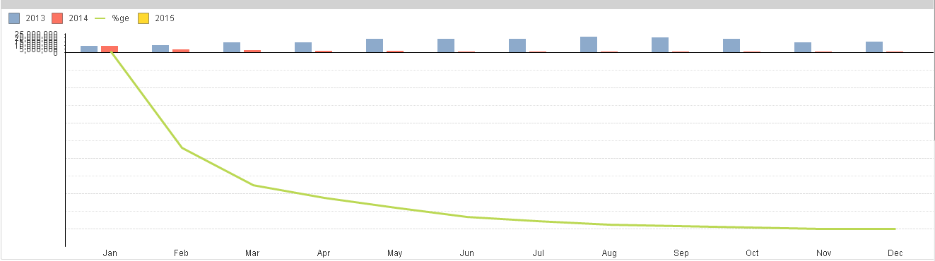
(I know it's not in the image above, but there is an axis of the right of 0 at the X to 100% at the bottom right, in 20% increments),
Is there anyway of forcing the X-axis to be at the centre of the chart so that the absoulute values are more readable?
Thanks,
Rory.
- « Previous Replies
-
- 1
- 2
- Next Replies »
- Mark as New
- Bookmark
- Subscribe
- Mute
- Subscribe to RSS Feed
- Permalink
- Report Inappropriate Content
Hi frds See This Attachment This Will Useful For U....
2 Y-Axis with One X-Axis With Expected Posion
- Mark as New
- Bookmark
- Subscribe
- Mute
- Subscribe to RSS Feed
- Permalink
- Report Inappropriate Content
No I think you have got me wrong Arjun.
In My case, I have a chart (Bar chart) with two expressions (KPI). one of the KPI can have negative values.
When I see the chart for some selections, the scale is not appearing properly on the chart as you can see my first screenshot.
- « Previous Replies
-
- 1
- 2
- Next Replies »