Unlock a world of possibilities! Login now and discover the exclusive benefits awaiting you.
- Qlik Community
- :
- All Forums
- :
- QlikView App Dev
- :
- Re: Gauge variable color mapping
- Subscribe to RSS Feed
- Mark Topic as New
- Mark Topic as Read
- Float this Topic for Current User
- Bookmark
- Subscribe
- Mute
- Printer Friendly Page
- Mark as New
- Bookmark
- Subscribe
- Mute
- Subscribe to RSS Feed
- Permalink
- Report Inappropriate Content
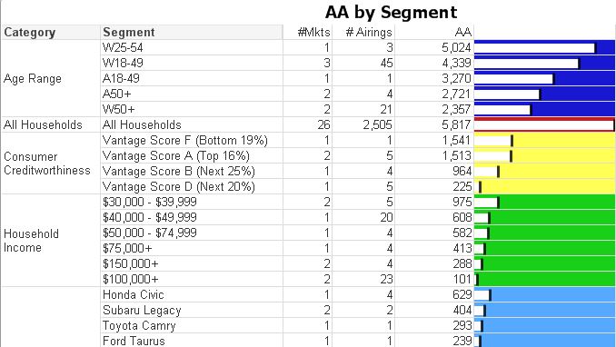
Gauge variable color mapping
Hi -
I am trying to have different sections of a gauge in a pivot table display bars in different colors. The attached screenshot shows 3 segments (We call a segment 'Tag Group' in the database). And here is the code I am using to make the color variable:
=IF([Tag Group]='All Households', red(),
IF([Tag Group]='Age Range', blue(),
IF([Tag Group]='Consumer Creditworthiness', yellow(),
IF([Tag Group]='Household Income', green(),
IF([Tag Group]='Make/Model', blue(),
LightGray())))))
But the displayed color is always coming out light gray.
Does this function work in QV, and if so then what am I doing wrong?
Thank you!
- « Previous Replies
-
- 1
- 2
- Next Replies »
- Mark as New
- Bookmark
- Subscribe
- Mute
- Subscribe to RSS Feed
- Permalink
- Report Inappropriate Content
@jerem1234 - Unfortunately you're probably right, what I want to do cannot be done in QV. Thanks anyway!
- Mark as New
- Bookmark
- Subscribe
- Mute
- Subscribe to RSS Feed
- Permalink
- Report Inappropriate Content
Hello Ron,
Unfortunately, the gauge element shall reuse the same color for each row. You can try putting the following expression in the color definition Color(RowNo()) to confirm this.
Regards,
Philippe
- Mark as New
- Bookmark
- Subscribe
- Mute
- Subscribe to RSS Feed
- Permalink
- Report Inappropriate Content
Ron,
If I may propose a workaround, you could invert the color use and define the color of the background and use a white or pale color overlay to indicate where the values are at.
Please find attached the modified example file.
Regards,
Philippe
- Mark as New
- Bookmark
- Subscribe
- Mute
- Subscribe to RSS Feed
- Permalink
- Report Inappropriate Content
interesting solution Philippe....exact same requirement discussion going on in this thread for reference...couple of work arounds in it
- « Previous Replies
-
- 1
- 2
- Next Replies »