Unlock a world of possibilities! Login now and discover the exclusive benefits awaiting you.
- Qlik Community
- :
- All Forums
- :
- QlikView App Dev
- :
- Re: Status Tab - Load from Excel
- Subscribe to RSS Feed
- Mark Topic as New
- Mark Topic as Read
- Float this Topic for Current User
- Bookmark
- Subscribe
- Mute
- Printer Friendly Page
- Mark as New
- Bookmark
- Subscribe
- Mute
- Subscribe to RSS Feed
- Permalink
- Report Inappropriate Content
Status Tab - Load from Excel
Hi everyone,
I need to create a status tab in an app that will read from an Excel file. The data in here does not need to be associated in any way with the data model but I'm struggling to think of a way to create this layout in the UI. Any suggestions on how to recreate this formatted Excel look in QV? The users would be updating the statuses on the Excel file and then when QV refreshes they'd be updated on the status tab.
Thank you.
Accepted Solutions
- Mark as New
- Bookmark
- Subscribe
- Mute
- Subscribe to RSS Feed
- Permalink
- Report Inappropriate Content
Hi Mark,
you could try like (pivot table like whiteline suggested):
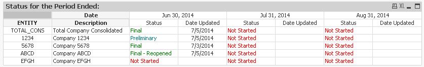
which I think is coming quite close to your request:

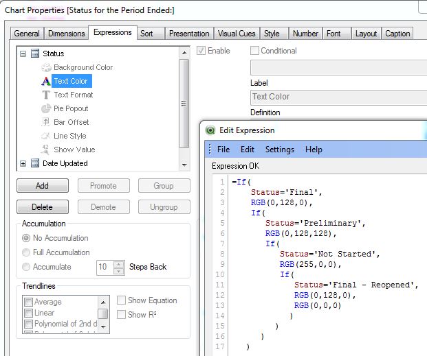
The color coding of the Status expression is done like this:
hope this helps
regards
Marco
- Mark as New
- Bookmark
- Subscribe
- Mute
- Subscribe to RSS Feed
- Permalink
- Report Inappropriate Content
Hi.
I guess the time periods are dynamic.
So you can create pivot table. ENTITY, Description, Time period as dimensions and Status, Date Updated as expressions. Then drag Time period to the right until the blue horizontal arrow appears.
- Mark as New
- Bookmark
- Subscribe
- Mute
- Subscribe to RSS Feed
- Permalink
- Report Inappropriate Content
Hi Mark,
you could try like (pivot table like whiteline suggested):
which I think is coming quite close to your request:
The color coding of the Status expression is done like this:
hope this helps
regards
Marco