Unlock a world of possibilities! Login now and discover the exclusive benefits awaiting you.
- Qlik Community
- :
- All Forums
- :
- QlikView App Dev
- :
- Re: Dimension two-line
- Subscribe to RSS Feed
- Mark Topic as New
- Mark Topic as Read
- Float this Topic for Current User
- Bookmark
- Subscribe
- Mute
- Printer Friendly Page
- Mark as New
- Bookmark
- Subscribe
- Mute
- Subscribe to RSS Feed
- Permalink
- Report Inappropriate Content
Dimension two-line
Hi,
I have a "chart" (barchart) with historical values on every one of my chart_sheets (it is not a real chart because it does not have a real dimension, only a constructed one, made up of the two data_points
- "prior_week"
- "prior_month".
My issue with that is, it is two-line, like
- 'prior_week'& chr(10) & 'week' & week(today())
or so.
Usually I have my dimensions diagonal, but then I'd have to make the charting_area too small to accommodate it all - I want to align that more or less with another chart (the "real" one which shows the current values) to the right of it.
<=> When I change that to having the dimensions horizontally, the second line somehow gets lost.
=> Can someone tell me why that happens? Having it horizontally seems like a solution, but I need the second line, too.
Thanks a lot!
Best regards,
DataNibbler
- Mark as New
- Bookmark
- Subscribe
- Mute
- Subscribe to RSS Feed
- Permalink
- Report Inappropriate Content
Can you post a sample application.
- Mark as New
- Bookmark
- Subscribe
- Mute
- Subscribe to RSS Feed
- Permalink
- Report Inappropriate Content
Hi Nitin,
no unfortunately I cannot - not without spending some time on that. The issue was in my personell_app.
Well, I have that historical_values_thing in all of my chart_sheets, so I can use another one.
However, I found a way now: By not using MONTHNAME, but instead using only MONTH and a shortend YEAR (two digits only), it all becomes a little bit shorter and I can just make it.
Thanks again!
Best regards,
DataNibbler
- Mark as New
- Bookmark
- Subscribe
- Mute
- Subscribe to RSS Feed
- Permalink
- Report Inappropriate Content
OK, great...
Moreover I was thinking to make the chart plot area small by holding Ctrl+Shift and the resize the area via mouse.
Anyway issue is solved......... 
- Mark as New
- Bookmark
- Subscribe
- Mute
- Subscribe to RSS Feed
- Permalink
- Report Inappropriate Content
Hi,
have You set multilines in Grafic Panel ?
Regards,
Antonio
- Mark as New
- Bookmark
- Subscribe
- Mute
- Subscribe to RSS Feed
- Permalink
- Report Inappropriate Content
Hi Antonio,
where do you mean I should do this?
Thanks!
Best regards,
DataNibbler
- Mark as New
- Bookmark
- Subscribe
- Mute
- Subscribe to RSS Feed
- Permalink
- Report Inappropriate Content
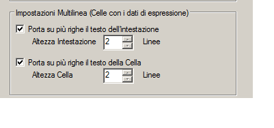 Sorry, I have Italian version.
In Grafic Panel of the Object