Unlock a world of possibilities! Login now and discover the exclusive benefits awaiting you.
- Qlik Community
- :
- All Forums
- :
- QlikView Integrations
- :
- 3 Line Graphs-Conditional Display as per Input
- Subscribe to RSS Feed
- Mark Topic as New
- Mark Topic as Read
- Float this Topic for Current User
- Bookmark
- Subscribe
- Mute
- Printer Friendly Page
- Mark as New
- Bookmark
- Subscribe
- Mute
- Subscribe to RSS Feed
- Permalink
- Report Inappropriate Content
3 Line Graphs-Conditional Display as per Input
Hi Expert ,
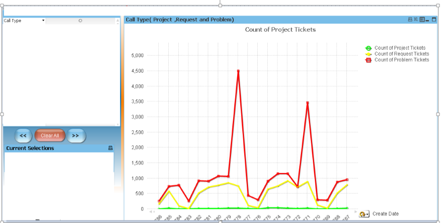
Here you can see 3 line graphs when Call Type field is blank.
Now the Call type may have 3 values (Project , Request and Problem)My requirement is to display the lines basis of Call Type selection .
Example :
If user select Call_Type as Problem, then only red graph should display
If user select 2 Call_Type i.e. Project and Request call type then Only green and yellow line should display
and so on.
Kindly help .Advance Thanks.
Accepted Solutions
- Mark as New
- Bookmark
- Subscribe
- Mute
- Subscribe to RSS Feed
- Permalink
- Report Inappropriate Content
Conditional expression should be something like:
=SubStringCount(Concat(Distinct [Call Type], ',') , 'Problem') // for expression related to problem
and similarly for other expressions.
Update: Corrected
- Mark as New
- Bookmark
- Subscribe
- Mute
- Subscribe to RSS Feed
- Permalink
- Report Inappropriate Content
If you want that features use the following expressions as conditional on and off in Expressions Tab.
Call_Type = 'Project'
Call_Type = 'Request'
Call_Type = 'Problem'
- Mark as New
- Bookmark
- Subscribe
- Mute
- Subscribe to RSS Feed
- Permalink
- Report Inappropriate Content
Hi,
Thanks for your prompt reply and help.
Please let me know what will be the expression if user will select two Call_TYPE i.e. Project and Request to display green(Project) and Yellow(Request line only) and to remove red(Problem) line from the graph.
Thanks,
Rahul
- Mark as New
- Bookmark
- Subscribe
- Mute
- Subscribe to RSS Feed
- Permalink
- Report Inappropriate Content
Hi Pradeep,
Thanks for your suggestion.
Please let me know what will be the expression if user will select two Call_TYPE i.e. Project and Request to display green(Project) and Yellow(Request line only) and to remove red(Problem) line from the graph.
Thanks,
Rahul
- Mark as New
- Bookmark
- Subscribe
- Mute
- Subscribe to RSS Feed
- Permalink
- Report Inappropriate Content
Have you tried the expression with SubStringCount() as I have shown above?
- Mark as New
- Bookmark
- Subscribe
- Mute
- Subscribe to RSS Feed
- Permalink
- Report Inappropriate Content
Thanks a lot....Its working fine  .
.
Appreciate your effort
- Mark as New
- Bookmark
- Subscribe
- Mute
- Subscribe to RSS Feed
- Permalink
- Report Inappropriate Content
Hi Tresesco,
First I want to say thanks for your previous help again .
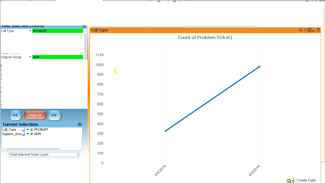
Now I have one more issue remain .Below is the expected output when user select Call Type as 'PROBLEM' and Support Group as ADM.
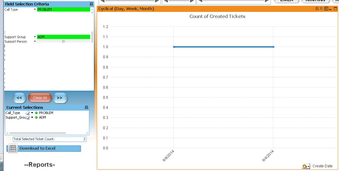
But here it’s coming like below and you can see the Y axis has very different value from above
Below is the code what I have written as script form PROBLEM (similarly for Request and Project)
LOAD
Ticket_ID as Ticket_ID_proj,
floor(Create_Date) as [Generic Date],
WeekName(date(num#([Create_Date]),'M/DD/YYYY'),0,-1) as [Generic Week],
MonthsName(1,date(num#([Create_Date]),'M/DD/YYYY')) as [Generic Month],
'Created Date' as DateType
FROM
..\DATA\VisualFactory\LogCall.qvd
(qvd)
where Call_Type = 'PROBLEM';
And here is the expression which I am using to display PROBLEM Graph
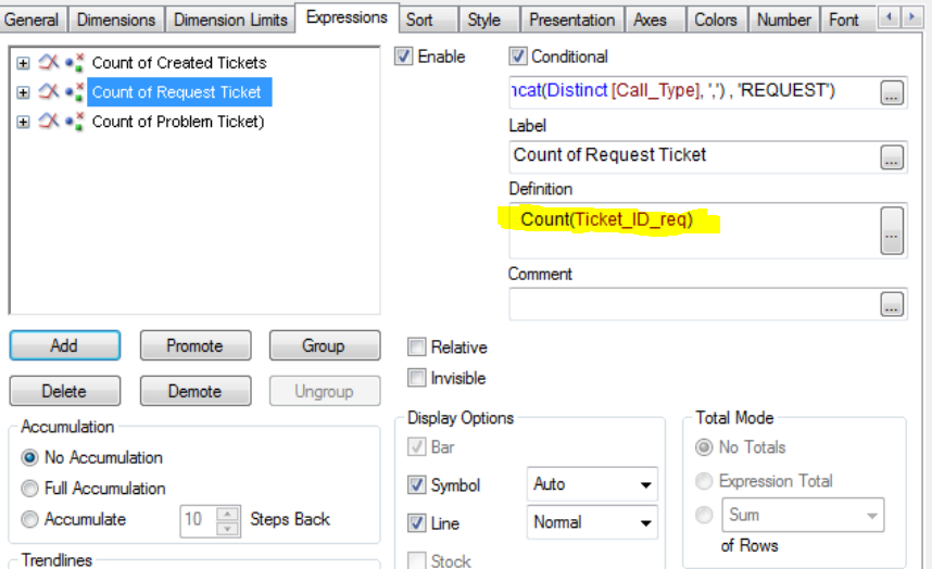
Similarly Graph is not showing the correct values when selecting one or two call type.
Please help. Thanks in Advance
Best Regards,
Rahul Pathak