Unlock a world of possibilities! Login now and discover the exclusive benefits awaiting you.
- Qlik Community
- :
- All Forums
- :
- QlikView App Dev
- :
- Re: Is there a way to move the dimension axis/lege...
- Subscribe to RSS Feed
- Mark Topic as New
- Mark Topic as Read
- Float this Topic for Current User
- Bookmark
- Subscribe
- Mute
- Printer Friendly Page
- Mark as New
- Bookmark
- Subscribe
- Mute
- Subscribe to RSS Feed
- Permalink
- Report Inappropriate Content
Is there a way to move the dimension axis/legend to the top of a chart?
Apologies if this has been asked before - I couldn't find a post with this exact question - but I am looking for a way to have the dimension labels (in this case, months) of a line chart at the top of the chart instead of bottom.
Thanks,
Clark
Accepted Solutions
- Mark as New
- Bookmark
- Subscribe
- Mute
- Subscribe to RSS Feed
- Permalink
- Report Inappropriate Content
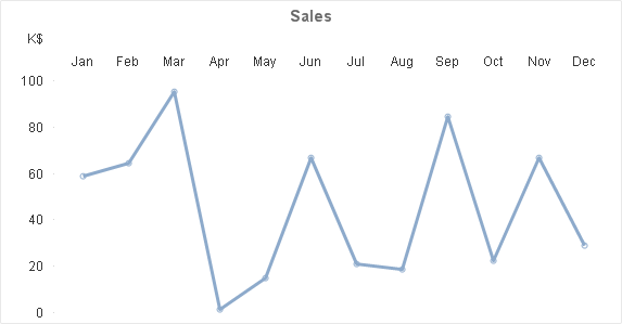
I've managed to produce a label on top by adding an additional expression that plots a dual "value on data point" with an invisible line. A bit of static max calc to get the labels above the numbers and it looks pretty good.
=dual(Month, max(TOTAL aggr(sum(Value), Month))*1.1)
Example QVW attached.
-Rob
- Mark as New
- Bookmark
- Subscribe
- Mute
- Subscribe to RSS Feed
- Permalink
- Report Inappropriate Content
Hi,
If I understand correct you can change this parameter from Presentation tab (Chart - Properties) .
In the upper right corner you have to see Legend and click Settings. There you can change the dimension labels from bottom to top or center. 
- Mark as New
- Bookmark
- Subscribe
- Mute
- Subscribe to RSS Feed
- Permalink
- Report Inappropriate Content
Thinking way outside the box - perhaps make two charts, one shows the plotted chart points, the other overlays with the month labels > elements would need to be made transparent but it could be worked out with layering, transparency and the proper coloring.
- Mark as New
- Bookmark
- Subscribe
- Mute
- Subscribe to RSS Feed
- Permalink
- Report Inappropriate Content
I've managed to produce a label on top by adding an additional expression that plots a dual "value on data point" with an invisible line. A bit of static max calc to get the labels above the numbers and it looks pretty good.
=dual(Month, max(TOTAL aggr(sum(Value), Month))*1.1)
Example QVW attached.
-Rob
- Mark as New
- Bookmark
- Subscribe
- Mute
- Subscribe to RSS Feed
- Permalink
- Report Inappropriate Content
Thank you, but I believe that setting only controls the expression legend, rather than the dimension legend.
I am not sure there is an "out-of-the-box" way to do it so I am going to try to implement the other suggestions when I get a moment.
- Mark as New
- Bookmark
- Subscribe
- Mute
- Subscribe to RSS Feed
- Permalink
- Report Inappropriate Content
This worked great. I was hoping there was a built in function for this, but your solution was relatively pain free.
Thanks!