Unlock a world of possibilities! Login now and discover the exclusive benefits awaiting you.
- Qlik Community
- :
- All Forums
- :
- QlikView App Dev
- :
- Re: Re: Re: how to visualise separate targets in s...
- Subscribe to RSS Feed
- Mark Topic as New
- Mark Topic as Read
- Float this Topic for Current User
- Bookmark
- Subscribe
- Mute
- Printer Friendly Page
- Mark as New
- Bookmark
- Subscribe
- Mute
- Subscribe to RSS Feed
- Permalink
- Report Inappropriate Content
how to visualise separate targets in same chart
Dear all,
I need to create charts for some sets of data, where, in each chart, the latest results of various Business Units are visualised.
In the same chart, these results need to be benchmarked against targets, which are different for every BU.
These charts will be pretty much static. It is just meant to give a snapshot overview, no user interaction, all data is fixed by using set analysis in the expression. Data variability is hence a function only of weekly data reload.
I am trying to have some inspirations by researching around in the internet, but with no success so far.
I was also reading this document
interesting, but not so useful for my matter.
From a data point of view, I created an additional target field, with the values of the targets and the applicable BU labels.
attached I have three options I came up with, but they are all somehow unsatisfactory for one reason or another
solution A.
very easy to maintain. hard to read; rather than result Vs. actual, it shows the result vs the gap to the target (if overachievement, gap is on the left of the bar)
actual numbers for the results / to be achieved do not appear if the segment is too short
solution B.
creation of two charts, layered above each other. So quite some maintenance is required, because charts tend to misalign if results are starting to be unexpectedly big or small. Results are directly comparable to targets; but I cannot find a way to show target values.
solution C.
also here we have layered charts plus some graphics objects. Very high maintenance. Very messy (as you can see in picture already). Targets values are visible, but indeed it easily gets messy.
How would you display these?
Do you please have some suggestions for me?
Thank you so much!
- « Previous Replies
-
- 1
- 2
- Next Replies »
- Mark as New
- Bookmark
- Subscribe
- Mute
- Subscribe to RSS Feed
- Permalink
- Report Inappropriate Content
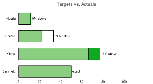
thank you for your input PFA!!
I have to say, graphically I like yours more.
But in terms of readability, I think Bill' s is more effective (although I will make and am making the actual results displayed as bars and targets displayed as single points)
In your representation, I am not right away understanding for example the actuals for Bhutan. is it the grey part, and the red part is what is missing to reach target?
I mean, I am pretty sure the red part is actually the gap to fill to reach target, but it is not immediately readable.
Maybe it would be better if the red part would also come on the right side of the bar, what do you think?
and. most important, is it feasible to have the red part on the right side of the bar?
But really thank you so much for your input!!
- Mark as New
- Bookmark
- Subscribe
- Mute
- Subscribe to RSS Feed
- Permalink
- Report Inappropriate Content
Yes, perhaps moving the red to become the shortfall would make more sense, should be possible.
- Mark as New
- Bookmark
- Subscribe
- Mute
- Subscribe to RSS Feed
- Permalink
- Report Inappropriate Content
Maybe this is more logical ...
flipside
- « Previous Replies
-
- 1
- 2
- Next Replies »