Unlock a world of possibilities! Login now and discover the exclusive benefits awaiting you.
- Qlik Community
- :
- All Forums
- :
- QlikView App Dev
- :
- What do you think of this visualization/metric sel...
- Subscribe to RSS Feed
- Mark Topic as New
- Mark Topic as Read
- Float this Topic for Current User
- Bookmark
- Subscribe
- Mute
- Printer Friendly Page
- Mark as New
- Bookmark
- Subscribe
- Mute
- Subscribe to RSS Feed
- Permalink
- Report Inappropriate Content
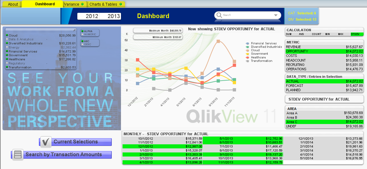
What do you think of this visualization/metric selection scheme?
Was trying to develop something that was self explanatory for the end-user that allowed at a glance a quick discernment of which metric and calculation combination were being rendered, when the possibilities were a product of the two. Any calculation combined across any metric and the end user has to make 3 clicks in the boxes on the right to select any data area/calculation combination within the app.
Many of my clients seem to request there be as little interactivity as possible to avoid potentially confusing the end-user, but to abandon all green-white-grey interaction altogether is to eschew one of the primary strengths of the product, so it becomes a delicate balancing act.
Does this layout have flow, or does it seem overly complicated? I thought perhaps adding dynamically constructed messages which label the combinations would help (i.e. "You are looking at the Sum of Actual Data for the Revenue data set"). That way the end user has a place to check if they get confused about what numbers they are evaluating.