Unlock a world of possibilities! Login now and discover the exclusive benefits awaiting you.
- Qlik Community
- :
- All Forums
- :
- QlikView App Dev
- :
- Re: How to create a candlestick chart???
- Subscribe to RSS Feed
- Mark Topic as New
- Mark Topic as Read
- Float this Topic for Current User
- Bookmark
- Subscribe
- Mute
- Printer Friendly Page
- Mark as New
- Bookmark
- Subscribe
- Mute
- Subscribe to RSS Feed
- Permalink
- Report Inappropriate Content
How to create a candlestick chart???
I am a starter to use qlikview, plz give a suggestion to me in order to make a candlestick chart.
I have such excel file
| TIME | LAST |
| 09:14:29.528551 | 22951 |
| 09:15:29.614293 | 22961 |
| 09:15:29.639119 | 22968 |
| 09:15:29.641101 | 22951 |
| 09:15:29.878346 | 22975 |
| 09:15:29.882078 | 22978 |
| 09:15:29.884098 | 22979 |
| 09:15:30.007220 | 22965 |
| 09:15:30.024216 | 22980 |
| 09:15:30.026978 | 22979 |
| 09:15:30.105209 | 22980 |
| 09:15:30.236066 | 22967 |
| 09:15:30.322187 | 22978 |
| 09:15:30.372227 | 22980 |
| 09:15:30.512260 | 22983 |
| 09:15:30.742066 | 22970 |
| 09:15:30.744072 | 22963 |
| 09:15:30.959001 | 22970 |
| 09:15:31.110226 | 22968 |
| 09:15:31.128118 | 22967 |
| 09:15:31.530215 | 22967 |
| 09:15:32.200263 | 22964 |
| 09:15:32.416145 | 22956 |
| 09:15:32.768265 | 22970 |
| 09:15:33.356351 | 22959 |
| 09:15:33.423385 | 22960 |
| 09:15:33.742317 | 22954 |
| 09:15:34.533320 | 22954 |
| 09:15:34.829320 | 22955 |
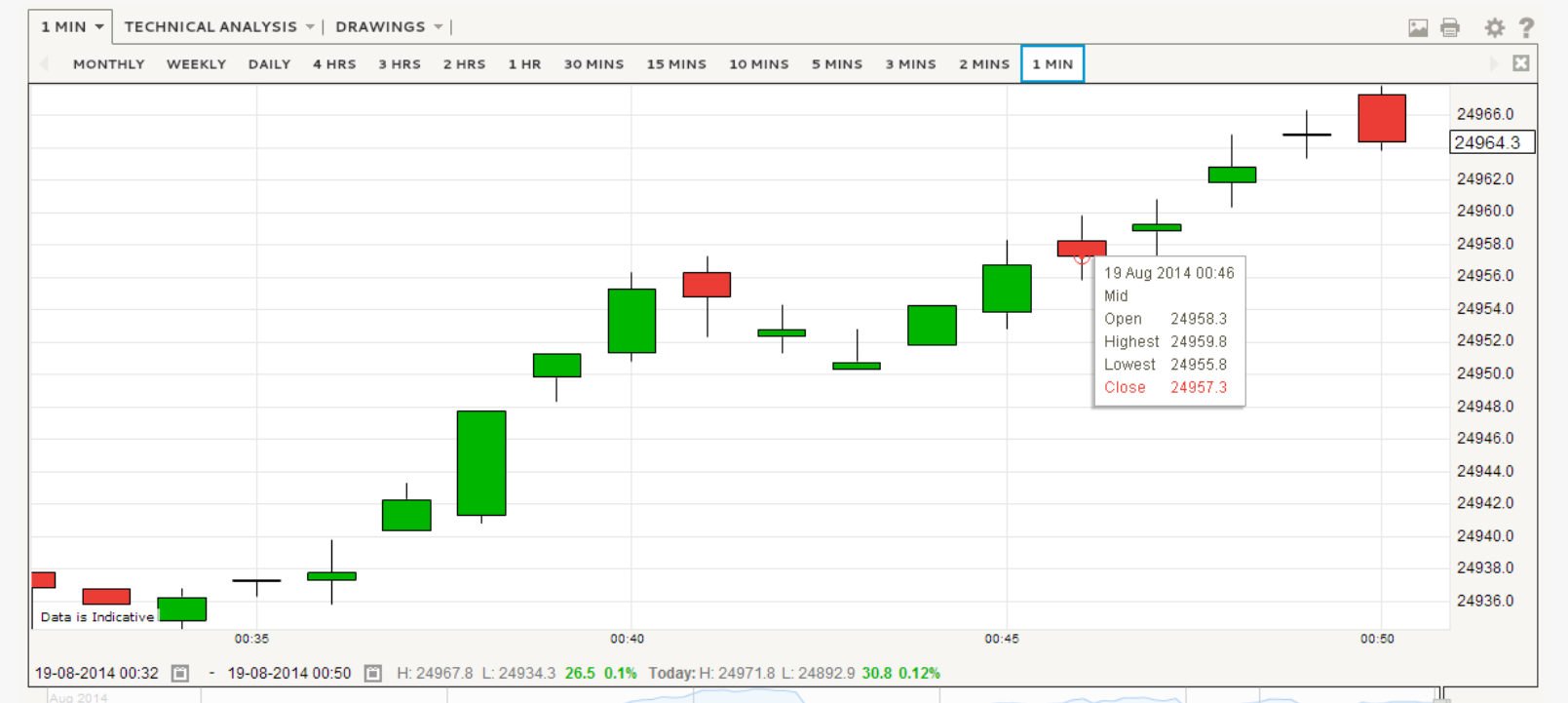
I wanna return it into like this in period of one min.
I don't know how to write the expression in order ti generate this chart.
- « Previous Replies
- Next Replies »
Accepted Solutions
- Mark as New
- Bookmark
- Subscribe
- Mute
- Subscribe to RSS Feed
- Permalink
- Report Inappropriate Content
Hi
Just replace your fixed Min and Max with calculated values:
Min(LAST), and Max(LAST)
See attached.
HTH
Jonathan
- Mark as New
- Bookmark
- Subscribe
- Mute
- Subscribe to RSS Feed
- Permalink
- Report Inappropriate Content
Hi, There is a sample Application DataVisualization.qvw provided by Qlikview. It should be available in C:\Program Files\QlikView\Examples\Documents.
Anyways I have attached a datavisualization.qvd. It is in the Trends sheet
- Mark as New
- Bookmark
- Subscribe
- Mute
- Subscribe to RSS Feed
- Permalink
- Report Inappropriate Content
But how to set to view it as 1 min, 5 min, so on when press a button, THZ
- Mark as New
- Bookmark
- Subscribe
- Mute
- Subscribe to RSS Feed
- Permalink
- Report Inappropriate Content
You have to create Timeperiod as the Dimension and then create multiple expressions working for different timeperiods
For clicking the button. You can have various buttons(behind the scene with variables). for the selected click of the button, you can conditionally enable/disable the expression in the chart.
- Ram
- Mark as New
- Bookmark
- Subscribe
- Mute
- Subscribe to RSS Feed
- Permalink
- Report Inappropriate Content
Does the example provided by ramko496 meet your original requirement of showing the data in 1 minute chunks?
You're now asking a different question - i.e. how do I add a button to change the Time Period?
You've also given a very vague requirement for this "1 min, 5 min and so on" - where does the "and so on" stop - 10 minutes, 15? 30? 60?
- Mark as New
- Bookmark
- Subscribe
- Mute
- Subscribe to RSS Feed
- Permalink
- Report Inappropriate Content
Hi
This can be achieved by using Box-Plot Chart.
See this thread for Answer:
The Answer is provided by Avinash R
Also, see the Attachment.
Regards
Aviral Nag
- Mark as New
- Bookmark
- Subscribe
- Mute
- Subscribe to RSS Feed
- Permalink
- Report Inappropriate Content
Thz a lot, I will try the examples that guys provided to me.
But I want to know more about the code how to write because I am not familiar to write program
- Mark as New
- Bookmark
- Subscribe
- Mute
- Subscribe to RSS Feed
- Permalink
- Report Inappropriate Content
Hi Terrrance,
For the code and how it work, refer the blog http://community.qlik.com/blogs/qlikviewdesignblog/2014/08/18/recipe-for-a-box-plot by hic. For similar example, refer the thread here Box plot graph
-siva
- Mark as New
- Bookmark
- Subscribe
- Mute
- Subscribe to RSS Feed
- Permalink
- Report Inappropriate Content
Do I need to change excel or MS Access format??
shankarece wrote:
Hi Terrrance,
For the code and how it work, refer the blog http://community.qlik.com/blogs/qlikviewdesignblog/2014/08/18/recipe-for-a-box-plot by Henric Cronström. For similar example, refer the thread here Box plot graph
-siva
- Mark as New
- Bookmark
- Subscribe
- Mute
- Subscribe to RSS Feed
- Permalink
- Report Inappropriate Content
Any source files are fine.
- « Previous Replies
- Next Replies »