Unlock a world of possibilities! Login now and discover the exclusive benefits awaiting you.
- Qlik Community
- :
- All Forums
- :
- QlikView App Dev
- :
- Re: Gantt type chart
- Subscribe to RSS Feed
- Mark Topic as New
- Mark Topic as Read
- Float this Topic for Current User
- Bookmark
- Subscribe
- Mute
- Printer Friendly Page
- Mark as New
- Bookmark
- Subscribe
- Mute
- Subscribe to RSS Feed
- Permalink
- Report Inappropriate Content
Gantt type chart
Hi,
I've created a Gantt-style chart using a stacked bar chart that displays pretty much what I want it to. However, the way I've done it uses a lot of memory due to using 40+ expressions, I'm wondering if anyone has a better idea of going about things.
I have several events with a start time, then each event has sub-events that each have start and end times. I've calculated the minutes in between start and and end times, given each sub-event a rank based on its start time, then stacked the values in rank order.
So for each event, the expressions run something like this:
=only({$<rank={'1'}>}prep_time)
=only({$<rank={'1'}>}session_time)
=only({$<rank={'1'}>}close_time)
=only({$<rank={'1'}>}down_time)
=only({$<rank={'2'}>}prep_time)
=only({$<rank={'2'}>}session_time)
=only({$<rank={'2'}>}close_time)
=only({$<rank={'2'}>}down_time)
.
.
`.
=only({$<rank={' ..n '}>}prep_time)
=only({$<rank={' ..n '}>}session_time)
=only({$<rank={' ..n '}>}close_time)
=only({$<rank={' ..n '}>}down_time)
for n sub-events.
Currently I've got 10 sub-events, but this will probably need to increase to more.
This is an image of what the chart looks like for 2 events: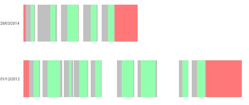
Does anyone have any ideas on a different approach?
Thanks
Tom
- Mark as New
- Bookmark
- Subscribe
- Mute
- Subscribe to RSS Feed
- Permalink
- Report Inappropriate Content
It looks like that you have created a crosstable over your different time-areas. From a performance point of view it could be better to create a (additionally) table like that:
timetable:
Load * Inline [
AnyID, TimeCategorie, Value
1, prep_time, 00:05
1, session_time, 00:05
....
];
- Marcus
- Mark as New
- Bookmark
- Subscribe
- Mute
- Subscribe to RSS Feed
- Permalink
- Report Inappropriate Content
here you have an example
- Mark as New
- Bookmark
- Subscribe
- Mute
- Subscribe to RSS Feed
- Permalink
- Report Inappropriate Content
Hi Tom,
Here is what I have used to build Gantt Charts. It's a different approach but it might be of use to you: