Unlock a world of possibilities! Login now and discover the exclusive benefits awaiting you.
- Qlik Community
- :
- All Forums
- :
- QlikView App Dev
- :
- Unable to reproduce Excel chart in Qlikview
- Subscribe to RSS Feed
- Mark Topic as New
- Mark Topic as Read
- Float this Topic for Current User
- Bookmark
- Subscribe
- Mute
- Printer Friendly Page
- Mark as New
- Bookmark
- Subscribe
- Mute
- Subscribe to RSS Feed
- Permalink
- Report Inappropriate Content
Unable to reproduce Excel chart in Qlikview
Hello !
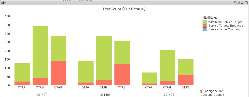
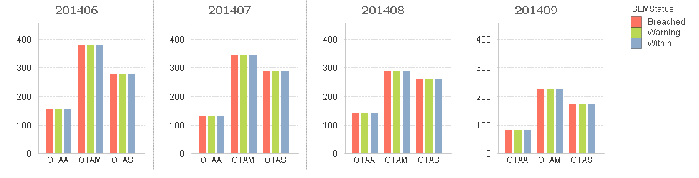
We have build the following graph under excel powerpivot: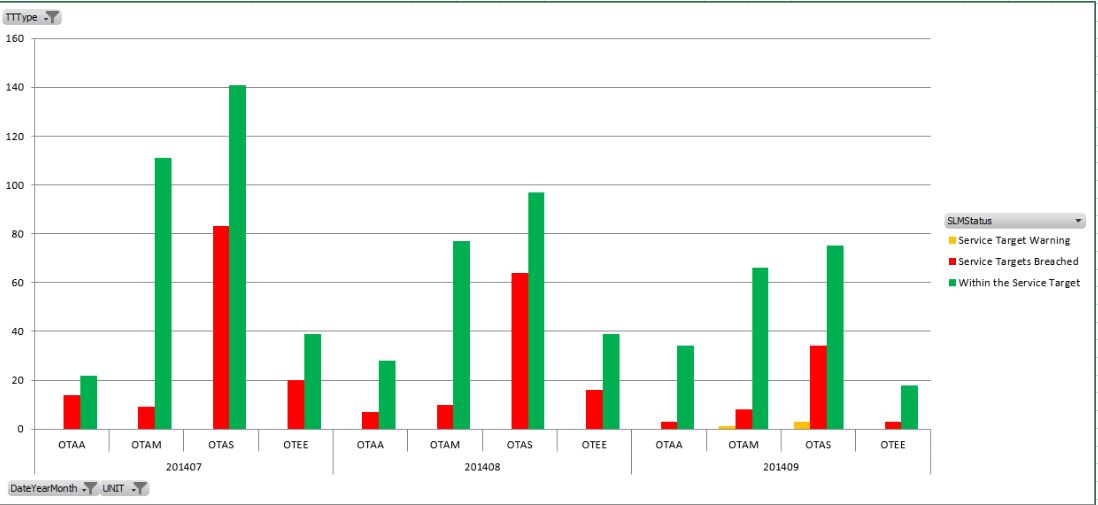
but the best we can have with QlikView is:
We don't want the SLMStatus stacked, but side by side (as in Excel).
How can we do that ?
Thanks,
- Mark as New
- Bookmark
- Subscribe
- Mute
- Subscribe to RSS Feed
- Permalink
- Report Inappropriate Content
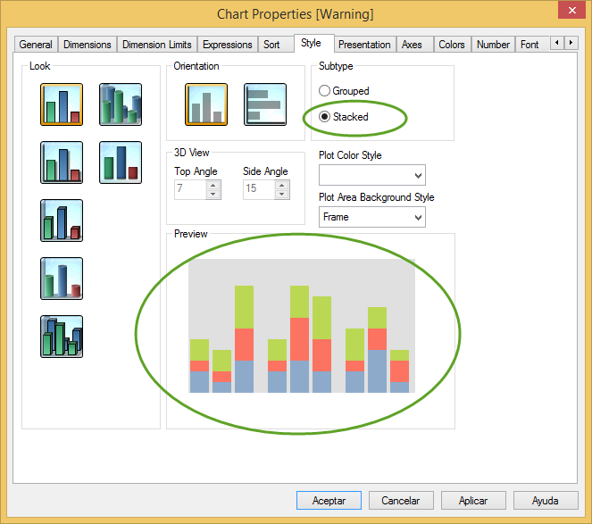
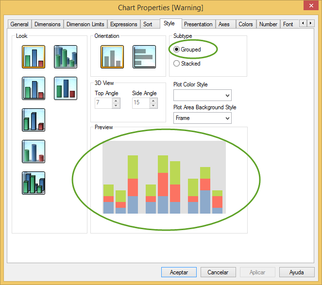
Try changing the settings:
Chart Properties -> Style -> Subtype -> Grouped
- Mark as New
- Bookmark
- Subscribe
- Mute
- Subscribe to RSS Feed
- Permalink
- Report Inappropriate Content
I would love to, but the option is greyed out.
As soon as I have 3 dimensions, it grey out.
Don't tell me I can do this very simply with Excel and not with Qlikview ?!
- Mark as New
- Bookmark
- Subscribe
- Mute
- Subscribe to RSS Feed
- Permalink
- Report Inappropriate Content
Hello !
I'am not in the right place for this simple question ?
- Mark as New
- Bookmark
- Subscribe
- Mute
- Subscribe to RSS Feed
- Permalink
- Report Inappropriate Content
Add 2 dimensions
1. Date
2. OTAA, OTAM, OTAS
Create three expressions using set analysis:
Expression 1:
TextCount({<SLMSTATUS={'Within the Service Target'}>} SLMStatus)
Expression 2:
TextCount({<SLMSTATUS={'Service Targets Breached'}>} SLMStatus)
Expression 3:
TextCount({<SLMSTATUS={'Service Target Warning'}>} SLMStatus)
- Mark as New
- Bookmark
- Subscribe
- Mute
- Subscribe to RSS Feed
- Permalink
- Report Inappropriate Content
Hello Martin !
The "Grouped / Stacked" option is now activated, but it is still stacked.
Can you do it ?
| YearMonthOpened | AssigneeUnit | Within | Breached | Warning |
| 201406 | OTAA | 155 | 155 | 155 |
| 201406 | OTAM | 381 | 381 | 381 |
| 201406 | OTAS | 277 | 277 | 277 |
| 201407 | OTAA | 128 | 128 | 128 |
| 201407 | OTAM | 342 | 342 | 342 |
| 201407 | OTAS | 287 | 287 | 287 |
| 201408 | OTAA | 142 | 142 | 142 |
| 201408 | OTAM | 287 | 287 | 287 |
| 201408 | OTAS | 258 | 258 | 258 |
| 201409 | OTAA | 81 | 81 | 81 |
| 201409 | OTAM | 225 | 225 | 225 |
| 201409 | OTAS | 173 | 173 | 173 |
Thanks for your help !
- Mark as New
- Bookmark
- Subscribe
- Mute
- Subscribe to RSS Feed
- Permalink
- Report Inappropriate Content
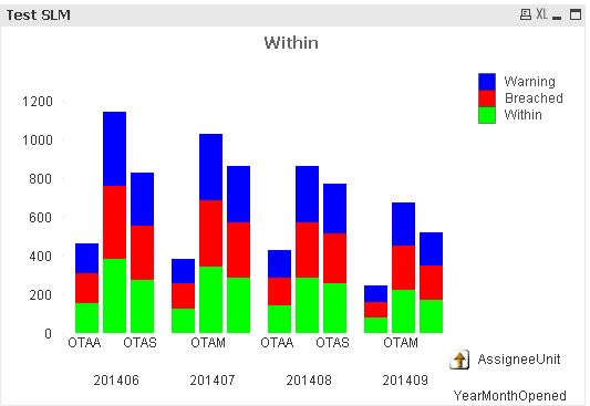
Hi,
I tried to reproduce your example in order to have a grouped bar chart with 2-3 dimensions, however the result is not the expected. I don't know if this a bug or just a expected (but counterintuitive) behaviour. If you create a bar chart with 2 dimensions (AssigneeUnit and MonthYearOpened) and 3 expressions (1 for Breached, 1 for Warning and 1 for Within) the result is a Stacked Bar chart even if you select Grouped in properties > Style tab.
take a look at the screenshots (I Created a similar scenario with random data):
So, as you can see the result is the same no matter if a choose Stacked or grouped. I'm also attaching a qvw with an example. I'm curious about this is a bug or an expected behaviour. Has anybody else faced a situation like this?
regards
- Mark as New
- Bookmark
- Subscribe
- Mute
- Subscribe to RSS Feed
- Permalink
- Report Inappropriate Content
Nope - I'm the same, with 2 dimensions, QV seems to default to stacked, no matter what I try.
I'd normally work with a cyclic group in a moment like this, however it seems a little odd that it's doing this only > 1 dimensions...
- Mark as New
- Bookmark
- Subscribe
- Mute
- Subscribe to RSS Feed
- Permalink
- Report Inappropriate Content
Hello Charles,
as far as I know, QlikView does not allow to have unstacked visualisation of bar charts when you exceed 2 dimensions. It sounds a bit odd not to be able to exactly reproduce Excel charts, but as QlikView is a different product, it is not suprising that there are things you can do wiht Excel and can't with QlikView and vice-versa.
An alternative would be to use treillis, if you want to group your bars, first by periode, then by Units, then by Status.
In this case, you will have the same level of information, although not exactly the same vizualisation (periode is on top, and not at the bottom).
If you need to display all these dimensions in order to be able to analyse any dimensions against the other, it is also a good solution to use Cycle groups. Do not forget, QlikView is above all a dynamic solution rather than static. Take advantage of this.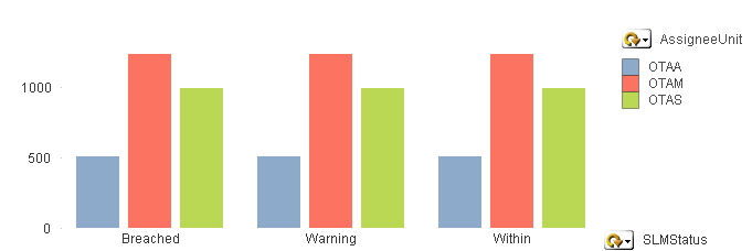
Please find attached QVW file as well as the data. You might need the data if you use the personal edition of QlikView.