Unlock a world of possibilities! Login now and discover the exclusive benefits awaiting you.
- Qlik Community
- :
- All Forums
- :
- QlikView App Dev
- :
- Re: Text color and format of a dimension
- Subscribe to RSS Feed
- Mark Topic as New
- Mark Topic as Read
- Float this Topic for Current User
- Bookmark
- Subscribe
- Mute
- Printer Friendly Page
- Mark as New
- Bookmark
- Subscribe
- Mute
- Subscribe to RSS Feed
- Permalink
- Report Inappropriate Content
Text color and format of a dimension
Hello,
Sorry for this simple question, but I don't find the answer.
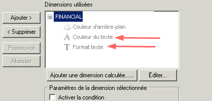
Do you know what kind of expression to enter in text colour and text format of a dimension to take effect ?
Is there a kind of lexicon somewhere ?
Thanks lot ! 
- Mark as New
- Bookmark
- Subscribe
- Mute
- Subscribe to RSS Feed
- Permalink
- Report Inappropriate Content
Hi
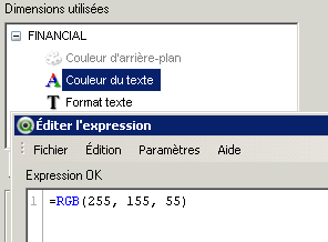
Text color - RGB() or ARGB() function
- Or even you can able to give functions like Yellow() , Lightblue()
- Or u can give SysColor() Or Colormix()
Check Color Functions in help document.
Text Format - '<B>' or '<I>' or '<U>' or combination of all.
Please close the thread by marking correct answer & give likes if you like the post.
- Mark as New
- Bookmark
- Subscribe
- Mute
- Subscribe to RSS Feed
- Permalink
- Report Inappropriate Content
Hi,
Try like this
If(DimensionName = 'SomeValue', RGB(255, 0,0), RGB(0, 255, 0))
OR
If(DimensionName = 'SomeValue', Red(), Green())
OR
If(Match(DimensionName, 'Value1', 'Value2', ......'ValueN'), Red(), Green())
Hope this helps you.
Regards,
Jagan.
- Mark as New
- Bookmark
- Subscribe
- Mute
- Subscribe to RSS Feed
- Permalink
- Report Inappropriate Content
Hello,
Thanks both of you for your responses.
Sorry but it doesn't work.
Can it be because I am in a trellis graph ?
- Mark as New
- Bookmark
- Subscribe
- Mute
- Subscribe to RSS Feed
- Permalink
- Report Inappropriate Content
Hi,
Qlikview Charts with Colours
Matt over at Qlikview Addict, recently posted about how to create Gantt Charts in Qlikview.
Here's my quick post about how I customized my Gantt chart to colour my chart based off dates and adding a couple more data guidelines. Please note that you will need to follow the original article before starting this...
What have you finished and what is in progress
First of all, here's my data - as you can see it covers three months of work.
In the standard chart I have added colours, that highlight which jobs have been completed and which ones are in progress.
To add colours to highlight individual items, open your chart and go to the expressions tab, expand the expression, select background color and open the Definition box.
And this is the formula that I have used, current work is set as orange whilst completed are set to red. (Days field in this is equivalent to Duration in the original post).
Where are we/What Month is this?
Next I wanted to see the work that I had to do in the current month, I've done this using Reference Lines and used some text in chart to ensure that the data is easy to read.
To add reference lines, open the chart properties and select the Presentation Tab.
Here's how to get the month start from a date and how to amend colour and style.
In order to re-order charts (to move text/resize labels) select the chart and hold ctrl+shift - red boxes will appear showing what can be changed.
Hope this is help for you
- Mark as New
- Bookmark
- Subscribe
- Mute
- Subscribe to RSS Feed
- Permalink
- Report Inappropriate Content
Hi,
Try the same in Expression -> Background color
I works.
Regards,
Jagan.
- Mark as New
- Bookmark
- Subscribe
- Mute
- Subscribe to RSS Feed
- Permalink
- Report Inappropriate Content
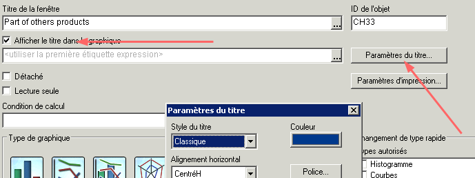
Hello,
I find it !
We have to pass by the graphic title, like this :
- Mark as New
- Bookmark
- Subscribe
- Mute
- Subscribe to RSS Feed
- Permalink
- Report Inappropriate Content
Hi,
Yes we need to do this using Title Settings, no other option. I tried earlier for changing Pie color.
Regards,
jagan.