Unlock a world of possibilities! Login now and discover the exclusive benefits awaiting you.
- Qlik Community
- :
- Discover
- :
- Programs
- :
- Education
- :
- Qlik Education Discussions
- :
- Bar chart
- Subscribe to RSS Feed
- Mark Topic as New
- Mark Topic as Read
- Float this Topic for Current User
- Bookmark
- Subscribe
- Mute
- Printer Friendly Page
- Mark as New
- Bookmark
- Subscribe
- Mute
- Subscribe to RSS Feed
- Permalink
- Report Inappropriate Content
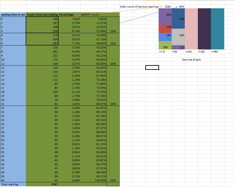
Bar chart
Hello Everybody,
I have attached a file for the reference.
blue part of the excel show the actual data where as the green part shows the calculated part along with the desired graph.
Question:
Is it possible to make an automatic dimension like <= 3 <=6 <=11 <=21 and <=41 based upon 20% window cluster which I have made in the graph.
I am new to Qlikview can you please guide me how can I make the calcuations which is presented in the green part along with the deseried graph.
- Mark as New
- Bookmark
- Subscribe
- Mute
- Subscribe to RSS Feed
- Permalink
- Report Inappropriate Content
- Mark as New
- Bookmark
- Subscribe
- Mute
- Subscribe to RSS Feed
- Permalink
- Report Inappropriate Content
Please post the excel file. A screenshot is very pretty, but if you want help then post the excel file instead of an image of it.
talk is cheap, supply exceeds demand
- Mark as New
- Bookmark
- Subscribe
- Mute
- Subscribe to RSS Feed
- Permalink
- Report Inappropriate Content
i am unable to attached the file I have no idea what is the problem