Unlock a world of possibilities! Login now and discover the exclusive benefits awaiting you.
- Qlik Community
- :
- Forums
- :
- Analytics
- :
- New to Qlik Analytics
- :
- Re: Selecting 200 entries from a bar chart to make...
- Subscribe to RSS Feed
- Mark Topic as New
- Mark Topic as Read
- Float this Topic for Current User
- Bookmark
- Subscribe
- Mute
- Printer Friendly Page
- Mark as New
- Bookmark
- Subscribe
- Mute
- Subscribe to RSS Feed
- Permalink
- Report Inappropriate Content
Selecting 200 entries from a bar chart to make a filter
Hello all! Beginner question here!
I have created a bar chart of customer IDs (X axis) vs net sales (Y axis) and I wanted to select the top 200 customers. So from the side tab made the necessary change in the limitation setting and chose 200. 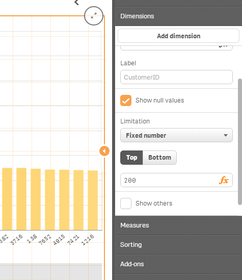
Now, my data has other properties like, zip code of the customer, mode of purchase etc. So what I want to do, is select these top 200 customers and make a filter out of that. So that I can analyse my data solely on the basis of the selected individuals.
Like for example say, I want to make a pie chart of the mode of order (as dimension) and net sales (sum net sales as measure) with the filter allowing me to display the relevant graphic on the top 200 customers and not all the the customers I have in the data set.
Any help would be amazing!
Thanks in advance!
Regards
Arka
- Mark as New
- Bookmark
- Subscribe
- Mute
- Subscribe to RSS Feed
- Permalink
- Report Inappropriate Content
i think you got it. It is just that the graph can't hold 200 bars and it you move over the square box at the bottom, you will see the rest.
- Mark as New
- Bookmark
- Subscribe
- Mute
- Subscribe to RSS Feed
- Permalink
- Report Inappropriate Content
Hi
as per alex pan ,
thats why i said early to use pivot or stright for top 200 sales and all
- Mark as New
- Bookmark
- Subscribe
- Mute
- Subscribe to RSS Feed
- Permalink
- Report Inappropriate Content
I tried it but unfortunately it is not working.
I made the necessary changes in the name of the entities, i.e NetSales (for sales) and CustomerID (for Customer). I made these changes in line with the headers of my data set.
Unfortunately it did not work.
However, what role does the tag "Custom" in =aggr(sum(if(rank(Customer)<=200,Custom),Sales)) play?
- Mark as New
- Bookmark
- Subscribe
- Mute
- Subscribe to RSS Feed
- Permalink
- Report Inappropriate Content
I think I am failing to explain myself! 
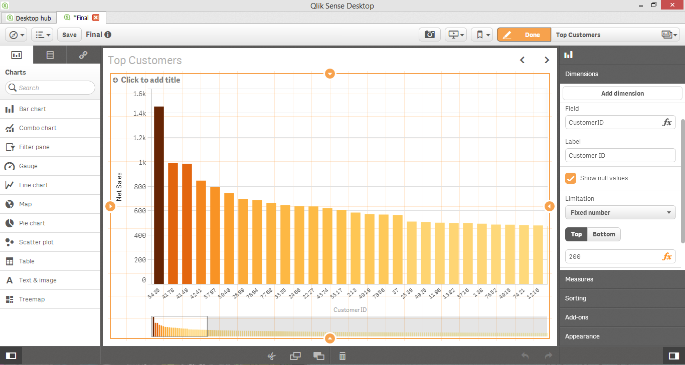
See, this image below shows you the bar chart which I plotted. It has my unique customer IDs (x axis) vs their net sales (y axis). In the properties of the chart, I have limited the graphic to display only the top 200 values since I my objective is to analyse these top customers.
Now I understand completely what you are trying to say when you are telling me that I need scroll with that box underneath by deselecting the edit button and seeing all the results.
But browsing my results in not what I want to do!
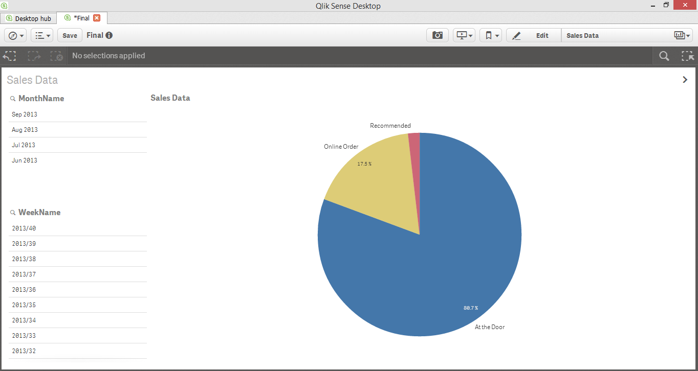
This show my first sheet. It displays as a percentage, the overall divisions in how sales are distributed over three categories. It is on a similar graphic, that I want to see this distribution changes when I have selected my top 200 customers from the picture above.
So in order to do what I said, I start selecting a few customers from the bar chart which automatically results in a filter. This filter is now modifying all the graphics in my sheets to display data accordingly. And that is precisely what I am aiming for.
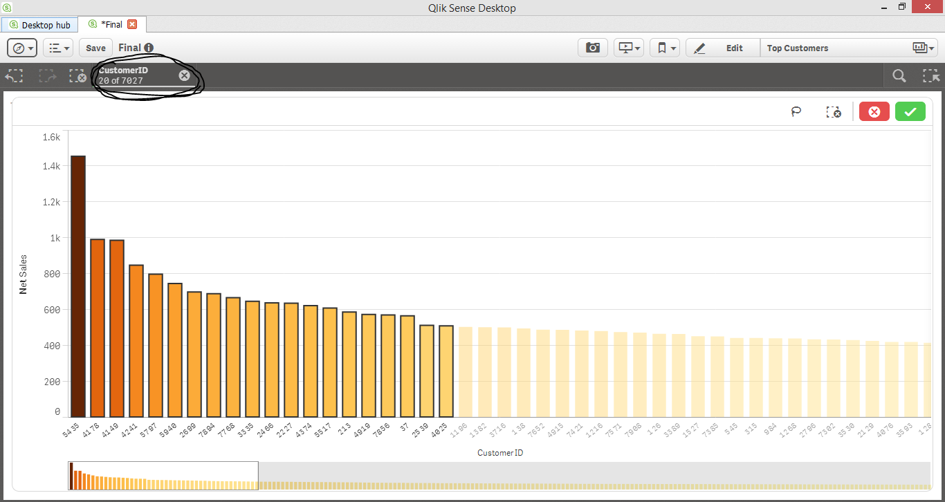
After having selected those few customer IDs, this is how the initial pie chart gets modified.
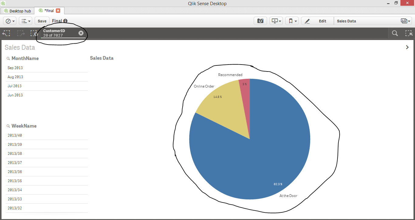
So the selected Customer IDs act as a filter so that I am analyzing the trends and graphics on the basis of data solely on those selected Customer IDs.
So now what I want to do is select all of those 200 Customers.
Individually clicking all the 200 customer IDs is quite time consuming so I was wondering if such a filter could be created with some code. Because that figure of 200 could very have been 2000 for example.
I hope I was able to get through to you this time.
- Mark as New
- Bookmark
- Subscribe
- Mute
- Subscribe to RSS Feed
- Permalink
- Report Inappropriate Content
I am using Qlik Sense Desktop. Version is 1.0.0
Unfortunately it doesn't seem that I have access to the said properties which you are referring to.
- Mark as New
- Bookmark
- Subscribe
- Mute
- Subscribe to RSS Feed
- Permalink
- Report Inappropriate Content
I made a very long and (hopefully) detailed reply to Alex's post. Do check it out. Hopefully I have been able to get through to you guys on this account.
- Mark as New
- Bookmark
- Subscribe
- Mute
- Subscribe to RSS Feed
- Permalink
- Report Inappropriate Content
Guys I am so sorry if it has gotten confusing that this post has appeared in the new to qlik view section (since I am using qlik sense). I did not realize that I had made such a blunder.
I am very grateful for your feedback.
Hope you guys can resolve my problem anyway.
- Mark as New
- Bookmark
- Subscribe
- Mute
- Subscribe to RSS Feed
- Permalink
- Report Inappropriate Content
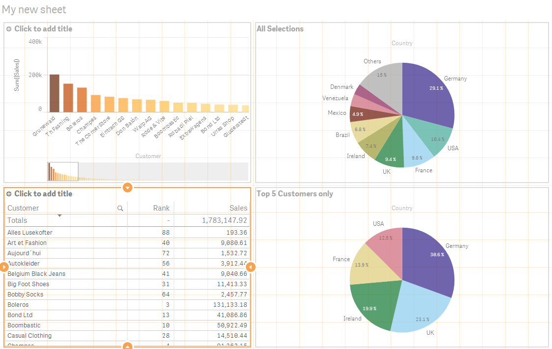
Hi , i think some of the answers pertained to QlikView , not Qlik Sense, but its clear that from your screenshots this is for Qlik Sense.
You can apply virtually any independant filter on any chart by using SET ANALYSIS.
In the following example, I'm showing sum(Sales) by Customer on the left and by Country on the right.
I've used the RANK() function to grab the sales ranking of each customer in the bottom left. The expression looks like this:
rank( total sum(Sales))
Now when i want to use a filter based on the rank within another chart, I do that by filtering customer within a SET Statement.
In the bottom right PIE i changed sum(Sales) as the measure expression to the following.
=Sum( {$<Customer={"=rank( total sum(Sales))<=5"}>} [Sales])
In this situation, the chart will update based on ANY selection EXCEPT for the Customer field because its been hard defined via the SET STATEMENT to only bring back the customers whose sales are in the top 5.
This is very flexible syntax.
- Mark as New
- Bookmark
- Subscribe
- Mute
- Subscribe to RSS Feed
- Permalink
- Report Inappropriate Content
Just wanted to add the sample .QVF so you can reference a live sample.
You can put this under your My Documents \ Qlik \ Sense \ Apps directory, relaunch Qlik Sense Desktop and then open from the hub
- Mark as New
- Bookmark
- Subscribe
- Mute
- Subscribe to RSS Feed
- Permalink
- Report Inappropriate Content
I have move the post to the correct section for you.
-Josh