Unlock a world of possibilities! Login now and discover the exclusive benefits awaiting you.
- Qlik Community
- :
- All Forums
- :
- QlikView App Dev
- :
- Re: Show horizontal dynamic values in split-axis c...
- Subscribe to RSS Feed
- Mark Topic as New
- Mark Topic as Read
- Float this Topic for Current User
- Bookmark
- Subscribe
- Mute
- Printer Friendly Page
- Mark as New
- Bookmark
- Subscribe
- Mute
- Subscribe to RSS Feed
- Permalink
- Report Inappropriate Content
Show horizontal dynamic values in split-axis chart?
Hi all,
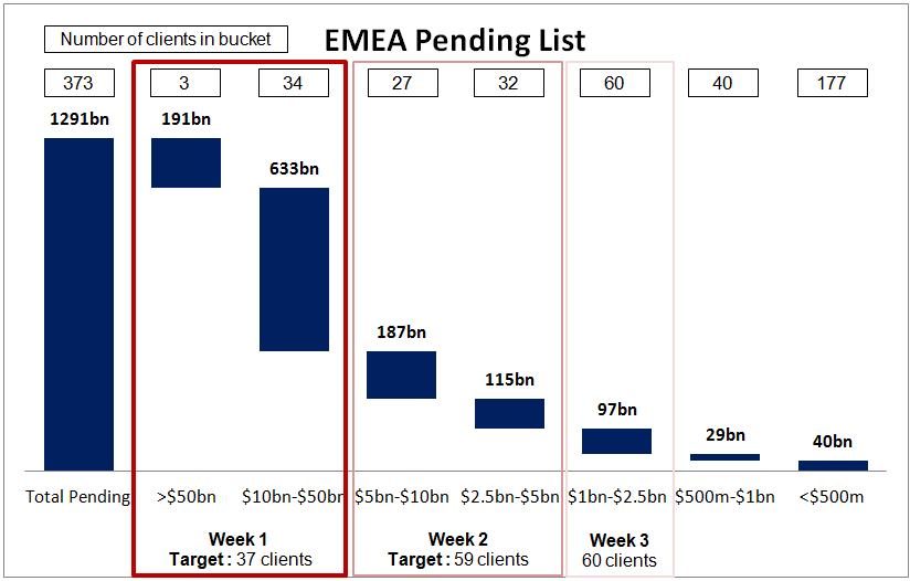
I have a client that wants to recreate the below chart. I have already figured out the waterfall bars, but am stumped on how to get the client counts per buckets to be horizontal at the top of the chart as well as dynamic as per the user's selections. I've tried a split axis chart with the bars on the bottom and the count as symbols on the top axis, however these are coming up to scale and my client would like them horizontal like the graph below. Any ideas?
T
Thanks!
Accepted Solutions
- Mark as New
- Bookmark
- Subscribe
- Mute
- Subscribe to RSS Feed
- Permalink
- Report Inappropriate Content
Taylor,
On the Axes tab, on the upper expression try placing a Static Max of some ridiculously higher number - e.g. the expression times one million.
This should have the effect of flattening out the scaling on the symbols. At least it did on the test I just made.
- Mark as New
- Bookmark
- Subscribe
- Mute
- Subscribe to RSS Feed
- Permalink
- Report Inappropriate Content
Hi Taylor,
Attach a sample QVW for me and I will be glad to take a look at it.
Shawn
- Mark as New
- Bookmark
- Subscribe
- Mute
- Subscribe to RSS Feed
- Permalink
- Report Inappropriate Content
Hi Shawn,
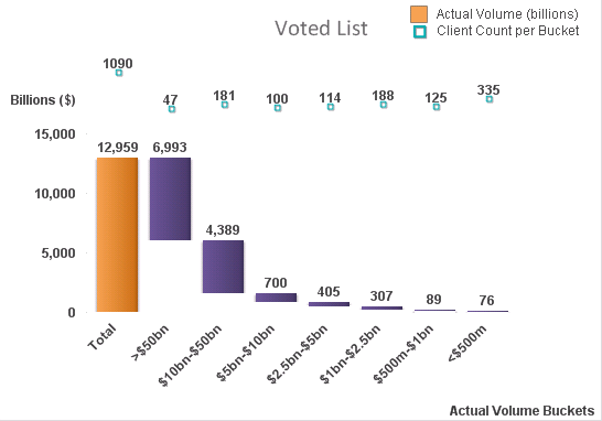
Thanks for the quick reply...but unfortunately I can't attach a qvw due to security. But here is a screenshot of what I have right now if that would help. I've hid the top axis, but the symbols are to scale, which I would like to be horizontal. If I make the top axis any smaller, the data labels are cut off. I've thought about trying some set analysis variables here and inputting them into a text object and placing transparently on top of the chart, but that wouldn't make any sense dynamically after selections have been made. I'm open to other ideas as well, I'm not married to the idea of using a split chart, but they do want this view to be dynamic and to be recreated as close as possible to the above chart.
Thanks again for any help/suggestions!
Taylor
- Mark as New
- Bookmark
- Subscribe
- Mute
- Subscribe to RSS Feed
- Permalink
- Report Inappropriate Content
Taylor,
On the Axes tab, on the upper expression try placing a Static Max of some ridiculously higher number - e.g. the expression times one million.
This should have the effect of flattening out the scaling on the symbols. At least it did on the test I just made.
- Mark as New
- Bookmark
- Subscribe
- Mute
- Subscribe to RSS Feed
- Permalink
- Report Inappropriate Content
Yes, the static max approach works!
Thank you!!