Unlock a world of possibilities! Login now and discover the exclusive benefits awaiting you.
- Qlik Community
- :
- All Forums
- :
- QlikView App Dev
- :
- All (two) scales (y-axis) in use - columns vary a ...
- Subscribe to RSS Feed
- Mark Topic as New
- Mark Topic as Read
- Float this Topic for Current User
- Bookmark
- Subscribe
- Mute
- Printer Friendly Page
- Mark as New
- Bookmark
- Subscribe
- Mute
- Subscribe to RSS Feed
- Permalink
- Report Inappropriate Content
All (two) scales (y-axis) in use - columns vary a lot in height
Hi,
I have a chart (combochart) where I display, on the dimension "month" (format like May-14), a few different kinds of costs.
I am already using two y-axes,
- the total costs on the left
- the individual costs on the right
(otherwise, the individual columns would just become too tiny)
Now I have a specific problem with one kind of costs where the values are very tiny - I would need to use a third scale to accommodate those figures which I obviously cannot do.
=> I had the idea of displaying the figures as such, vertically, so they too would be visible.
<=> The other columns are a lot bigger, so for them I would like to "show the figures inside the elements" (I know there is a checkbox for this) - but when I tick this, the figures for the tiny columns (not at all visible in fact) disappear.
=> Can I somehow code this in the expression_properties?
Thanks a lot!
Best regards,
DataNibbler
- Mark as New
- Bookmark
- Subscribe
- Mute
- Subscribe to RSS Feed
- Permalink
- Report Inappropriate Content
Maybe value on axis could help.
- Mark as New
- Bookmark
- Subscribe
- Mute
- Subscribe to RSS Feed
- Permalink
- Report Inappropriate Content
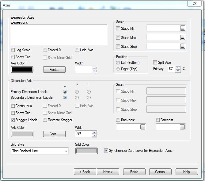
use line charts in the same combo chart for tiny values. so that u can recognize the values.
or
use "split axis" in axes tab for the tiny value in your chart. option shown below.
- Mark as New
- Bookmark
- Subscribe
- Mute
- Subscribe to RSS Feed
- Permalink
- Report Inappropriate Content
Hi,
Could you please share screenshot of your chart?
Thanks,
AS