Unlock a world of possibilities! Login now and discover the exclusive benefits awaiting you.
- Qlik Community
- :
- Forums
- :
- Analytics
- :
- New to Qlik Analytics
- :
- Re: Qlik Sense: Simple line chart visualization wi...
- Subscribe to RSS Feed
- Mark Topic as New
- Mark Topic as Read
- Float this Topic for Current User
- Bookmark
- Subscribe
- Mute
- Printer Friendly Page
- Mark as New
- Bookmark
- Subscribe
- Mute
- Subscribe to RSS Feed
- Permalink
- Report Inappropriate Content
Qlik Sense: Simple line chart visualization with date on x-axis
Hi all,
I'm brand-new to Qlik and really want to love it, but I must admit that right out the gate, I'm completely baffled on how to do even the simplest-seeming thing.
I'm trying to create a dashboard for an IVR system that takes several million calls a month, so I'm playing around with an extract of 3 days' worth of data until I get my feet wet. The first visualization I tried to create is a line chart showing number of calls into the system charted over time. My x-axis data is in the form of timestamps:
9/12/2014 12:00:15 AM
9/12/2014 12:00:17 AM
9/12/2014 12:00:22 AM
etc.
When I wrap the variable (StartTime) in the Date#( ) function it converts it to the long integer-looking data
41894.000015
41894.000017
41894.000022
etc.
My y-axis is a simple count of CallID's.
No matter how I create the line chart, it tries to display every value of the date, either as-is without wrapping it in Date#(), or as those long numbers. I can't figure out how to format the axis to create intervals based on day (which would be 3 values since it's 3 days' worth of data), or hour (72 values over a 3-day period, presumably I'd be able to display them grouped to whatever # of hours makes sense.
Anyhow, I'm sure I must be missing something extremely obvious, and hopefully once it's pointed out, I can figure other things out as well, but I've literally scoured the documentation and forums, watched videos, and tried a million things, without any success.
Thanks in advance for your help!
- « Previous Replies
-
- 1
- 2
- Next Replies »
- Mark as New
- Bookmark
- Subscribe
- Mute
- Subscribe to RSS Feed
- Permalink
- Report Inappropriate Content
Hi
Date#() converts a string into a date value (a numeric value). Date() formats a numeric to display as a date.
Change Date#() to Date()
HTH
Jonathan
- Mark as New
- Bookmark
- Subscribe
- Mute
- Subscribe to RSS Feed
- Permalink
- Report Inappropriate Content
The two are complementary and work together. So if you are injesting dates of the format that you have (written in the example below), you can display it in an alternate formate using date()
=date(date#('9/12/2014 12:00:15 AM','M/D/YYYY hh:mm:ss TT'),'YYYY-MM-DD')
Important point... date() is only for formatting, the detail is actually still preserved in the field and can yield unexpected duplicate entries. If you actually want to display a DATE (with no time) , suggest using floor() to round down the timestamps to whole dates as follows
=date(floor(date#('9/12/2014 12:00:15 AM','M/D/YYYY hh:mm:ss TT')),'YYYY-MM-DD')
- Mark as New
- Bookmark
- Subscribe
- Mute
- Subscribe to RSS Feed
- Permalink
- Report Inappropriate Content
Thank you for your comments.
So I'm able to format the date in this fashion, but what I'm unable to do is have the x-axis be customizable. It either displays every single value of timestamps (thousands), or collapses to a single point when I format.
I'd like to be able to create an x-axis with the days as labels, or hours, etc. using the same underlying data (which is timestamps).
How might I do this?
- Mark as New
- Bookmark
- Subscribe
- Mute
- Subscribe to RSS Feed
- Permalink
- Report Inappropriate Content
Were you using the floor() function ? This should get you down to whole days. Just replace '9/12/2014 12:00:15 AM' with your timestamp field.
=date(floor(date#('9/12/2014 12:00:15 AM','M/D/YYYY hh:mm:ss TT')),'YYYY-MM-DD')
Individual hours will come back like this
=hour(date#('9/12/2014 12:00:15 AM','M/D/YYYY hh:mm:ss TT'))
Day and hour:
date(floor(date#('9/12/2014 12:00:15 AM','M/D/YYYY hh:mm:ss TT')),'YYYY-MM-DD') & ':' & our(date#('9/12/2014 12:00:15 AM','M/D/YYYY hh:mm:ss TT'))
If it doesn't work, kindly upload a small sample or spreadsheet.
- Mark as New
- Bookmark
- Subscribe
- Mute
- Subscribe to RSS Feed
- Permalink
- Report Inappropriate Content
Thanks again for your super-quick reply!
I have a feeling I'm missing an important step, since none of this is working...
I've done the following steps:
1. Opened Qlik Sense
2. Imported my XLSX file
3. Created a new sheet
4. Dragged "Line chart" onto the sheet,
5. Chosen "StartTime" as my Dimension
6. Chosen "CallID" as my Measure: Count([CallID])
When I don't modify the function for StartTime, I get all the time stamps along the x-axis.
When I do either of the date formatting functions to modify StartTime (date(...), date(floor...), hour(...)), I get a single point.
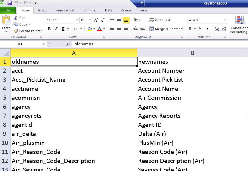
My data looks like this:
| CallID | StartTime |
| 227937779 | September 12, 2014 12:00:00 AM |
| 227937781 | September 12, 2014 12:00:01 AM |
| 227937780 | September 12, 2014 12:00:01 AM |
| 227937782 | September 12, 2014 12:00:02 AM |
| 227937783 | September 12, 2014 12:00:06 AM |
| 227937784 | September 12, 2014 12:00:06 AM |
| 227937785 | September 12, 2014 12:00:07 AM |
| 227937786 | September 12, 2014 12:00:07 AM |
| 227937787 | September 12, 2014 12:00:09 AM |
| 227937789 | September 12, 2014 12:00:12 AM |
| 227937791 | September 12, 2014 12:00:14 AM |
I'd like to be able to do all of the following (this is Excel):
Hourly view:

Daily view:
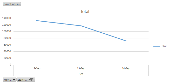
Most granular view (basically showing concurrent calls):

Thanks again and sorry I'm being so difficult! I really hope to understand the tool so I can move on to more interesting things!
James
- Mark as New
- Bookmark
- Subscribe
- Mute
- Subscribe to RSS Feed
- Permalink
- Report Inappropriate Content
James,
I went to the load editor and added a bunch of date and time buckets to use.
LOAD
CallID,
StartTime,
Date(floor(date(StartTime))) as StartDate,
hour(StartTime) as StartHour,
Minute(StartTime) as StartMinute,
Second(StartTime) as StartSecond
FROM [lib://Temp/CallIDs.xlsx]
(ooxml, embedded labels, table is Sheet1);
But i felt like i was chasing my tail a bit because the data only spans a few seconds... so you only see variation by second at the bottom. Topmost is 'starttime' as is. The middle ones are Date , Hour, Minute.
This is valid off the attached spreadsheet.

- Mark as New
- Bookmark
- Subscribe
- Mute
- Subscribe to RSS Feed
- Permalink
- Report Inappropriate Content
Aha, the Data Load Editor! I watched some videos on how to use that and gave it a shot according to your instructions, but the load failed.
I was able to connect to the folder and select the data, then hit "Insert Script" (or whatever it says). After that, I clicked "Load Data", and it went through and appeared to load every row, taking about 23 seconds (there are 300,000 rows or so). But then it generated an error that said "Invalid Path". This didn't make sense to me since it connected to the folder and displayed the columns of data with tick boxes before I inserted the script.
Simplified, it looked like this:
LOAD
CallID,
StartTime,
<additional stuff>
FROM [lib://<foldername>/<filename>.xlsx]
(ooxml, embedded labels, table is Table);
I got this progress update:

But then this at the end:

I suppose this warrants a separate thread, but I'd rather keep the conversation inside here, since it's all related.
Any additional help would be appreciated! I'm getting there slowly but surely 
James
- Mark as New
- Bookmark
- Subscribe
- Mute
- Subscribe to RSS Feed
- Permalink
- Report Inappropriate Content
James , on the line before the load can you type: first 10
like this:
first 10
LOAD
CallID,
StartTime,
....
It will load only 10 records... lets see if it still errors out.
ps: what is the name of the filename ? Also try the following which will explicitly name the table 'Data' instead of some strange unacceptable name. Just a guess.
first 10
Data:
LOAD
CallID,
StartTime,
....
- Mark as New
- Bookmark
- Subscribe
- Mute
- Subscribe to RSS Feed
- Permalink
- Report Inappropriate Content
Hi Jonathan,
Thanks for your help. That's the syntax / format I'm using. I also tried adding it via the UI by selecting it via the wizard in the 'Data load editor' but that results in an error. Please see the attached screen captures.
The debugger doesn't include a very details error either (also attached). I'm going to perform a full reload to see if I get a more detailed error message.
Josh
- « Previous Replies
-
- 1
- 2
- Next Replies »