Unlock a world of possibilities! Login now and discover the exclusive benefits awaiting you.
- Qlik Community
- :
- All Forums
- :
- QlikView App Dev
- :
- Re: BG color expression with set analysis?
- Subscribe to RSS Feed
- Mark Topic as New
- Mark Topic as Read
- Float this Topic for Current User
- Bookmark
- Subscribe
- Mute
- Printer Friendly Page
- Mark as New
- Bookmark
- Subscribe
- Mute
- Subscribe to RSS Feed
- Permalink
- Report Inappropriate Content
BG color expression with set analysis?
Should I expect set analysis to work inside a background color expression for each row of a chart?
Per an answer from John W (http://community.qlik.com/message/175445#175445😞
A set is calculated for an entire chart, not for a row of the chart. The same is true of dollar sign expansion.
I'm using the following BG color expression. I artificially set the limit to 0. Since none of my values are less than 0, I expected green background, but I'm getting all red background. See the below image:
=IF(
(sum({< PeriodType = {'Y'}, ValueType = {'nCOS'} >} Value) / sum({< PeriodType = {'Y'}, ValueType = {'InvValue'} >} Value)) > 0, $(vGoodColor),
$(vPoorColor)
)
Each of the values in the below table (straight table) are generated by a set analysis expression for different years and product groups.

John
11.2, SR4
Accepted Solutions
- Mark as New
- Bookmark
- Subscribe
- Mute
- Subscribe to RSS Feed
- Permalink
- Report Inappropriate Content
Rob,
Thank you. That debugging hint helped a lot.
Using the below, I get the ever popular '-', which indicates an aggregation issue.
(sum({< PeriodType = {'Y'}, ValueType = {'nCOS'} >} Value) /
sum({< PeriodType = {'Y'}, ValueType = {'InvValue'} >} Value)) > 0
And that lead me to add in the FYear parameter, which then gives me the colors I expect.
=IF(
(sum({< PeriodType = {'Y'}, ValueType = {'nCOS'}, FYear ={"$(=(max(FYear)-1))"} >} Value) /
sum({< PeriodType = {'Y'}, ValueType = {'InvValue'}, FYear ={"$(=(max(FYear)-1))"} >} Value)) >= GoalTurns, $(vGoodColor),
$(vPoorColor)
)
Now to work that into the rest of my BG equations.
JLR
- Mark as New
- Bookmark
- Subscribe
- Mute
- Subscribe to RSS Feed
- Permalink
- Report Inappropriate Content
Hi John,
is there a reason by the standard visual cues setting in the chart would not work for you? You can still use your colour variables too but it will be evaluated across each row
hope that helps
Joe
- Mark as New
- Bookmark
- Subscribe
- Mute
- Subscribe to RSS Feed
- Permalink
- Report Inappropriate Content
Joe,
per an older response (2010): ( Search for "Visual cues in table using set analysis")
"Visual cue expressions are evaluated on a global level, not on a row by row basis, to do that you should use the color subexpressions."
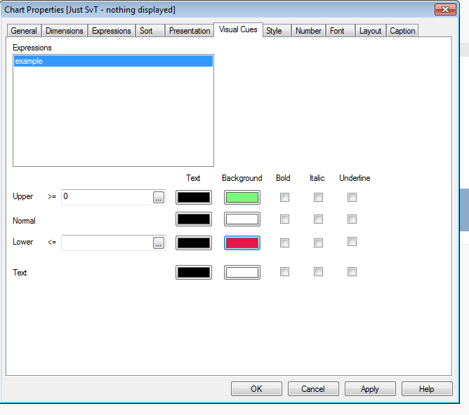
And I tried using Visual Cues - I was not able to get a per-row, per column to work.
If I use just numbers in the visual cue's entry boxes, I get the expected color changes, but when I use attributes, it does not work.
Edit: Also, I need to apply the same sort of background color to bar charts and Visual Cues is not available for bar charts.
John
- Mark as New
- Bookmark
- Subscribe
- Mute
- Subscribe to RSS Feed
- Permalink
- Report Inappropriate Content
Your Sum(Value) will be executed row by row, so it should work. What do you get if you paste just the
(sum({< PeriodType = {'Y'}, ValueType = {'nCOS'} >} Value) / sum({< PeriodType = {'Y'}, ValueType = {'InvValue'} >} Value)) > 0
in an expression column?
-Rob
- Mark as New
- Bookmark
- Subscribe
- Mute
- Subscribe to RSS Feed
- Permalink
- Report Inappropriate Content
Rob,
Thank you. That debugging hint helped a lot.
Using the below, I get the ever popular '-', which indicates an aggregation issue.
(sum({< PeriodType = {'Y'}, ValueType = {'nCOS'} >} Value) /
sum({< PeriodType = {'Y'}, ValueType = {'InvValue'} >} Value)) > 0
And that lead me to add in the FYear parameter, which then gives me the colors I expect.
=IF(
(sum({< PeriodType = {'Y'}, ValueType = {'nCOS'}, FYear ={"$(=(max(FYear)-1))"} >} Value) /
sum({< PeriodType = {'Y'}, ValueType = {'InvValue'}, FYear ={"$(=(max(FYear)-1))"} >} Value)) >= GoalTurns, $(vGoodColor),
$(vPoorColor)
)
Now to work that into the rest of my BG equations.
JLR
- Mark as New
- Bookmark
- Subscribe
- Mute
- Subscribe to RSS Feed
- Permalink
- Report Inappropriate Content
I think that quote is a little misleading John, visual cue will evaluate on the expression values broken down by the dimension(s) present within your chart, so if your expression was just
sum({< PeriodType = {'Y'}, ValueType = {'nCOS'} >} Value) / sum({< PeriodType = {'Y'}, ValueType = {'InvValue'} >} Value))
you could use them with no problem, rather than a colour expression (which should give better performance I believe due to less expressions) and it would highlight accordingly for each dimension value.
If you are looking for a different evaluation based on some other expression though, then yes of course would need to use the colour expression for that (or as you say within a different chart type) I totally agree.