Unlock a world of possibilities! Login now and discover the exclusive benefits awaiting you.
- Qlik Community
- :
- All Forums
- :
- QlikView App Dev
- :
- Re: trendline on stacked chart
- Subscribe to RSS Feed
- Mark Topic as New
- Mark Topic as Read
- Float this Topic for Current User
- Bookmark
- Subscribe
- Mute
- Printer Friendly Page
- Mark as New
- Bookmark
- Subscribe
- Mute
- Subscribe to RSS Feed
- Permalink
- Report Inappropriate Content
trendline on stacked chart
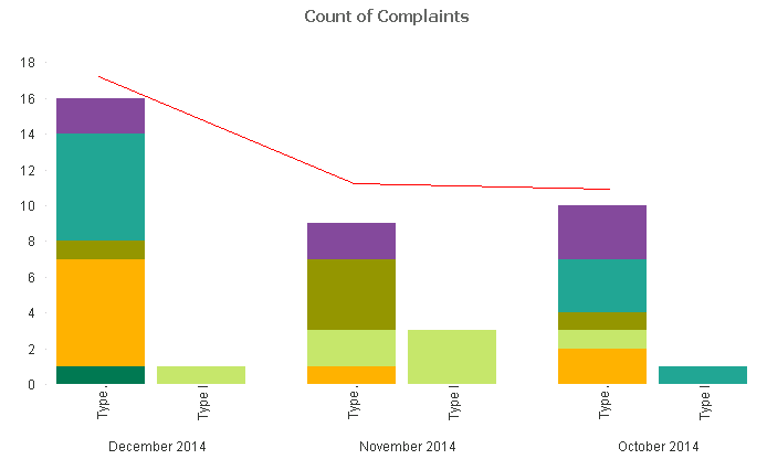
I'm new to Qlikview and I'm wondering if there is a way to accomplish the following. I'd like to add a single trendline (red) to the below mockup where the trendline represents the sum of each data set for the month. For example, in December the first 'Type' column has a value of 16 and the second column is 1,. The trendline value should be 17. I think this may not even be a trendlne but rather a dual chart (bar and line), but I'm not sure how to accomplish. As previouly stated, I'm extremely new at Qlikview, so forgive my ignorance. Thanks.
- « Previous Replies
-
- 1
- 2
- Next Replies »
- Mark as New
- Bookmark
- Subscribe
- Mute
- Subscribe to RSS Feed
- Permalink
- Report Inappropriate Content
Hi Brent,
I changed graph as follows:
Dimensions:
Month
EscalateDesc
Expressions:
- 1 Expressions for 1 ProductLOB (e.g. ProductLOB=Alternative)
Label: Alternative
Definition: Count({$<ProductLOB={'Alternative'}>}HandlingOrgUnit)
DisplayOptions: Bar
create similar Expressions for each ProductLOB, just change wording (marked bold) and Label
- 1 Expression for Total
Definition: Aggr(Count({$<ProductLOB>}HandlingOrgUnit),Month)
DisplayOptions: Line
This line chart ignore your "EscalateDesc" Dimension and count just per Month
Hope this helps you to create same graph now.
Let me know if you need help and would be nice to mark answer as helpful/correct if this solve your issue.
Regards,
Ronny
- Mark as New
- Bookmark
- Subscribe
- Mute
- Subscribe to RSS Feed
- Permalink
- Report Inappropriate Content
Sorry for the delay in response. I didn't see that you posted back with an explanation. I like the solution but unfortunately there are many ProductLOB values and they are dynamic, meaning a new one could be added at some point in the future without me knowing it. Unfortunately I can't hardcode their values into a formula because know the will change. I did try this out and it appeared to work as you specified - a good solution as it stands, but I don't know if it will work in my situation. Thanks for all your help.
- « Previous Replies
-
- 1
- 2
- Next Replies »