Unlock a world of possibilities! Login now and discover the exclusive benefits awaiting you.
- Qlik Community
- :
- All Forums
- :
- Integration, Extension & APIs
- :
- Re: New Qlik Sense extension released on Qlik Bran...
- Subscribe to RSS Feed
- Mark Topic as New
- Mark Topic as Read
- Float this Topic for Current User
- Bookmark
- Subscribe
- Mute
- Printer Friendly Page
- Mark as New
- Bookmark
- Subscribe
- Mute
- Subscribe to RSS Feed
- Permalink
- Report Inappropriate Content
New Qlik Sense extension released on Qlik Branch: Compare Period Chart
Hi, today I released a first version of a Qlik Sense extension called Compare Period Chart.
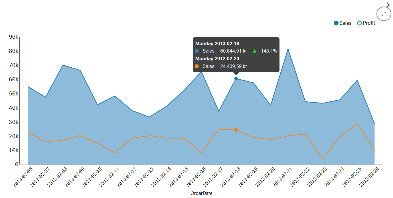
My ambition is to leverage one of Qlikview/Qlik Sense most powerful features in a more user friendly way, the Set analysis. I want to separate it from the measure as it's own entity, and make it addative. Just like a filter. This is demonstrated in this extension.
Check out the example app included in the extension!
http://branch.qlik.com/projects/showthread.php?408-Compare-Period-Chart
This is just the first version and I want to improve this with the help of the community and the developers from Qlik.
Roadmap
Axis customization
Custom colors
Custom components for better UX
Best regards
Karl
- Mark as New
- Bookmark
- Subscribe
- Mute
- Subscribe to RSS Feed
- Permalink
- Report Inappropriate Content
This looks awesome! Great work!
- Mark as New
- Bookmark
- Subscribe
- Mute
- Subscribe to RSS Feed
- Permalink
- Report Inappropriate Content
Thanks for the response!
Have you tried it out? And what do you think about my use of set analysis as a filter? It's even better showcased in my first extension KFTable. You can find that on Qlik branch as well.
I have updated the visualisation with some formatting options for the tooltip and conformed the properties to match the built in visualisations better.
- Mark as New
- Bookmark
- Subscribe
- Mute
- Subscribe to RSS Feed
- Permalink
- Report Inappropriate Content
Karl,
I am trying this but it wont work with my data which is a sample order line item table with transaction date and total amount. Keeps saying Measure nr 1 has no data when i try to add the measure of totalamount.
I have other graphs working well with my data. Also your demo app works just great.