Unlock a world of possibilities! Login now and discover the exclusive benefits awaiting you.
- Qlik Community
- :
- Forums
- :
- Analytics
- :
- New to Qlik Analytics
- :
- Calculate trends in bar chart - assistance needed
- Subscribe to RSS Feed
- Mark Topic as New
- Mark Topic as Read
- Float this Topic for Current User
- Bookmark
- Subscribe
- Mute
- Printer Friendly Page
- Mark as New
- Bookmark
- Subscribe
- Mute
- Subscribe to RSS Feed
- Permalink
- Report Inappropriate Content
Calculate trends in bar chart - assistance needed
I want to calculate revenue per region for future quarters, and put the results in a bar chart. From what I've been able to find so far, I think I have to calculate as the data is loaded, not as a calculated dimension while building the chart. True? The range functions I think I need don't seem to be available in the list. Any guidance on steps, or applicable tutorials would be helpful.
Also, I think I need to put forecasted data in different bar chart so I can distinguish....True? Can't control colors programmatically so the forecasted data looks different?
- « Previous Replies
-
- 1
- 2
- Next Replies »
- Mark as New
- Bookmark
- Subscribe
- Mute
- Subscribe to RSS Feed
- Permalink
- Report Inappropriate Content
Hi Linda - for some reason your post was not marked as a question, I fixed that for you.
Are you using Qlik Sense?
If so - check out the "correct answer-post" in this discussion and let us know - if this helps put you in the right direction: http://community.qlik.com/message/589876#589876
When appropriate, please mark the posts / discussions as correct / helpful so our team and other community members know that your question has been answered to your satisfaction.
Regards,
Mike T
Qlik
Mike Tarallo
Qlik
- Mark as New
- Bookmark
- Subscribe
- Mute
- Subscribe to RSS Feed
- Permalink
- Report Inappropriate Content
Thanks for the reply. It was helpful, as I was trying to figure out how to do this earlier, and eventually wanted to get back to it. In my case, I'd like the line over a stacked bar chart. From my reading, I think the only way to do this is a line chart with a transparent background over my stacked bar chart. Still need to explore this.
I have attached a screen shot of the visualization I'm working on. In the right hand chart, the 3rd and 4th quarters are forecast. I was originally trying to see if I could calculate the forecast data for these columns in a chart expression, or script. That's one area I'm looking for quidance.
In the current version, I've calculated forecast values in Excel before loading. I'm wondering if I can somehow indicate that the 2 right most columns are forecast by changing colors. If not, then I will likely need to put the forecast in a different column in my spreadsheet so I can make a different bar chart. This raises likely questions of formatting I've run into. I'd like to make these charts closer to each other while maintaining the same ranges. In the current example, there is extra unnecessary space between left and middle charts. When I try to move middle chart closer, it overlaps the left chart and I lose data. 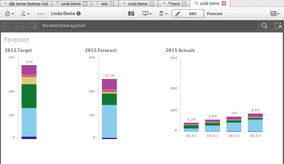
- Mark as New
- Bookmark
- Subscribe
- Mute
- Subscribe to RSS Feed
- Permalink
- Report Inappropriate Content
Hi Linda - let me review and see if I can get someone else to look at this for you to verify and clarify your findings.
But yes - you are correct - the combo chart in sense does not have a stacked option.
If you don't hear from me or anyone else shortly, please let us know.
Regards,
Mike T
Qlik
Mike Tarallo
Qlik
- Mark as New
- Bookmark
- Subscribe
- Mute
- Subscribe to RSS Feed
- Permalink
- Report Inappropriate Content
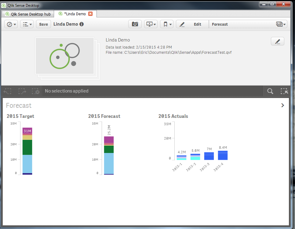
While waiting for your reply, I've made some progress using expressions to control color, but haven't yet figured out how to get the 12 colors I'll need for 6 regions(6 for actuals, 6 for forecast data). The IfThenElse syntax doesn't seem to do it.... is there another way?
if((Region='Americas'and (YearQtr='2015-1'or YearQtr='2015-2')),rgb(100,255,245),
if (Region='Asia'and (YearQtr='2015-1'or YearQtr='2015-2'), rgb(200,200,245),
rgb(50,100,245)))
- Mark as New
- Bookmark
- Subscribe
- Mute
- Subscribe to RSS Feed
- Permalink
- Report Inappropriate Content
Hi Michael,
Just checking in....not sure what you meant by "shortly", :-).
Thanks,
Linda
- Mark as New
- Bookmark
- Subscribe
- Mute
- Subscribe to RSS Feed
- Permalink
- Report Inappropriate Content
Hi Linda,
No worries 🙂 I understand. I just contacted someone in support to see if they can further assist you, I got tied down with some other priorities my response this discussion thread will bump the discussion threads to the top and it is possible somebody else might reply as well. I i'll check back on this later today.
MIke
Mike Tarallo
Qlik
- Mark as New
- Bookmark
- Subscribe
- Mute
- Subscribe to RSS Feed
- Permalink
- Report Inappropriate Content
*BUMP*
Hello Qlik Community Experts - can someone help out our fellow member here with her request?
Mike T
Qlik
Mike Tarallo
Qlik
- Mark as New
- Bookmark
- Subscribe
- Mute
- Subscribe to RSS Feed
- Permalink
- Report Inappropriate Content
Hi Linda - I am checking up on you to see if you have made any progress? Apparently other community members may not know you answer as I see they have not responded either. Usually many of them are very happy to jump in and help.
Let me know where you are and if you still require assistance.
Kinds Regards,
Mike T
Qlilk
Mike Tarallo
Qlik
- Mark as New
- Bookmark
- Subscribe
- Mute
- Subscribe to RSS Feed
- Permalink
- Report Inappropriate Content
Hi Mike,
No, I haven't made progress. I'd like to know if what I'm trying to do is even possible before investing more effort. I've looked to examples but haven't really found anything.
Thanks,Linda
- « Previous Replies
-
- 1
- 2
- Next Replies »