Unlock a world of possibilities! Login now and discover the exclusive benefits awaiting you.
- Qlik Community
- :
- All Forums
- :
- QlikView App Dev
- :
- Re: Gauge Chart Compare Years
- Subscribe to RSS Feed
- Mark Topic as New
- Mark Topic as Read
- Float this Topic for Current User
- Bookmark
- Subscribe
- Mute
- Printer Friendly Page
- Mark as New
- Bookmark
- Subscribe
- Mute
- Subscribe to RSS Feed
- Permalink
- Report Inappropriate Content
Gauge Chart Compare Years
Hi,
How can i create a gauge chart that shows how much % electricity that is saved (oldest selected year vs latest selected year)
Info:
In my table I have data for the consumption of electricity hourly. Dimensions name: kWh
- Mark as New
- Bookmark
- Subscribe
- Mute
- Subscribe to RSS Feed
- Permalink
- Report Inappropriate Content
Hi Marius,
you need the total consumption per year - then you can build some expression (possibly using set_analysis) to grab the value for the 1st and last year in the selected range and calculate the % difference between those.
How exactly is that done? Does the user select on two separate fields?
=> Once you have one single value, you can display it in a gauge chart.
HTH
Best regards,
DataNibbler
- Mark as New
- Bookmark
- Subscribe
- Mute
- Subscribe to RSS Feed
- Permalink
- Report Inappropriate Content
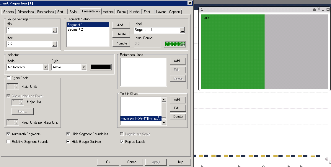
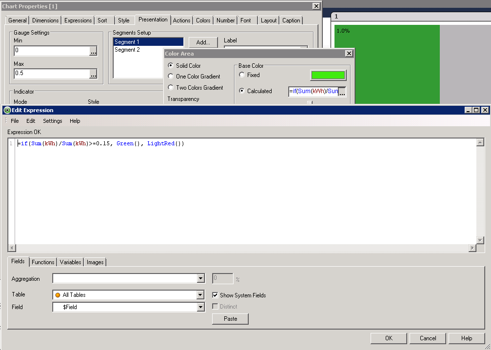
num(1-sum({<Year={"$(=max(Year))"}>}kWh)/sum({<Year={"$(=min(Year))"}>}kWh),'#.0%')
talk is cheap, supply exceeds demand
- Mark as New
- Bookmark
- Subscribe
- Mute
- Subscribe to RSS Feed
- Permalink
- Report Inappropriate Content
Thanks!
Think that expression was correct, but the colors in the graph shows 50/50 green gray...