Unlock a world of possibilities! Login now and discover the exclusive benefits awaiting you.
- Qlik Community
- :
- All Forums
- :
- QlikView App Dev
- :
- Graph Displays for Filters (with Data Example)
- Subscribe to RSS Feed
- Mark Topic as New
- Mark Topic as Read
- Float this Topic for Current User
- Bookmark
- Subscribe
- Mute
- Printer Friendly Page
- Mark as New
- Bookmark
- Subscribe
- Mute
- Subscribe to RSS Feed
- Permalink
- Report Inappropriate Content
Graph Displays for Filters (with Data Example)
Hi All,
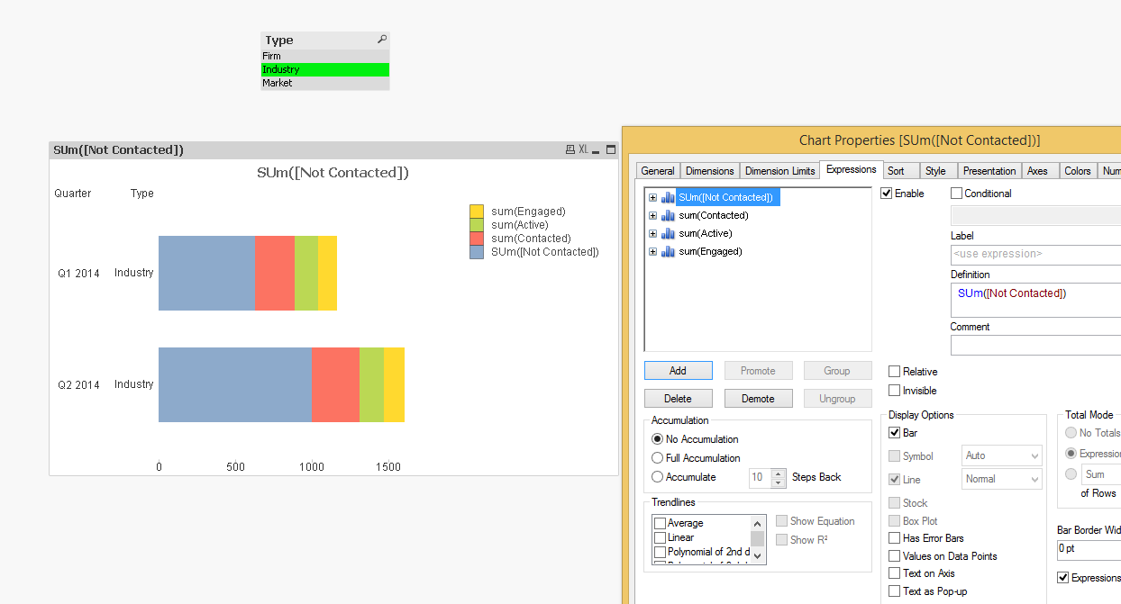
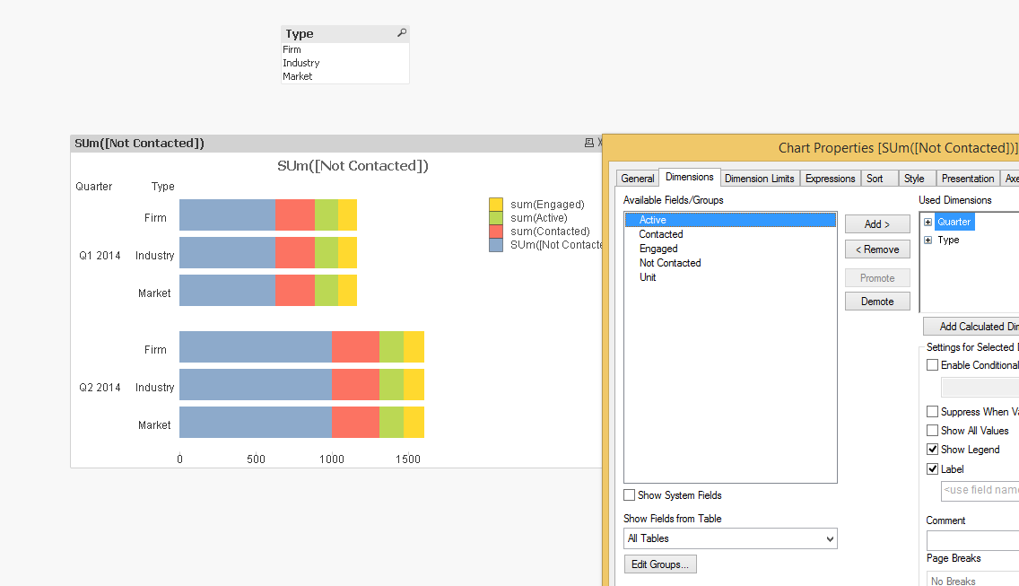
I am trying to get Quarterly data to filter for three different Types: Firm, Industry, and Market.
There are 4 different amount fields that I would like to display these by: Contacted, Not Contacted, Engaged, and Active.
The idea behind the graph is would be to have a filter (or button with variables) that when I click on say, Industry, bar graphs would display for each Quarter and a stacked bar Graph for the Amounts.
Please find a sample data set attached below:
The idea behind it would look something like the attachment (name: Desired Result), except I would only have one Type showing at once, with all of the Units for that showing as well.
However the filters won't work for some reason (i.e. when I click Market, nothing happens)
I was hoping that someone could take a look at the sample data and let me know what type of expression and dimensions I should use to get this to show the way I want.
My initial thought is I need to use multiple SumIF expressions (i.e. SumIF(Type='Firm') ) or something like that, but I am unfamiliar with using this expression in Qlikview.
Currently I have four expressions to show the breakdown of Contacted, Not Contacted, Engaged, and Active (just SUM(1 of those 4 fields).
Any help at all would be amazing and much appreciated. Feel free to ask for clarification if you need it at all.
Thanks in advance!
Ryan
- Mark as New
- Bookmark
- Subscribe
- Mute
- Subscribe to RSS Feed
- Permalink
- Report Inappropriate Content
Hi,
List box selection works fine when I tried with your sample data set.xlsx. Maybe try building the chart again.