Unlock a world of possibilities! Login now and discover the exclusive benefits awaiting you.
- Qlik Community
- :
- All Forums
- :
- QlikView App Dev
- :
- Re: Linear Gaugue - Dynamic Segment Color
- Subscribe to RSS Feed
- Mark Topic as New
- Mark Topic as Read
- Float this Topic for Current User
- Bookmark
- Subscribe
- Mute
- Printer Friendly Page
- Mark as New
- Bookmark
- Subscribe
- Mute
- Subscribe to RSS Feed
- Permalink
- Report Inappropriate Content
Linear Gaugue - Dynamic Segment Color
Hi QV Experts,
I have a simple requirement of a Straight Table with Expression as a Linear Gauge. For e.g.
Data Example
Phase Project %Complete
PROD A 0.5
PROD B 0.75
QA C 0.35
QA D 0.25
I would Like to show %Complete as a Linear Gauge with only 1 segment (Lower Bound =0, Fill to Value). However, I would like the color of the Linear Gauge Fill to vary based on Phase. for example - Green for PROD and Orange for QA.
I tried few ways but not working and making me feel it is a Bug. Appreciate your responses.
Thank You,
Ganesh
- Mark as New
- Bookmark
- Subscribe
- Mute
- Subscribe to RSS Feed
- Permalink
- Report Inappropriate Content
I think the linear gauge color in a chart is one color (always the same)
- Mark as New
- Bookmark
- Subscribe
- Mute
- Subscribe to RSS Feed
- Permalink
- Report Inappropriate Content
Yes, I had kinda the same task lately, I guess you can't dinamically change gauge color 
- Mark as New
- Bookmark
- Subscribe
- Mute
- Subscribe to RSS Feed
- Permalink
- Report Inappropriate Content
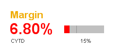
Could you display how you tried to solve it?
I have used this in a gauge with this expression on the first segment color
=if(Sum(Margin)/Sum(LineSalesAmount)>=0.15, $(vABCColor_Green1), $(vABCColor_Red))
The second segment is simply Grey. The two segment boundries are 0 for the first one and this for the second one
=Sum({$<CYTDFlag={'1'}, Year=, Quarter=, Month= >}Margin)/Sum({$<CYTDFlag={'1'}, Year=, Quarter=, Month= >}LineSalesAmount)
I have not tried this in a line chart but it should work the same way . You should be able to adjust the first if statement to chose the colors you want.
- Mark as New
- Bookmark
- Subscribe
- Mute
- Subscribe to RSS Feed
- Permalink
- Report Inappropriate Content
Hi Nils, Thanks for the reply but It doesnt seem to work.
I tried to display by writing an expression like this in the segment color expression -
If (Phase='PROD', red(), yellow())
Is it possible to attach the qvw of the expression you mentioned which is working for you.
Ganesh