Unlock a world of possibilities! Login now and discover the exclusive benefits awaiting you.
- Qlik Community
- :
- All Forums
- :
- QlikView App Dev
- :
- Re: Monthly Variance Daynamically
- Subscribe to RSS Feed
- Mark Topic as New
- Mark Topic as Read
- Float this Topic for Current User
- Bookmark
- Subscribe
- Mute
- Printer Friendly Page
- Mark as New
- Bookmark
- Subscribe
- Mute
- Subscribe to RSS Feed
- Permalink
- Report Inappropriate Content
Monthly Variance Daynamically
How can i plot the the monthly variance in my chart?
I have the cummulative data.
Example:
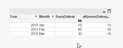
| Year | Month | Sales |
| 2015 | Jan | 10 |
| 2015 | Feb | 40 |
| 2015 | Mar | 30 |
The chart should show the values
Jan 10
Feb 30
Mar -10
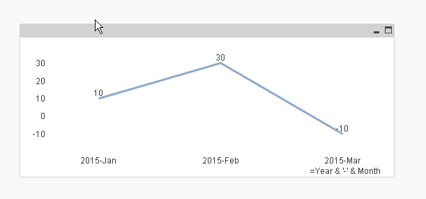
The chart show dynamically the month based on availability of data.
Note: I am using calaender function in my application
- « Previous Replies
-
- 1
- 2
- Next Replies »
- Mark as New
- Bookmark
- Subscribe
- Mute
- Subscribe to RSS Feed
- Permalink
- Report Inappropriate Content
my expression is
alt(sum(Sales)-above(Sum(Sales)),sum(Sales))
- Mark as New
- Bookmark
- Subscribe
- Mute
- Subscribe to RSS Feed
- Permalink
- Report Inappropriate Content
Thank You !
- Mark as New
- Bookmark
- Subscribe
- Mute
- Subscribe to RSS Feed
- Permalink
- Report Inappropriate Content
How can i plot this in Trend Chart?
- Mark as New
- Bookmark
- Subscribe
- Mute
- Subscribe to RSS Feed
- Permalink
- Report Inappropriate Content
with a calculated dimension and same expression
- Mark as New
- Bookmark
- Subscribe
- Mute
- Subscribe to RSS Feed
- Permalink
- Report Inappropriate Content
i have another dimension on top of that which shows the actual amount instead of variance when i plot that
- Mark as New
- Bookmark
- Subscribe
- Mute
- Subscribe to RSS Feed
- Permalink
- Report Inappropriate Content
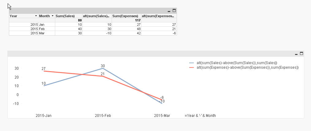
My data is lke :
Income Jan 200
Income Feb 250
Expense Jan 300
Expense Feb 450
The Chart Should show Monthly Income Varince and Expense Variance
I.e
Jan Feb
Income 200 50
Expense 300 150
- Mark as New
- Bookmark
- Subscribe
- Mute
- Subscribe to RSS Feed
- Permalink
- Report Inappropriate Content
add another expression
alt(sum(Expenses)-above(Sum(Expenses)),sum(Expenses))
- Mark as New
- Bookmark
- Subscribe
- Mute
- Subscribe to RSS Feed
- Permalink
- Report Inappropriate Content
That works fine . Thanks for your support.
How did you hide the Chart Label.
i.e when i create the legend the first Ledgend Label is appearing in my chart. How to come out of that?
- Mark as New
- Bookmark
- Subscribe
- Mute
- Subscribe to RSS Feed
- Permalink
- Report Inappropriate Content
Hi,
Uncheck Show Title in Chart option in
Chart Properties -> General tab.
Hope this helps you.
Regards,
Jagan.
- « Previous Replies
-
- 1
- 2
- Next Replies »