Unlock a world of possibilities! Login now and discover the exclusive benefits awaiting you.
- Qlik Community
- :
- All Forums
- :
- QlikView App Dev
- :
- Bar Chart X Axis - Qliksense
- Subscribe to RSS Feed
- Mark Topic as New
- Mark Topic as Read
- Float this Topic for Current User
- Bookmark
- Subscribe
- Mute
- Printer Friendly Page
- Mark as New
- Bookmark
- Subscribe
- Mute
- Subscribe to RSS Feed
- Permalink
- Report Inappropriate Content
Bar Chart X Axis - Qliksense
Hi All,
I have an issue with headings that I want to appear on an X axis on the bar graphs in Qliksense.
A small sample of my dataset is below:
| Patient | Pharmacy Cost | Medical Cost | Radiology Cost | Therapy Cost | Ward Cost |
| 1 | 1,079.16 | 1,254.55 | 68.72 | 1,888.82 | 18,510.45 |
| 2 | 35.77 | 746.09 | NULL | 175.56 | 2,510.16 |
| 3 | 186.78 | 162.61 | NULL | 237.94 | 2,496.49 |
| 4 | NULL | 43.34 | NULL | 1.61 | 18.86 |
| 5 | 17.88 | 51.21 | NULL | 360.14 | 513.21 |
| 6 | 41.51 | 62.43 | NULL | 77.99 | 673.96 |
| 7 | NULL | 75.03 | NULL | 2.52 | 28.51 |
| 8 | NULL | 139.28 | NULL | 2.52 | 57.53 |
| 9 | NULL | 139.28 | NULL | 2.52 | 195.50 |
| 10 | 2,407.36 | 28,367.47 | 174.82 | 7,188.27 | 10,648.02 |
My actual dataset has about 30 columns and 90,000 rows of data and is not very easy to manipulate
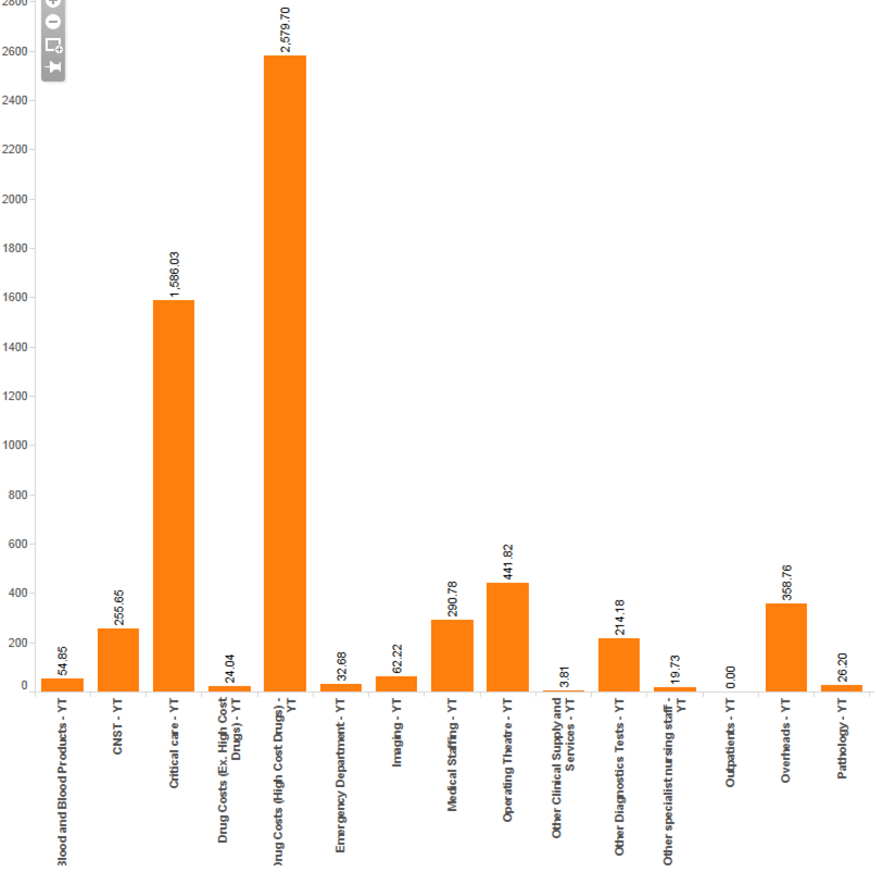
Do you know if it is possible to have the Column headings (Pharmacy to Ward) on the x-axis and have it calculating the average cost using the values in the table?
Ideally I would have about 20 bars for each cost category and an average cost for each of those.
It would look a bit like the below:
Is there an easy solution to this?
Many thanks
Dan
- Mark as New
- Bookmark
- Subscribe
- Mute
- Subscribe to RSS Feed
- Permalink
- Report Inappropriate Content
Use the CrossTable function to load your data so that the category descriptions end up in one field instead of as the names of 30 different fields.
Also, choose a layout with horizontal bars instead of vertical bars. Your chart will be far, far better readable that way.
talk is cheap, supply exceeds demand