Unlock a world of possibilities! Login now and discover the exclusive benefits awaiting you.
- Qlik Community
- :
- All Forums
- :
- QlikView App Dev
- :
- Re: How to read this QV position chart ?
- Subscribe to RSS Feed
- Mark Topic as New
- Mark Topic as Read
- Float this Topic for Current User
- Bookmark
- Subscribe
- Mute
- Printer Friendly Page
- Mark as New
- Bookmark
- Subscribe
- Mute
- Subscribe to RSS Feed
- Permalink
- Report Inappropriate Content
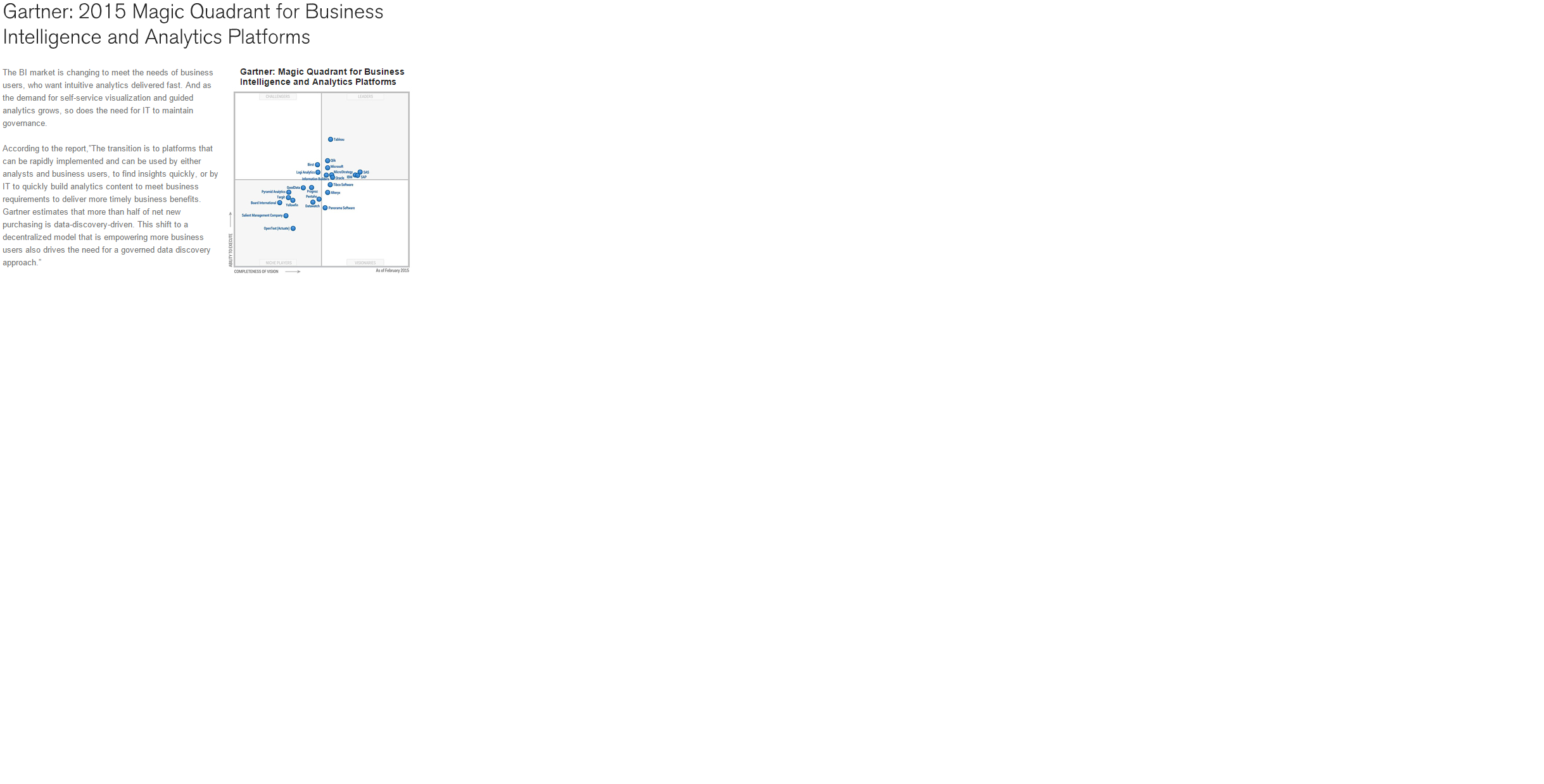
How to read this QV position chart ?
Hi All
From QV web site i found this article , from the chart , i can see the Tablue software is in better position then QV . because it way much higher the QV on the Y axis. where the X axis both are same.
Hope some one can share with me the way i read the chart is correct.
Paul
- Tags:
- qlikview_scripting
- Mark as New
- Bookmark
- Subscribe
- Mute
- Subscribe to RSS Feed
- Permalink
- Report Inappropriate Content
Hi, Found the below info. There is nothing magic about these MQs: they are results of Gartner’s 2-dimensional understanding of BI, Analytics and Data Visualization (DV) Platforms, features and usage. 1st Measure (X axis) according to Gartner is the “Completeness of Vision” and 2nd Measure (Y axis) is the “Ability to Execute”, which allows to distribute DV and BI Vendors among 4 “Quarters”: RightTop – “Leaders”, LeftTop -“Challengers”, RightBottom – “Visionaires” and LeftBottom – “Niche Players” (or you can say LeftOvers). Reference: apandre.wordpress.com
- Mark as New
- Bookmark
- Subscribe
- Mute
- Subscribe to RSS Feed
- Permalink
- Report Inappropriate Content
Hi Sir
So many be 2 year later . When more people using Qlik sense . Then Tab B.I will lost to qlik sense on Y axis right ?
- Mark as New
- Bookmark
- Subscribe
- Mute
- Subscribe to RSS Feed
- Permalink
- Report Inappropriate Content
Not sure Paul, I just explained how to read the chart. Am not sure about the future..