Unlock a world of possibilities! Login now and discover the exclusive benefits awaiting you.
- Qlik Community
- :
- All Forums
- :
- QlikView App Dev
- :
- Re: line chart customization
- Subscribe to RSS Feed
- Mark Topic as New
- Mark Topic as Read
- Float this Topic for Current User
- Bookmark
- Subscribe
- Mute
- Printer Friendly Page
- Mark as New
- Bookmark
- Subscribe
- Mute
- Subscribe to RSS Feed
- Permalink
- Report Inappropriate Content
line chart customization
Hi,
My task is two show 2 brands simultaneously on a line chart.
Brand1 has Budget Value in every month. Brand2 has Budget Value only in Jan, Feb, Apr, Sep, Oct.
If Brand 2 has Budget in Feb and Apr, but doesn't have Budget in Mar, then QlikView connects the point 'Feb' with the oint 'Apr'. QlikView doesn't show a gap, though there is a gap.
Is it possible to customize a line chart so that gaps would be displayed?
| Brand1 | Jan | 10 |
| Brand1 | Feb | 20 |
| Brand1 | Mar | 17 |
| Brand1 | Apr | 18 |
| Brand1 | May | 12 |
| Brand1 | Jun | 8 |
| Brand1 | Jul | 15 |
| Brand1 | Aug | 12 |
| Brand1 | Sep | 10 |
| Brand1 | Oct | 15 |
| Brand1 | Nov | 5 |
| Brand1 | Dec | 7 |
| Brand2 | Jan | 12 |
| Brand2 | Feb | 15 |
| Brand2 | Apr | 8 |
| Brand2 | Sep | 12 |
| Brand2 | Oct | 10 |
Thank you in advance,
See the file attached.
Larisa
Accepted Solutions
- Mark as New
- Bookmark
- Subscribe
- Mute
- Subscribe to RSS Feed
- Permalink
- Report Inappropriate Content
I think your setting might be a bit more complicated than the one Gysbert handled in his referenced thread.
You are using 2 dimensions and your data is missing records for some months.
Attached a QVW with your data and some proposals.
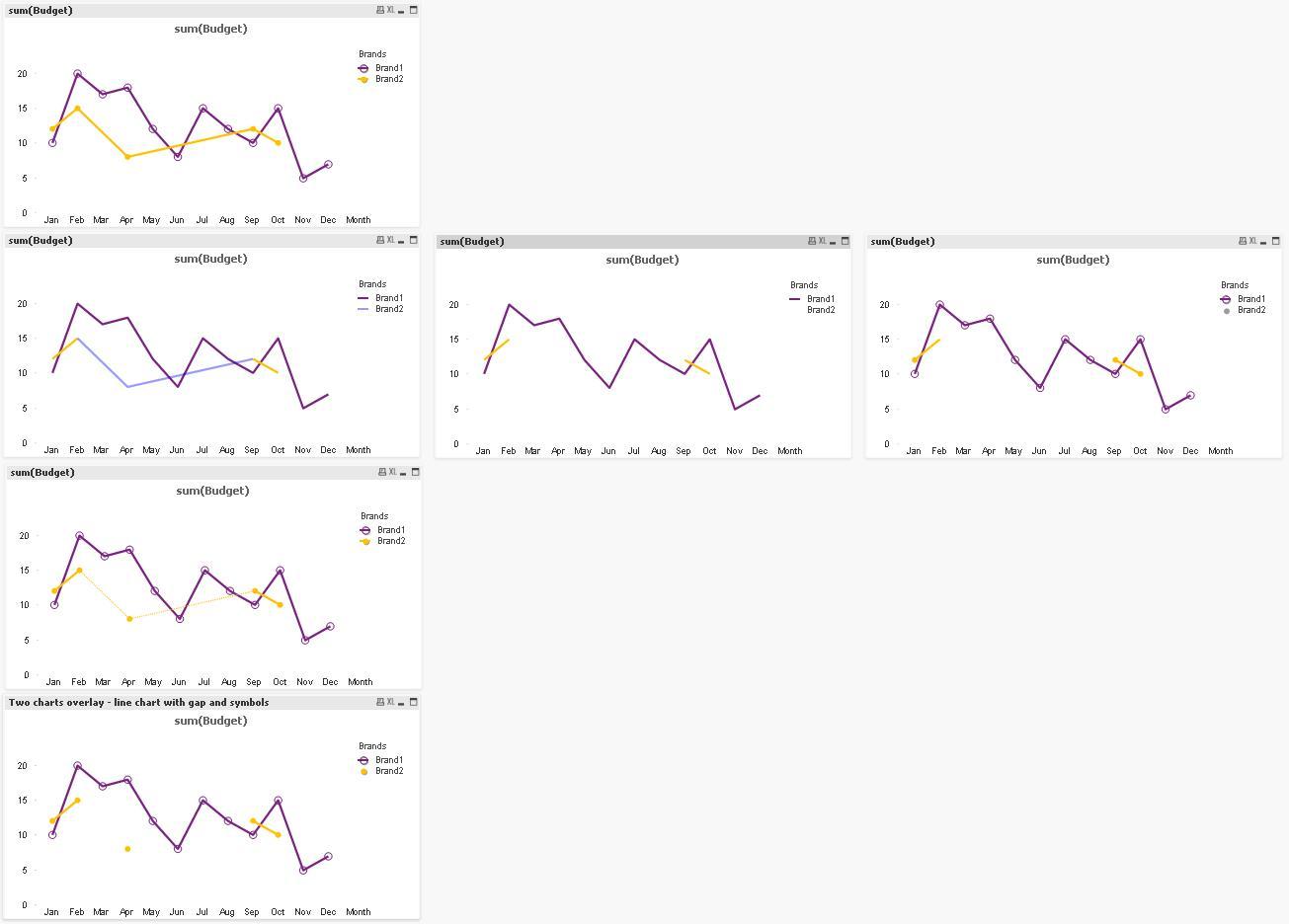
1) What about just enabling symbols, so one can clearly see where data points exist and where there is no data available
(chart on first row)
2) With creating a background color attribute expression, you can try hiding the line
Since you are using two dimensions, I needed an advanced aggregation here (thankfully, your Month is already correctly sorted by load order):
=aggr(if(Month(Date#(Month,'MMM')) -Month(below(Date#(Month,'MMM'))) <=-2,argb(100,0,0,255)),Brands,Month)
[The part Month(Date#(Month,'MMM')) is only needed, because your Month is pure text. Using a QV date function to create a Month field with a dual value would simplify above to
=aggr(if(Month - below(Month) <=-2, argb(100,0,0,255)),Brands,Month)
]
Basically I am testing if the dimensional gap between two sampling points is greater than 1 (month).
For demonstration, I used a visible color (2nd line, left chart)
Now you can use a white color with transparency, but unfortunately, this also hides single sampling points
(2nd line, middle chart, you can't see April for Brand2 anymore)
Even enabling the symbols doesn't help (same color) -> 2nd line, right chart
3) Instead of using color, you can manipulate the line style, I tried with a slimmer and dotted line (chart on 3rd line)
4) Finally (and as far as I've understood closest to your request), you can overlay a chart with lines with a chart with symbols
(The color of lines is manipulated as in 2nd line, in the top chart with symbols, no color expression is used.
- Mark as New
- Bookmark
- Subscribe
- Mute
- Subscribe to RSS Feed
- Permalink
- Report Inappropriate Content
That should be possible. See this discussion for an example: Help! How to break off the line in a chart?
talk is cheap, supply exceeds demand
- Mark as New
- Bookmark
- Subscribe
- Mute
- Subscribe to RSS Feed
- Permalink
- Report Inappropriate Content
I think your setting might be a bit more complicated than the one Gysbert handled in his referenced thread.
You are using 2 dimensions and your data is missing records for some months.
Attached a QVW with your data and some proposals.
1) What about just enabling symbols, so one can clearly see where data points exist and where there is no data available
(chart on first row)
2) With creating a background color attribute expression, you can try hiding the line
Since you are using two dimensions, I needed an advanced aggregation here (thankfully, your Month is already correctly sorted by load order):
=aggr(if(Month(Date#(Month,'MMM')) -Month(below(Date#(Month,'MMM'))) <=-2,argb(100,0,0,255)),Brands,Month)
[The part Month(Date#(Month,'MMM')) is only needed, because your Month is pure text. Using a QV date function to create a Month field with a dual value would simplify above to
=aggr(if(Month - below(Month) <=-2, argb(100,0,0,255)),Brands,Month)
]
Basically I am testing if the dimensional gap between two sampling points is greater than 1 (month).
For demonstration, I used a visible color (2nd line, left chart)
Now you can use a white color with transparency, but unfortunately, this also hides single sampling points
(2nd line, middle chart, you can't see April for Brand2 anymore)
Even enabling the symbols doesn't help (same color) -> 2nd line, right chart
3) Instead of using color, you can manipulate the line style, I tried with a slimmer and dotted line (chart on 3rd line)
4) Finally (and as far as I've understood closest to your request), you can overlay a chart with lines with a chart with symbols
(The color of lines is manipulated as in 2nd line, in the top chart with symbols, no color expression is used.
- Mark as New
- Bookmark
- Subscribe
- Mute
- Subscribe to RSS Feed
- Permalink
- Report Inappropriate Content
Hi, Swuehl,
I appreciate your attenion to details. Thank you!
Actually Month field has a Month format in my big model.
Could you say how I can simplify this formula then?
aggr(if(Month(Date#(Month,'MMM')) -Month(below(Date#(Month,'MMM'))) <=-2,argb(0,255,255,255)),Brands,Month)
- Mark as New
- Bookmark
- Subscribe
- Mute
- Subscribe to RSS Feed
- Permalink
- Report Inappropriate Content
[The part Month(Date#(Month,'MMM')) is only needed, because your Month is pure text. Using a QV date function to create a Month field with a dual value would simplify above to
=aggr(if(Month - below(Month) <=-2, argb(100,0,0,255)),Brands,Month)
]
You need to assure that load order of Month field is chronologic.