Unlock a world of possibilities! Login now and discover the exclusive benefits awaiting you.
- Qlik Community
- :
- All Forums
- :
- QlikView App Dev
- :
- Re: Bridge Graph - Dynamic Axis adjustment
- Subscribe to RSS Feed
- Mark Topic as New
- Mark Topic as Read
- Float this Topic for Current User
- Bookmark
- Subscribe
- Mute
- Printer Friendly Page
- Mark as New
- Bookmark
- Subscribe
- Mute
- Subscribe to RSS Feed
- Permalink
- Report Inappropriate Content
Bridge Graph - Dynamic Axis adjustment
Hi Everyone,
I have been struggling with this for a bit and our in house specialists are unable to assist. I have a data-set as below - sample provided as our IT policies prevent me from uploading actual data.
| YTD Target | Cost 1 | Cost 2 | Total Cost | Variance to FY | FY Target |
|---|---|---|---|---|---|
| 10,000 | 1,000 | 8,000 | 9,000 | 81,000 | 120,000 |
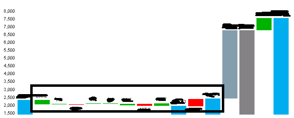
I have successfully created a bridge graph, but i'm struggling to get the axis to adjust automatically. Because the variance between the cost 1 & cost 2 is so low in comparison to the FY target, it reflects as a tiny line on my bridge graph. If anyone could advise me if there is a solution to dynamically adjust a range on the axis to lower the intervals up to a calculated max value, and then let the built in intervals continue from that point?
Regards,
Ridwaan
- Mark as New
- Bookmark
- Subscribe
- Mute
- Subscribe to RSS Feed
- Permalink
- Report Inappropriate Content
- Mark as New
- Bookmark
- Subscribe
- Mute
- Subscribe to RSS Feed
- Permalink
- Report Inappropriate Content
Thanks for the response hariprasadqv, but its not what im really looking for. I just need to expand the items in the rectangle below to show a little more on the axis. I also cant layer charts because someone will need to save this image into a presentation.
- Mark as New
- Bookmark
- Subscribe
- Mute
- Subscribe to RSS Feed
- Permalink
- Report Inappropriate Content
I think you have only two choices -
- exclude the larger items from the waterfall
- manually crop the vertical axis (Axes | Min and Max values)
Another option would be to lump all the small movements together to create one chart, and on a separate chart show the smaller movements
- Mark as New
- Bookmark
- Subscribe
- Mute
- Subscribe to RSS Feed
- Permalink
- Report Inappropriate Content
Thanks for the response Jonathan.
The options suggested wont work for me because the larger items have to be shown, its a financial graph. If i crop the axis manually, when selections are made the graph will go out of sync, and the last suggestions also wont be possible because they need to download the chart and if i create two graphs its means copying two graphs out and aligning it on powerpoint. I dont have option to build a powerpoint presentation as well because we dont have access to Macros.
Looks like I may need to chalk this one up as un-solvable.
Regards
Ridwaan