Unlock a world of possibilities! Login now and discover the exclusive benefits awaiting you.
- Qlik Community
- :
- Forums
- :
- Analytics
- :
- New to Qlik Analytics
- :
- Re: Stack colors in Bar chart for Qlik sense?
- Subscribe to RSS Feed
- Mark Topic as New
- Mark Topic as Read
- Float this Topic for Current User
- Bookmark
- Subscribe
- Mute
- Printer Friendly Page
- Mark as New
- Bookmark
- Subscribe
- Mute
- Subscribe to RSS Feed
- Permalink
- Report Inappropriate Content
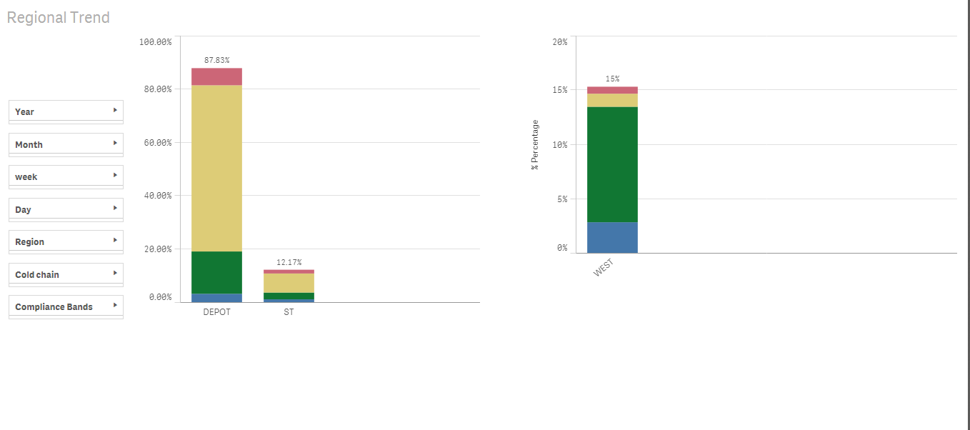
Stack colors in Bar chart for Qlik sense?
Here i'm working in Qlik sense.
i have attached sample data QVF.
1)How we can give desired colors for stacks inside bar in Qlik sense if i used calculated Dimension.
2) here when i click on Cold Chain filter e.g DEPOT.
It should Visualize only DEPOT in first chart but it shows ST and DEPOT also.
even my set analysis and condition in Dimension are correct.
Is this problem of Qlik sense or my Condition?
- Mark as New
- Bookmark
- Subscribe
- Mute
- Subscribe to RSS Feed
- Permalink
- Report Inappropriate Content
for 2 its your condition
On % Compliance Measure
Count({$<param_name={'Temperature'},branch_type=>}param_value)/
count(total(if(param_name='Temperature' and (param_value)<='-1','Blue')))
Remove ,Branch_type= and it will work.
- Mark as New
- Bookmark
- Subscribe
- Mute
- Subscribe to RSS Feed
- Permalink
- Report Inappropriate Content
In 1st and 2nd chart i have calculated percentage.
But how can i assigned stack colors into Bars for a percentage of following groups
above -10-->Blue()
-10.1 to -13.9-->red()
-14 to -17.9 -->yellow(),
-18 & below-->green()
i'm trying to show the percentage for above groups into the BAR in these colors.
| above -10 |
| -10.1 to -13.9 |
| -14 to -17.9 |
| -18 & below |
Existing colors in chart are given by Qlik sense itself.
- Mark as New
- Bookmark
- Subscribe
- Mute
- Subscribe to RSS Feed
- Permalink
- Report Inappropriate Content
The answer is in applying colours by expression in appearance.
I tried it using your dimension condition in this way and it crashed my machine so for your data set probably not practical to get the appearance your looking for.
Can you do something in your data load to assign a colour (category) dimension by the condition you have defined then you would be able to use the colour by expression on a field.
Something like
if([bandcolour]={'blue'},blue(), if([bandcolour]={'yellow'},yellow(),))) etc... which would be less memory intensive.
Regards
Andy
- Mark as New
- Bookmark
- Subscribe
- Mute
- Subscribe to RSS Feed
- Permalink
- Report Inappropriate Content
Glad I could be of help.
Please mark any answers you have found helpful.
Regards
Andy
- Mark as New
- Bookmark
- Subscribe
- Mute
- Subscribe to RSS Feed
- Permalink
- Report Inappropriate Content
It is Helpful.
You have given me a hint.
but it won't work in Qlik sense.
i could not able to create field in Script for a group of Temp.
i'm trying.

- Mark as New
- Bookmark
- Subscribe
- Mute
- Subscribe to RSS Feed
- Permalink
- Report Inappropriate Content
If that type of colour visualisation is a really important requirement perhaps try creating it in the QlikView product as you have a lot more control over appearance at present and you can copy your data model straight into it.
Qlik Sense is still building up its capabilities in this area although I know there is a new release due end of this month. 2.0 who knows you might get lucky and you have some extra features in this area.
- Mark as New
- Bookmark
- Subscribe
- Mute
- Subscribe to RSS Feed
- Permalink
- Report Inappropriate Content
Satish,
Please see here my reply about this.
Re: How to use custom colours in a stacked bar chart
I learned that in Qlik Sense it is not possible yet to change the colours in a stacked bar with simple IF statements.
Hope this helps.
Cheers!
- Mark as New
- Bookmark
- Subscribe
- Mute
- Subscribe to RSS Feed
- Permalink
- Report Inappropriate Content
You can colour a stacked bar chart in the following way. Take this as an Example.
Use these expressions:
Dimension 1: year-month
Dimension 2: valuelist( 'achieved', 'justmissed' and 'missed')
Measure : if(valuelist( 'achieved', 'justmissed' and 'missed') = 'achived',<expression1>,
if(valuelist( 'achieved', 'justmissed' and 'missed') = 'justmissed',<expression2>,
if(valuelist( 'achieved', 'justmissed' and 'missed') = 'missed',<expression3> )))
Colour Expression:
if(valuelist( 'achieved', 'justmissed' and 'missed') = 'achived',lightgreen(),
if(valuelist( 'achieved', 'justmissed' and 'missed') = 'justmissed',yellow(),
if(valuelist( 'achieved', 'justmissed' and 'missed') = 'missed',lightred() )))
Check this for a QVF sample.