Unlock a world of possibilities! Login now and discover the exclusive benefits awaiting you.
- Qlik Community
- :
- All Forums
- :
- QlikView App Dev
- :
- Re: Rotate Value in Chart
- Subscribe to RSS Feed
- Mark Topic as New
- Mark Topic as Read
- Float this Topic for Current User
- Bookmark
- Subscribe
- Mute
- Printer Friendly Page
- Mark as New
- Bookmark
- Subscribe
- Mute
- Subscribe to RSS Feed
- Permalink
- Report Inappropriate Content
Rotate Value in Chart
Hello,
if got a chart and want to show the value absolute and in percent different rotated.
The absolte value should be vertical and the percent value should be horizontal.
I found only a solution to rotate all values of the chart
- Mark as New
- Bookmark
- Subscribe
- Mute
- Subscribe to RSS Feed
- Permalink
- Report Inappropriate Content
Not entirely sure I understand what you are trying to do? Can you share a sample with an expected output.
Best,
Sunny
- Mark as New
- Bookmark
- Subscribe
- Mute
- Subscribe to RSS Feed
- Permalink
- Report Inappropriate Content
For the Percent values, use the "Text on Axis" option instead of "Values on Data Points".
-Rob
- Mark as New
- Bookmark
- Subscribe
- Mute
- Subscribe to RSS Feed
- Permalink
- Report Inappropriate Content
Hi Andrea, is this for QlikView or Qlik Sense? Your screen shot looks like QlikView. Just making sure before I move this to the appropriate forum.
Regards,
Mike T
Qlik
Mike Tarallo
Qlik
- Mark as New
- Bookmark
- Subscribe
- Mute
- Subscribe to RSS Feed
- Permalink
- Report Inappropriate Content
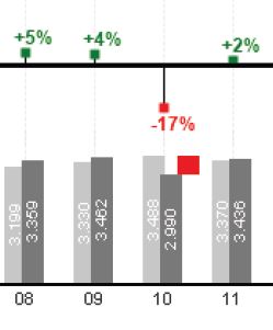
Hi Sunny,
it should look like this:
- Mark as New
- Bookmark
- Subscribe
- Mute
- Subscribe to RSS Feed
- Permalink
- Report Inappropriate Content
Hi Rob,
thanks for feedback.
"Text on Axis" is not so good, because it shows the text on the first axis and the percent values are on the second axis. Please look at my first answer with the sample. This was done with qlikview, but if got only a Picture.
- Mark as New
- Bookmark
- Subscribe
- Mute
- Subscribe to RSS Feed
- Permalink
- Report Inappropriate Content
Hi Mike,
i use qlikview.
- Mark as New
- Bookmark
- Subscribe
- Mute
- Subscribe to RSS Feed
- Permalink
- Report Inappropriate Content
Hi Andreas,
from my point of view you need to create 2 charts.
The first chart have to contains only expression for the real values, the second chart have to contains only the expression for the variances. If you have 2 charts you will be able to change the position of Data points.
- Mark as New
- Bookmark
- Subscribe
- Mute
- Subscribe to RSS Feed
- Permalink
- Report Inappropriate Content
Hi Mike,
thank you for your answer.
Is it possible to replace the neg. values?
- Mark as New
- Bookmark
- Subscribe
- Mute
- Subscribe to RSS Feed
- Permalink
- Report Inappropriate Content
You can create one chart only with positive values and one with negative, but in that way they will be 3 charts and it can make your app slower.