Unlock a world of possibilities! Login now and discover the exclusive benefits awaiting you.
- Qlik Community
- :
- All Forums
- :
- QlikView App Dev
- :
- Re: Strange Chart Behavior - Huge Spacing Between ...
- Subscribe to RSS Feed
- Mark Topic as New
- Mark Topic as Read
- Float this Topic for Current User
- Bookmark
- Subscribe
- Mute
- Printer Friendly Page
- Mark as New
- Bookmark
- Subscribe
- Mute
- Subscribe to RSS Feed
- Permalink
- Report Inappropriate Content
Strange Chart Behavior - Huge Spacing Between X axis points
I'm having an issue with a chart that I'm trying to create monitoring drive sizes on our servers. I want to set up a graph with the date across the bottom and show all of our server drives as individual lines. We have about 8 servers with several drives each.
I'm not sure what is going on, but when I create the chart with dimensions Date and Server Drive Name, then a measure =sum(DriveSize - FreeSpace), the chart displays only one or two dates across the bottom with a huge space between them. If I maximize the width of the chart then I get maybe 3 or 4 dates, but there is always about an inch or two of space between each date. This is obviously unacceptable, since I want to be able to show the last few months on the chart. Here's an example... I have about 1.5 months worth of data, but it only shows the first 4 days. And that is only when I stretch it halfway across my screen... if I shrink it down at all then it only shows 1 or two values:
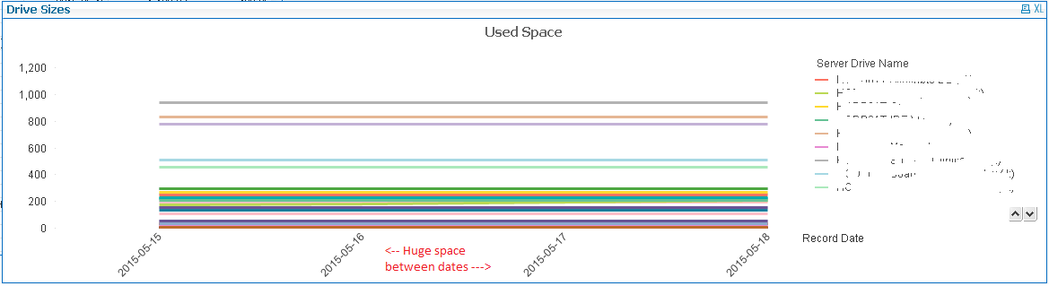
I played with every setting that I could think of: Adding a scrollbar allows access to the other values, but the dates are still limited. I tried all sorts of combinations of showing and hiding values, that didn't help. My data has values for all the other dates, so it's not hiding missing values or anything.
I finally turned on "Continuous" in the axis setting... and that seemed to work. But after a couple reloads of the data something even more bizarre happened:
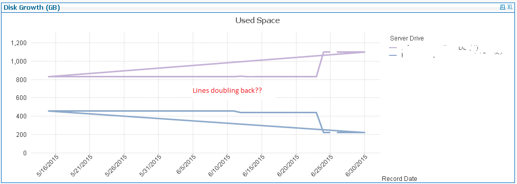
The lines now double back on one another! It is showing all the dates across the bottom... but some of the lines are basically going crazy and skipping around, doubling back, etc. I checked and rechecked the data and I have one and only one value for drive size and free space per date per drive, so it's not like I have multiples here.
Can anyone tell me what is going on? What I *want* to have is all of my dates across the bottom with each server drive represented by a separate line. Why is this so difficult?
- « Previous Replies
-
- 1
- 2
- Next Replies »
Accepted Solutions
- Mark as New
- Bookmark
- Subscribe
- Mute
- Subscribe to RSS Feed
- Permalink
- Report Inappropriate Content
You want it more like this?
- Mark as New
- Bookmark
- Subscribe
- Mute
- Subscribe to RSS Feed
- Permalink
- Report Inappropriate Content
In the general tab set the chart type to combo chart, then in the Style tab set SubType to grouped.
- Mark as New
- Bookmark
- Subscribe
- Mute
- Subscribe to RSS Feed
- Permalink
- Report Inappropriate Content
It already is a Combo chart with a subtype of grouped.
- Mark as New
- Bookmark
- Subscribe
- Mute
- Subscribe to RSS Feed
- Permalink
- Report Inappropriate Content
Can you share a sample app demonstrating your problem?
If you're worried about data sensitivity, have a look here
Preparing examples for Upload - Reduction and Data Scrambling
- Mark as New
- Bookmark
- Subscribe
- Mute
- Subscribe to RSS Feed
- Permalink
- Report Inappropriate Content
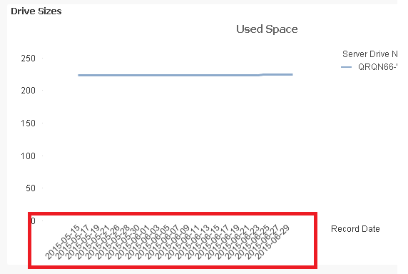
Sure, here is an example file. When no server or drive is selected, the graph only shows one date. This version doesn't seem to be doing the doubling-back issue, but that only happens once I select "Continuous" in the chart properties.
I would like the dates to be packed together nicely like this, which is what happens if only one drive is selected:
Or have it so that I can select what the step is across the bottom (like every 10 days, etc).
- Mark as New
- Bookmark
- Subscribe
- Mute
- Subscribe to RSS Feed
- Permalink
- Report Inappropriate Content
The file I uploaded has just one drive selected, remove that selection and you'll see the issue.
- Mark as New
- Bookmark
- Subscribe
- Mute
- Subscribe to RSS Feed
- Permalink
- Report Inappropriate Content
Hi Michael,
Yes strange, the space between the dates seems to increase as the number of possible values in the second dimension increase. No idea why, I've never encountered it as I generally don't try to display so many lines at one time.
You could ask yourself whether a line chart is the ideal representation for this, especially with so little variation. I would advice to at least limit the number of one or maybe even two of the dimensions. The time you can offcourse group to a higher level of weeks or months, for the server drive name you can maybe consider grouping these e.g. using a rank based on the calculation. See example attached.
- Mark as New
- Bookmark
- Subscribe
- Mute
- Subscribe to RSS Feed
- Permalink
- Report Inappropriate Content
You want it more like this?
- Mark as New
- Bookmark
- Subscribe
- Mute
- Subscribe to RSS Feed
- Permalink
- Report Inappropriate Content
Thanks... I was wondering if I was doing something wrong but it looks like it's just a weird "feature" of QlikView.
Most of the time our users are selecting one drive, but it was actually kind of handy to view all the lines with very little variation because any spikes would immediately stand out. What I'll probably do is set up some conditional dimensions to show each server when no server is selected and then drives when one server is selected. That should reduce the number of lines and give me a better result.
- Mark as New
- Bookmark
- Subscribe
- Mute
- Subscribe to RSS Feed
- Permalink
- Report Inappropriate Content
Ah, the thin bars and all bars display options in the presentation tab, did not think of that...
- « Previous Replies
-
- 1
- 2
- Next Replies »