Unlock a world of possibilities! Login now and discover the exclusive benefits awaiting you.
- Qlik Community
- :
- All Forums
- :
- QlikView App Dev
- :
- Re: Strange Chart Behavior - Huge Spacing Between ...
- Subscribe to RSS Feed
- Mark Topic as New
- Mark Topic as Read
- Float this Topic for Current User
- Bookmark
- Subscribe
- Mute
- Printer Friendly Page
- Mark as New
- Bookmark
- Subscribe
- Mute
- Subscribe to RSS Feed
- Permalink
- Report Inappropriate Content
Strange Chart Behavior - Huge Spacing Between X axis points
I'm having an issue with a chart that I'm trying to create monitoring drive sizes on our servers. I want to set up a graph with the date across the bottom and show all of our server drives as individual lines. We have about 8 servers with several drives each.
I'm not sure what is going on, but when I create the chart with dimensions Date and Server Drive Name, then a measure =sum(DriveSize - FreeSpace), the chart displays only one or two dates across the bottom with a huge space between them. If I maximize the width of the chart then I get maybe 3 or 4 dates, but there is always about an inch or two of space between each date. This is obviously unacceptable, since I want to be able to show the last few months on the chart. Here's an example... I have about 1.5 months worth of data, but it only shows the first 4 days. And that is only when I stretch it halfway across my screen... if I shrink it down at all then it only shows 1 or two values:
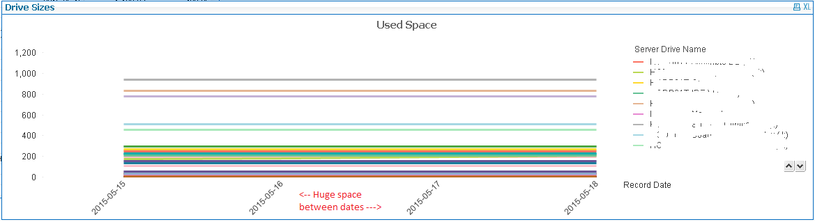
I played with every setting that I could think of: Adding a scrollbar allows access to the other values, but the dates are still limited. I tried all sorts of combinations of showing and hiding values, that didn't help. My data has values for all the other dates, so it's not hiding missing values or anything.
I finally turned on "Continuous" in the axis setting... and that seemed to work. But after a couple reloads of the data something even more bizarre happened:
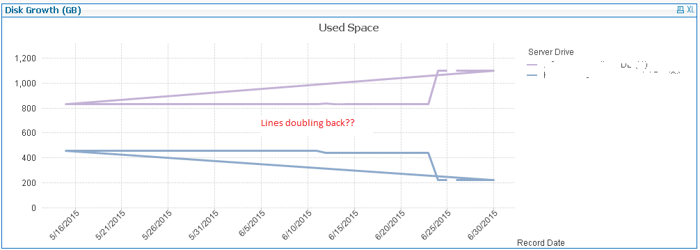
The lines now double back on one another! It is showing all the dates across the bottom... but some of the lines are basically going crazy and skipping around, doubling back, etc. I checked and rechecked the data and I have one and only one value for drive size and free space per date per drive, so it's not like I have multiples here.
Can anyone tell me what is going on? What I *want* to have is all of my dates across the bottom with each server drive represented by a separate line. Why is this so difficult?
- « Previous Replies
-
- 1
- 2
- Next Replies »
- Mark as New
- Bookmark
- Subscribe
- Mute
- Subscribe to RSS Feed
- Permalink
- Report Inappropriate Content
Yes, no idea why one needs this in that scenario.
It should also work fine by just switching the original sample chart type to line chart (in case there is no need for additional bars).
- Mark as New
- Bookmark
- Subscribe
- Mute
- Subscribe to RSS Feed
- Permalink
- Report Inappropriate Content
Ahh... that worked perfectly! Thanks very much for that. Adding the Thin Bars and Show All Bars worked.
I do need it to be a Combo since when you drill into the main view then I show some extra informaton in bars.
- « Previous Replies
-
- 1
- 2
- Next Replies »