Unlock a world of possibilities! Login now and discover the exclusive benefits awaiting you.
- Qlik Community
- :
- Forums
- :
- Analytics
- :
- New to Qlik Analytics
- :
- Re: Point Map Not Showing All Data Points - Exampl...
- Subscribe to RSS Feed
- Mark Topic as New
- Mark Topic as Read
- Float this Topic for Current User
- Bookmark
- Subscribe
- Mute
- Printer Friendly Page
- Mark as New
- Bookmark
- Subscribe
- Mute
- Subscribe to RSS Feed
- Permalink
- Report Inappropriate Content
Point Map Not Showing All Data Points - Example
Hi, I'm using the following point map in QlikSense to chart forest fires from 2014 in Canada (this point is on Vancouver Island):

Which is backed by the following data (lat, long, etc.):
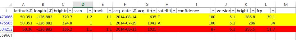
What you can see above is that the "frp" column of data has been considered for the yellow items, thus leading to a total sum of 73.1 MW (this is how fires are rated in power). However, the red data does not affect the data point even though it has the same longitude, as in, its "frp" value of 51.7 is not included in the sum. Now, this may be due to the fact that the latitude is slightly different, however, I am stuck here as something extremely weird happens if I remove my location filter:
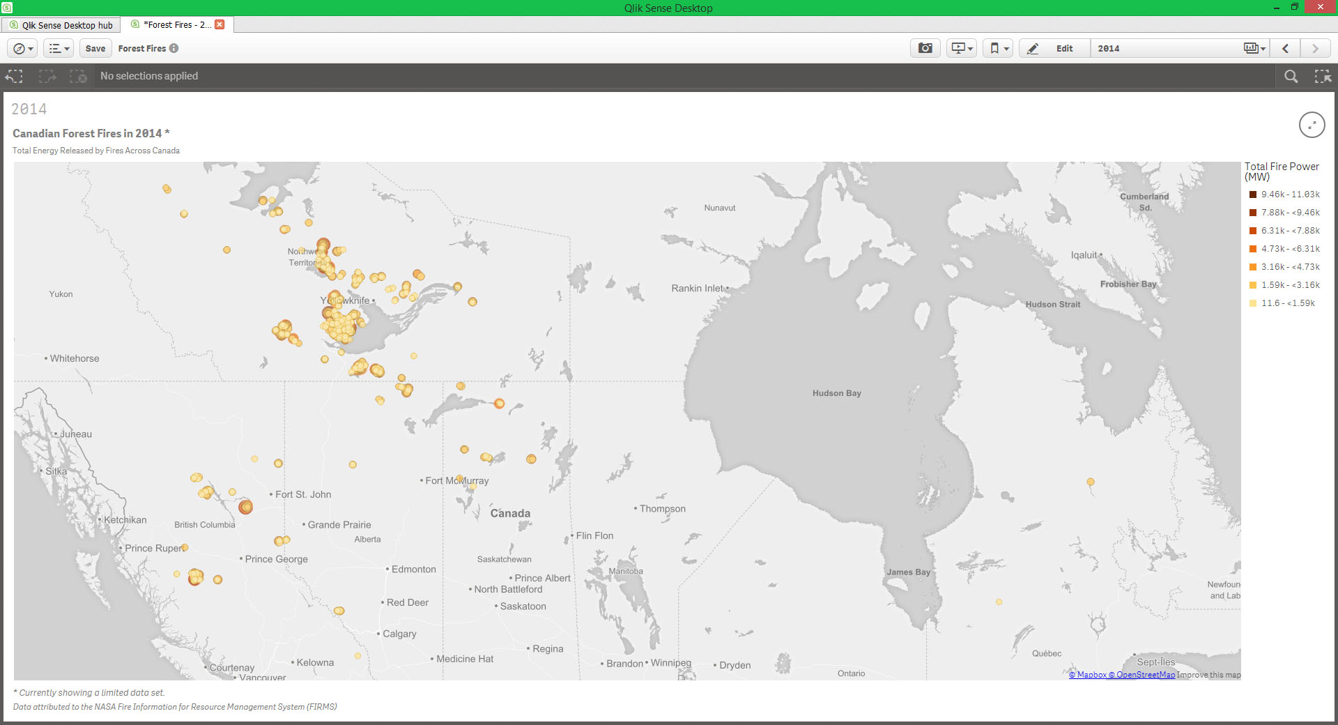
After removing the filter, notice how there's no map points at all where there was at least the one above previously on that island (on Vancouver Island)? How can that be possible? Removing filters should only expand the map points, not reduce the map points.
So I'm stumped on two fronts:
- With no filters set, it appears not all map points are being shown, there should be many more points looking at the data.
- How far apart do latitudes and longitudes need to be for two map points to be shown vs both points being aggregated into a larger map point? I thought in the data above those three points were very close (yellow and red are in the same area) and would be aggregated into one map point. Is that not the case?
The logic behind my Measure's expression is very simple:
Sum(if(year(acq_date)=2014,if(confidence > 80,frp)))
Essentially, sum the "frp" if we have over 80 confidence and if the date is 2014.
Thank you for your insights!
Message was edited by: Ryan Park Can't understand why this was not approved, please leave a message as to why if you disapprove a post, otherwise it's a mystery.
Accepted Solutions
- Mark as New
- Bookmark
- Subscribe
- Mute
- Subscribe to RSS Feed
- Permalink
- Report Inappropriate Content
Hi Ryan,
I believe what you are running into is a point limitation on the mapping object. Currently the mapping object is limited to 1000 data points. Note at the bottom of your image says that a limit data set is being displayed.
-Josh
Qlik
PS You post wasn't rejected it just entered our moderation queue.
- Mark as New
- Bookmark
- Subscribe
- Mute
- Subscribe to RSS Feed
- Permalink
- Report Inappropriate Content
Bonus question: Why are my latitudes and longitudes being rounded so strangely vs the original data? For instance:
longitude in data: 126.882
longitude in QlikSense: 126.8820000000001
I believe the extra digits are rather unnecessary, no?
- Mark as New
- Bookmark
- Subscribe
- Mute
- Subscribe to RSS Feed
- Permalink
- Report Inappropriate Content
Hi Ryan,
I believe what you are running into is a point limitation on the mapping object. Currently the mapping object is limited to 1000 data points. Note at the bottom of your image says that a limit data set is being displayed.
-Josh
Qlik
PS You post wasn't rejected it just entered our moderation queue.
- Mark as New
- Bookmark
- Subscribe
- Mute
- Subscribe to RSS Feed
- Permalink
- Report Inappropriate Content
Hi Josh,
I resubmitted the post, it was rejected, I got an email saying so. I just edited it, added that statement about moderation and resubmitted it. Now it's accepted, strange.
Anyway, as a new user, that limitation is not clear. I felt it was limiting data due to my Measure's expression, which is a filter of sorts. So I would suggest QlikSense comes with a better warning like, "output limited as over 1,000 map points", or something else that makes it clear why there are limited points being shown.
Ultimately, this limitations is unfortunate. People will expect certain points to be on the map, but they won't see them and then they'll think the map is erroneous. As I did. I understand that having the limitation is probably due to the fact too many points is hard to visualize on a map, but it should be up to the user to decide how to filter points to clear up the clutter.
Oh well, we're demoing all of the BI products out there, so hopefully this isn't a weakness of QlikSense that the others can do, because I like most things about QlikSense...
Thanks for your answer, marking it as such.
EDIT: PS: Any word on why QlikSense is rounding my longitude and latitude as it is? It's adding 10 trailing zeros followed by an integer in many cases...
- Mark as New
- Bookmark
- Subscribe
- Mute
- Subscribe to RSS Feed
- Permalink
- Report Inappropriate Content
Thanks for the feedback Ryan. I feel you make some very valid points and I will pass them to R&D team.
If you need any assistance with your evaluation please do not hesitate to reach out to us.
-Josh
Qlik
- Mark as New
- Bookmark
- Subscribe
- Mute
- Subscribe to RSS Feed
- Permalink
- Report Inappropriate Content
Thanks Josh, appreciate it and the very quick response!
- Mark as New
- Bookmark
- Subscribe
- Mute
- Subscribe to RSS Feed
- Permalink
- Report Inappropriate Content
My pleasure. Hopefully Qlik can help with the forest fire situation. I'd really like the air quality in Vancouver to get back to normal.
- Mark as New
- Bookmark
- Subscribe
- Mute
- Subscribe to RSS Feed
- Permalink
- Report Inappropriate Content
i know this post is old, but now in 2018 also we have limitions of the point which we can show on the map, so here i divide the data based on some condition then each group of data i show in different layer , and i am able to see all the points ..