Unlock a world of possibilities! Login now and discover the exclusive benefits awaiting you.
- Qlik Community
- :
- Forums
- :
- Analytics
- :
- New to Qlik Analytics
- :
- Re: QlikSense - pivot table - change color of cell...
- Subscribe to RSS Feed
- Mark Topic as New
- Mark Topic as Read
- Float this Topic for Current User
- Bookmark
- Subscribe
- Mute
- Printer Friendly Page
- Mark as New
- Bookmark
- Subscribe
- Mute
- Subscribe to RSS Feed
- Permalink
- Report Inappropriate Content
QlikSense - pivot table - change color of cell vs average of grouping
Hi - this is my first post and I am just learning QlikSense. Thanks in advance for your help.
I cannot upload my data due to confidentiality.
I have a pivot table that looks like the table below.
I would like to be able to color code the cells where the unit values are below average in red and above average in green.
The value for "average for task" is a row in my data set. I would need some kind of formula that references the average cell, within each grouping for comparison to the current cell value.
I hope all that makes sense. Any help / guidance / link to a place where I can RTFM are all appreciated.
| Task / Employee | Q1 | q2 |
|---|---|---|
| Task 1 | ||
employee 1 | 5 units | 10 units |
| employee 2 | 10 units | 20 units |
| employee 3 | 15 units | 30 units |
| Average for Task | 10 units | 20 units |
| Task 2 | ||
| employee 1... | xx | xx |
- « Previous Replies
-
- 1
- 2
- Next Replies »
- Mark as New
- Bookmark
- Subscribe
- Mute
- Subscribe to RSS Feed
- Permalink
- Report Inappropriate Content
Hi Randy,
I am attaching a sample QVF file which you can open it by copying it to 'C:\Users\Your user name\My Documents\Qlik\Sense\Apps'
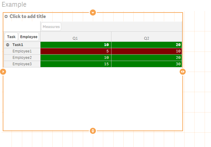
From the below screenshot, you can see that the values lower than the average per Task in red and the others are in green:
If for some reasons, you cannot open the attached app, here is the expression:
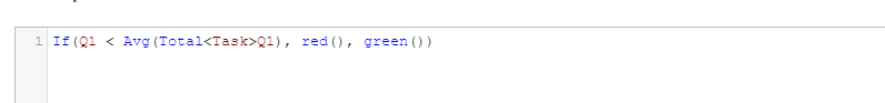
This expression needs to be put in "Background color expression" text box under the measures.
Hope this helps.
Thanks !
- Mark as New
- Bookmark
- Subscribe
- Mute
- Subscribe to RSS Feed
- Permalink
- Report Inappropriate Content
Thanks very much for your reply but I did not add enough complexity to my simple example.
In my actual application my pivot table has two row value and two column values that segregate the measures. I did show that on the row but not on the columns. I could not make this formula work for my example and I think the reason must be that I have two column values?
thanks!
- Mark as New
- Bookmark
- Subscribe
- Mute
- Subscribe to RSS Feed
- Permalink
- Report Inappropriate Content
In that case, can you post a sample dataset which reflects the complexity of your dataset?
Thanks
- Mark as New
- Bookmark
- Subscribe
- Mute
- Subscribe to RSS Feed
- Permalink
- Report Inappropriate Content
Thanks so much for your help. I have created some data that more closely matches my example. Thanks - I did not know how to create in-line data.
So now I have multiple values for each column and I have also added the complexity that the average I am comparing against is a weighted average that is computed within the source database. Therefore I need to reference the value of the cell called "AllEmployeesWeightedAverage" in order to determine which values are higher or lower and set the cell color appropriately.
thanks again!
- Mark as New
- Bookmark
- Subscribe
- Mute
- Subscribe to RSS Feed
- Permalink
- Report Inappropriate Content
Just to clarify, you are looking to compare Sum(value1) for each employee with AllEmployeesWeightedAverage row for each Task, correct?
- Mark as New
- Bookmark
- Subscribe
- Mute
- Subscribe to RSS Feed
- Permalink
- Report Inappropriate Content
yes that is correct! And just for further clarification although it probably doesn't matter to the solution --- in my case, the values of sum(value1) and min(value1) and max(value1) are all identical. There is never more than 1 value per task/employee/quarter combination.
- Mark as New
- Bookmark
- Subscribe
- Mute
- Subscribe to RSS Feed
- Permalink
- Report Inappropriate Content
Hi Randy,
Sorry I took a while. I handled everything in the load script and change the look of the pivot table. I will work on a more robust solution.
Let me know if this meets with your requirements.
Thanks
- Mark as New
- Bookmark
- Subscribe
- Mute
- Subscribe to RSS Feed
- Permalink
- Report Inappropriate Content
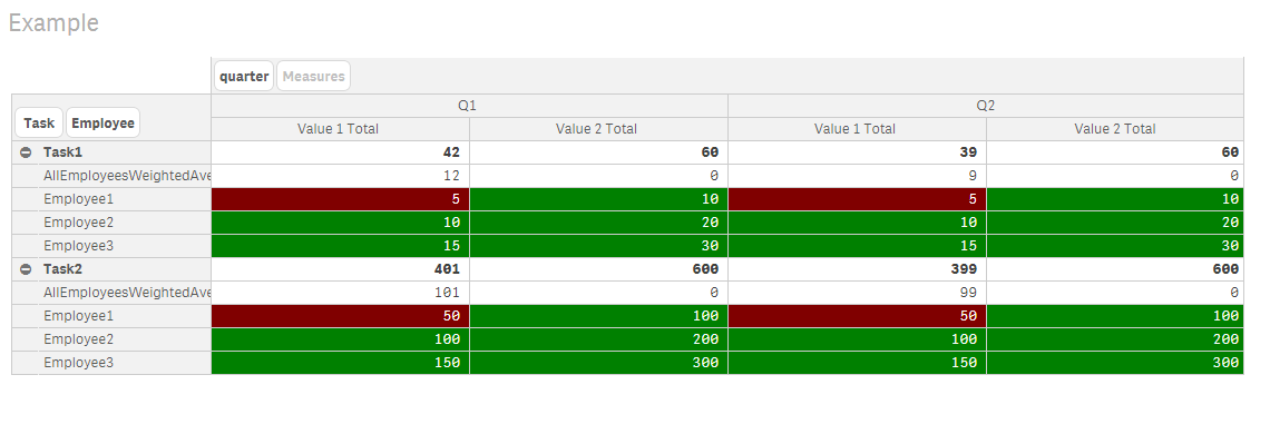
Hi Randi,
Here is the v3 without any modification in the load script. I wrote a function that compares each row to the all employee weighted average row and changes the color based on the comparison.
Please see the below screenshot and the attachment:
If this solves your problem, please mark this as correct answer.
Thank you.
- Mark as New
- Bookmark
- Subscribe
- Mute
- Subscribe to RSS Feed
- Permalink
- Report Inappropriate Content
Dears,
Is it possible to change colour in Dimension for example from the above Task/Employee in QlikSense.
- « Previous Replies
-
- 1
- 2
- Next Replies »