Unlock a world of possibilities! Login now and discover the exclusive benefits awaiting you.
- Qlik Community
- :
- All Forums
- :
- QlikView App Dev
- :
- Table box - elements have a colour?
- Subscribe to RSS Feed
- Mark Topic as New
- Mark Topic as Read
- Float this Topic for Current User
- Bookmark
- Subscribe
- Mute
- Printer Friendly Page
- Mark as New
- Bookmark
- Subscribe
- Mute
- Subscribe to RSS Feed
- Permalink
- Report Inappropriate Content
Table box - elements have a colour?
I have been asked to do graph, but I am not sure it what is wanted can even be done in Excel.
So I think what is wanted is something like a diary/scheduler with :
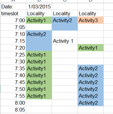
Each Acitivity has a timestamp. And to make it more useful, each Activity can be colour-coded.
I have a duration for each activity as well.
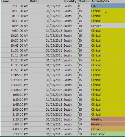
So the table looks something like this - and I think it is a good start - but given that it is a table box - am I able to add the colours to the ActivitySts as shown below? Any other ideas?
I am stumped how to start!
Jo
- Mark as New
- Bookmark
- Subscribe
- Mute
- Subscribe to RSS Feed
- Permalink
- Report Inappropriate Content
A pivot table perhaps might be the starting point.
- Mark as New
- Bookmark
- Subscribe
- Mute
- Subscribe to RSS Feed
- Permalink
- Report Inappropriate Content
Hi Josephine,
the tablebox is not actually a chart. It is only a tool that you can use to determine whether a keyfield is unique or something like it.
For displaying detail data out of a table, you can use it, but if you want to do anything more complex for a Dashboard, you should use a straight_table diagram instead.
It is definitely more work to add every field you need as a formula to the straight table (compared to a table_box), but then you can add background colours, even based on conditions, and the like.
So you should use that, with the time as your dimension.
HTH
- Mark as New
- Bookmark
- Subscribe
- Mute
- Subscribe to RSS Feed
- Permalink
- Report Inappropriate Content
Thank you HTH, what is a straight_table diagram?
Jo