Unlock a world of possibilities! Login now and discover the exclusive benefits awaiting you.
- Qlik Community
- :
- All Forums
- :
- QlikView App Dev
- :
- Alternative lay out suggestions>?
- Subscribe to RSS Feed
- Mark Topic as New
- Mark Topic as Read
- Float this Topic for Current User
- Bookmark
- Subscribe
- Mute
- Printer Friendly Page
- Mark as New
- Bookmark
- Subscribe
- Mute
- Subscribe to RSS Feed
- Permalink
- Report Inappropriate Content
Alternative lay out suggestions>?
Hi Guys,
Ive been creating some graphs lately. Now I created these pie charts. Basically Im interested in the number that is presented behind the pie charts. But Im not happy with the visualization, I think the pie chart makes not much sense. However the values are interesting, what would you suggest to be a better visualization method for these numbers.
So that it keeps clear, easy on the eye and practical.
I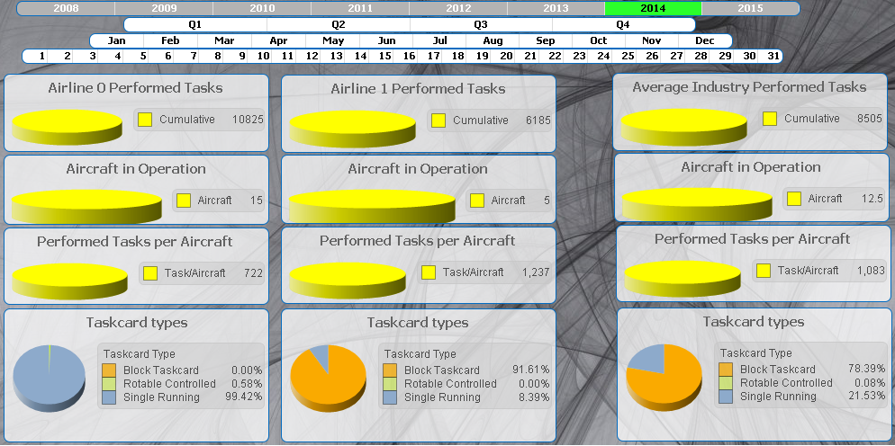
- Mark as New
- Bookmark
- Subscribe
- Mute
- Subscribe to RSS Feed
- Permalink
- Report Inappropriate Content
Try horizontal bar charts (one each for performed tasks (both airlines). in operation etc
Of look at the various types of gauges.
- Mark as New
- Bookmark
- Subscribe
- Mute
- Subscribe to RSS Feed
- Permalink
- Report Inappropriate Content
It rather depends on what are the important points in this data - for example, is it to compare airlines to each other and an average?
- Mark as New
- Bookmark
- Subscribe
- Mute
- Subscribe to RSS Feed
- Permalink
- Report Inappropriate Content
Yes exactly. to get an overview of differences. And average them.
I like your idea, I will try this.