Unlock a world of possibilities! Login now and discover the exclusive benefits awaiting you.
- Qlik Community
- :
- Forums
- :
- Analytics
- :
- App Development
- :
- Re: How can I remove the scroll bar from a chart?
- Subscribe to RSS Feed
- Mark Topic as New
- Mark Topic as Read
- Float this Topic for Current User
- Bookmark
- Subscribe
- Mute
- Printer Friendly Page
- Mark as New
- Bookmark
- Subscribe
- Mute
- Subscribe to RSS Feed
- Permalink
- Report Inappropriate Content
How can I remove the scroll bar from a chart?
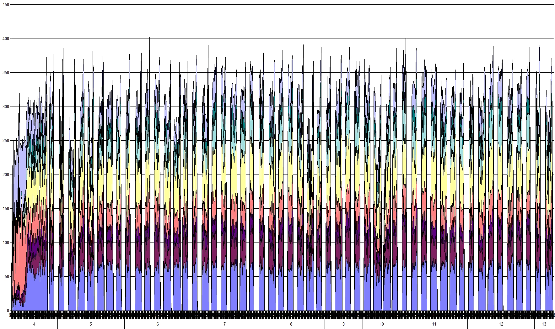
I would like to be able to expand the amount of data to be shown in the graph. Instead of having just a section of the data visible, adjustable by the scroll bar, I would like the entire data set to be visible at once.
If it isn't possible at the moment, when is it going to be possible?
- « Previous Replies
-
- 1
- 2
- Next Replies »
- Mark as New
- Bookmark
- Subscribe
- Mute
- Subscribe to RSS Feed
- Permalink
- Report Inappropriate Content
I would say that Qlik Sense works very well, but it is not yet as feature rich as QlikView.
You can expect to see QlikView 12 being release in second half of this year.
- Mark as New
- Bookmark
- Subscribe
- Mute
- Subscribe to RSS Feed
- Permalink
- Report Inappropriate Content
hi Toni, it is offtopic but I would like to hear how you use Sense - we are very large healthcare organization and typically all projects involve lots of data, customizations and complex calculations. I tried Sense with a few prototypes which worked fine in QV (with a lot of tweaking and messing around) and just would not cut in Sense. In fact I came up with a detailed list which I sent to Qlik.
- Mark as New
- Bookmark
- Subscribe
- Mute
- Subscribe to RSS Feed
- Permalink
- Report Inappropriate Content
Hi,
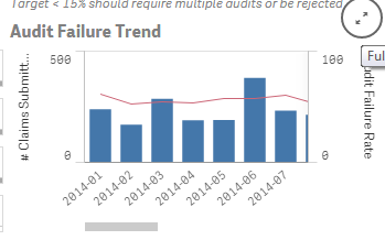
we are currently evaluating QLIK Sense for our data analysis. Presenting all values of the x-axis on one screen is a key feature that we definitely need. Of course you are not able to distinguish which e.g. day had which value. But you have the overall picture, e.g. development over time. Isn't there any way to compress the x-axis on one screen to get something like this?
- Mark as New
- Bookmark
- Subscribe
- Mute
- Subscribe to RSS Feed
- Permalink
- Report Inappropriate Content
Hi,
So far, no.
Hope they will add this option in upcoming versions, or someone will develop some extension to support it.
- Mark as New
- Bookmark
- Subscribe
- Mute
- Subscribe to RSS Feed
- Permalink
- Report Inappropriate Content
As a work around the user can always expand their chart if view port allows to display more data and does not have to accept the initial view presented to them.
From
To
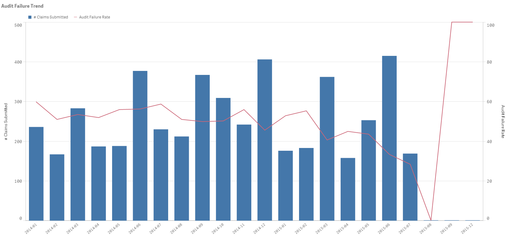
So making the more of the chart visible. e.g. Legend becomes visible, more data points visible.
Personally I like the fact Sense tries to present the information in a way the device they are using best supports. It takes some getting used to but my users/customers after initial resistance and a bit of training saw the benefit once they got familiar with the new interface.
- « Previous Replies
-
- 1
- 2
- Next Replies »