Unlock a world of possibilities! Login now and discover the exclusive benefits awaiting you.
- Qlik Community
- :
- Forums
- :
- Analytics
- :
- New to Qlik Analytics
- :
- Re: How to define measures separately in Bar Chart...
- Subscribe to RSS Feed
- Mark Topic as New
- Mark Topic as Read
- Float this Topic for Current User
- Bookmark
- Subscribe
- Mute
- Printer Friendly Page
- Mark as New
- Bookmark
- Subscribe
- Mute
- Subscribe to RSS Feed
- Permalink
- Report Inappropriate Content
How to define measures separately in Bar Chart?
Hey all,
I have a bar chart with two measures like this
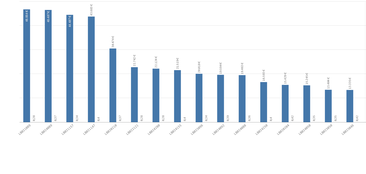
I want to fit the size of the second measure which is displayed in %, so that the bars are displayed larger. When i put in a min/max value it nearly displays what i want to, but it cuts the maxvalues of my first measure.
I tried with a combo chart, but in this i can only define the y-axis seperatly when i use lines, not bars.
Any Ideas?
BR
Leon
- Mark as New
- Bookmark
- Subscribe
- Mute
- Subscribe to RSS Feed
- Permalink
- Report Inappropriate Content
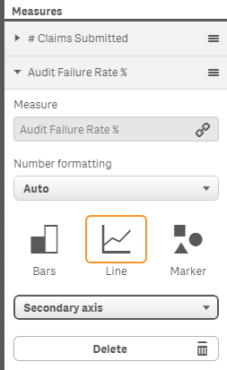
in your combo chart measure select the 2nd measure and set it to the secondary axis that will bring your values into proportion.
Regards
Andy
- Mark as New
- Bookmark
- Subscribe
- Mute
- Subscribe to RSS Feed
- Permalink
- Report Inappropriate Content
Thx for your reply but like i described in my post, i dont want to show a line, i want to show bars. And i cannot set a secondary axis when i choose bars.
Regards
- Mark as New
- Bookmark
- Subscribe
- Mute
- Subscribe to RSS Feed
- Permalink
- Report Inappropriate Content
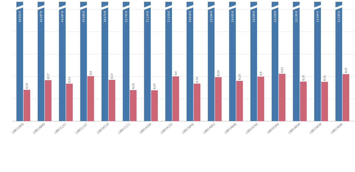
I see. In my example I used a Line for % and bar for volume so didn't have your issue.
Looks like Sense doesn't allow the same measure type in different axis for the combo chart.
If you use a standard bar chart with 2 bar measure and for the percentage value you (* by 100) and format the number as a percentage your bar values look like they would align better.
Regards
Andy
- Mark as New
- Bookmark
- Subscribe
- Mute
- Subscribe to RSS Feed
- Permalink
- Report Inappropriate Content
- Mark as New
- Bookmark
- Subscribe
- Mute
- Subscribe to RSS Feed
- Permalink
- Report Inappropriate Content
Glad I could help.
I think the challenge for Qlik Sense would be using the standard colour pallet the first bar value is blue the second red etc... In a combo chart you would have 2 bar values being generated with the first colour blue. Which would not look great. It would need to be clever enough to start from the 2nd colour for the secondary axis which it does for the line value.
Regards
Andy
- Mark as New
- Bookmark
- Subscribe
- Mute
- Subscribe to RSS Feed
- Permalink
- Report Inappropriate Content
*100 works .. and i set the pattern to : #.###0,0
but is it still possible to add a %? when i change it to #.###0,0% is does * 100 again