Unlock a world of possibilities! Login now and discover the exclusive benefits awaiting you.
- Qlik Community
- :
- All Forums
- :
- QlikView App Dev
- :
- Re: X Axis with continuous dates
- Subscribe to RSS Feed
- Mark Topic as New
- Mark Topic as Read
- Float this Topic for Current User
- Bookmark
- Subscribe
- Mute
- Printer Friendly Page
- Mark as New
- Bookmark
- Subscribe
- Mute
- Subscribe to RSS Feed
- Permalink
- Report Inappropriate Content
X Axis with continuous dates
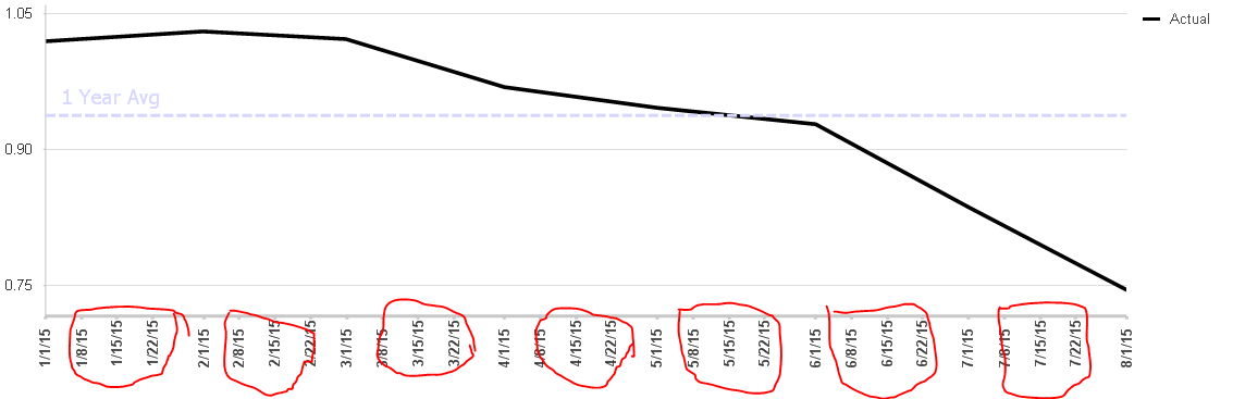
My data set has dates. The data represents monthly averages (not loading daily data) and given the first of the month as the date. When I create a graph, the X axis is populated with the dates in between. I dont want this but cant figure out how to get rid of. I have the axis set to continuous and need it that way when showing longer time periods (more than 1 year). I dont have this issue when more than one year is graphed. I have suppress zero values and missing on.
Accepted Solutions
- Mark as New
- Bookmark
- Subscribe
- Mute
- Subscribe to RSS Feed
- Permalink
- Report Inappropriate Content
Ok, this is the correct answer per my testing. The only issue (which is minor) is the last data point doesn't get an x-axis label. I suspect there is no solution to this but if you have one I would be interested. Thanks for your help.
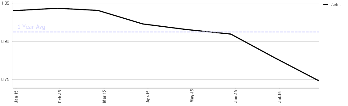
PS - How did you come up with 30.44?
- Mark as New
- Bookmark
- Subscribe
- Mute
- Subscribe to RSS Feed
- Permalink
- Report Inappropriate Content
Please post your sample appication
- Mark as New
- Bookmark
- Subscribe
- Mute
- Subscribe to RSS Feed
- Permalink
- Report Inappropriate Content
That's what you get when you set the axis to continuous.
But if the data is monthly, you could manually scale the axis to 30.44 days. I don't think there is any way (with a continuous axis) of making it strictly monthly, but it may be good enough with that scale and the axis format set to MMM-YY (or similar without the day number)
- Mark as New
- Bookmark
- Subscribe
- Mute
- Subscribe to RSS Feed
- Permalink
- Report Inappropriate Content
Ok, this is the correct answer per my testing. The only issue (which is minor) is the last data point doesn't get an x-axis label. I suspect there is no solution to this but if you have one I would be interested. Thanks for your help.
PS - How did you come up with 30.44?